December 2008 Archives

Negro Suffrage 1866

Graphic Arts Broadside Collection

In 1866, the two candidates running for governor of Pennsylvania were Democrat Hiester Clymer (1827-1884), who ran on a white-supremacy platform, and Republican James White Geary (1819-1873), who supported Negro suffrage. This was a poster created by the Clymer campaign to discredit the Republicans.

Clymer spoke to a Philadelphia audience shortly before the election:

“Everywhere I beheld not only Democrats but Conservatives who had joined hands with us, and who had declared that the integrity of the American Union should be actually as well as in theory preserved. My fellow-citizens, the clouds of darkness are disappearing. Upon every hill-top and in every valley the watchfires of conservatism are burning brightly; and by the 9th of October I predict the glorious sun of victory will arise to shine upon the peace and happiness of our distracted country.”

The official voted was Geary: 307,274 and Clymer: 290,096. Geary served two terms as the governor of Pennsylvania from 1867 to 1873.

New Year's Resolutions

| 2 Comments
Broadside advertisement

John Bartholomew Gough (1817-1886), Sunlight and Shadow (Hartford, Conn.: Worthington and Company, 1881). Graphic Arts Collection (GAX) Hamilton 686
As a poor young man, John Gough was an alcoholic. When he “signed the pledge” and stopped drinking, he began a career as a temperance lecturer and reformer. Gough became an internationally acclaimed inspirational speaker and writer. He published his first autobiography in 1845, with reprints or new editions nearly every year until it was completely rewritten in 1869. Other books, based on his life experience, had minor plots as an excuse to publish more of his personal message, such as Sunlight and Shadow; or, Gleanings from My Life Work. Comprising Personal Experiences and Opinions, Anecdotes, Incidents, and Reminiscences, Gathered from Thirty-Seven Years’ Experience on the Platform and among the People, at Home and Abroad.


Here is a short excerpt from one of his speeches:

I had fallen, O, how low ! In the very depths of my desolation, wife and children had been torn from my side. In the midst of thousands I was lonely, and, abandoning hope, the only refuge which seemed open for me was the grave. …Despair was my companion, and perpetual degradation appeared to me my allotted doom. I was intensely wretched ; and this dreadful state of things was of my own bringing about. I had no one but myself to blame for the sufferings that I endured ; …Such was my pitiable state at this period—a state apparently beyond the hope of redemption. But a change was about to take place—a circumstance which eventually turned the whole current of my life into a new and unhoped for channel.

Gough also wrote in support of others, such as his introduction to Ann Eliza Young (born 1844), Wife No. 19, or the Story of a Life in Bondage: Being a Complete Exposé of Mormonism, and Revealing the Sorrows, Sacrifices and Sufferings of Women in Polygamy (1876). Princeton owns no less than five copies of this book, including one you can check out: Firestone 1226.987

Gough died on stage in Pennsylvania in 1886.

One of the longest poems in European literature

Le donne, i cavallier, l’arme, gli amori, / le cortesie, l’audaci imprese io canto.
Of wives and ladies, knights and arms, I sing, / of courtesies and many a daring feat.


Lodovico Ariosto (1474-1533), Orlando furioso; nuouamente adornato di figure di rame da Girolamo Porro padouano ([Venice]: Appresso Francesco de Franceschi senese e compagni, 1584). Graphic Arts Collection (GAX), Oversize 2004-1179Q

Ariosto began work on his epic poem Orlando Furioso (Mad Orlando) at the age of 32. He continued to expand and polish it over 16 years before it was finally published in 1532, a year before his death.

The plot revolves around the conflict of the Christian versus the Moor, the war between the Holy Roman Emperor, the King of North Africa, and the King of Spain. It is a continuation of Matteo Maria Boiardo’s romance Orlando Innamorato (Orlando in Love), although it can be read on its own.

The poem is divided into forty-six cantos, each containing a variable number of eight-line stanzas. The complete work is 38,736 lines long, making it one of the longest poems in European literature. It was also one of the most celebrated narrative poems of the Italian high Renaissance.

Princeton owns sixteen illustrated editions of Orlando Furioso. One of the most elaborate is this 1584 edition with 64 full-page engravings by the Venetian artist Girolamo Porro (1520-1604). In addition, the argomento or theme that introduces each poem is set inside a classical cartouche.

Also recommended is the 1879 French edition, Roland furieux: poème héroïque, illustrated by Gustave Doré (1832-1883). Rare Books (Ex), Oversize 2004-0064F.

Scenes from Shakespeare

| 1 Comment
Henry William Bunbury (1750-1811), Twenty-Two Plates Illustrative of Various Interesting Scenes in the Plays of Shakspeare (London: Published originally by the late T. Macklin, sold by J. Nichols & son, [1792-1796]). Graphic Arts Collection (GA) Oversize Rowlandson 1792.2e

Around the end of the eighteenth century, the most successful London print shop was the Shakespeare Gallery, run by John Boydell. Their most famous project was a series of over one hundred extravagantly large engravings illustrating well-known scenes from Shakespeare’s plays. Boydell’s success led to many imitations, such as the Woodmason’s Shakespeare Gallery and the Irish Shakespeare Gallery. The most ambitious was the Poet’s Gallery, managed by Thomas Macklin.

Macklin hired the popular caricaturist Henry Bunbury to create a similar series of pen and ink and watercolor drawings to illustrate Shakespeare’s plays. Bunbury chose comic, often obscure scenes, emphasizing the outlandish and the ridiculous. His designs were engraved over five year by Francesco Bartolozzi (1727-1815), Peltro William Tomkins (1760-1840), Thomas Cheeseman (active 1780-1790), and Robert Mitchell Meadows (died 1812). The artists only finished twenty-two prints, which in the end was no real competition for Boydell.

See also Andrew White Tuer (1838-1900), Bartolozzi and his works: a biographical and descriptive account of the life and career of Francesco Bartolozzi, R.A. (illustrated): with some observations on the present demand for and value of his prints …: together with a list of upwards of 2,000 … of the great engraver’s works (London: Field & Tuer; New York: Scribner & Welford, [1882]) Graphic Arts Collection (GA) Oversize Rowlandson 953.2q

The Four Stages of Cruelty

William Hogarth, First Stage of Cruelty, 1 February 1751. Etching and engraving. Graphic Arts GA113


William Hogarth, Second Stage of Cruelty, 1 February 1751. Etching and engraving. Graphic Arts GA113


William Hogarth, Cruelty in Perfection, 1 February 1751. Etching and engraving. Graphic Arts GA113


William Hogarth, The Reward of Cruelty, 1 February 1751. Etching and engraving. Graphic Arts GA113


William Hogarth (1697-1764) created this print series “in the hopes of preventing in some degree that cruel treatment of poor Animals which makes the streets of London more disagreeable to the human mind, than any thing what ever….”
The first plate finds Tom Nero (center) as a young boy torchering a dog.

Text transcribed:

While various Scenes of sportive Woe
The Infant Race employ.
And tortur’d Victims bleeding shew
The Tyrant in the boy

Behold a Youth of gentler Heart
To spare the Creature’s pain
O take, he cries — take all my Tart.
But Tears and Tart are vain.

Learn from this fair Example — You
Whom savage Sports delight
How Cruelty disgusts the view
While Pity charms the sight.


In the second plate, Nero is a young man working as a coach driver. He has been mistreating his horse, which now has a broken leg. All around them are examples of cruelty to animals on the public streets of London.

The generous Steed in hoary Age
Subdu’d by Labour lies,
And mourns a cruel Master’s rage,
While Nature Strength denies.

The tender lamb o’er drove and faint
Amidst expiring Throws
Bleats forth its innocent complaint
And dies beneath the Blows.

Inhuman Wretch! Say whence proceeds
This coward Cruelty?
What Int’rest springs from barb’rous deeds?
What Joy from Misery?


In Hogarth’s third plate, Nero has become a highway robber. He is being apprehended for killing Ann Gill, his pregnant lover.

To lawless love when once betray’d,
soon crime to crime succeeds:
At length beguil’d to theft,
the maid By her beguiler bleeds.

Yet learn, Seducing Man.’nor Night.
with all its sable Cloud.
Can screen the guilty deed from sight;
Foul Murder cries aloud.

The gaping Wounds, and blood stain’d steel.
Now shock his trembling Soul:
But Oh! what Pangs his Breast must feel.
When Death his knell shall toll.

In the final scene, Nero has been hanged and his body is being dissected in the Cutlerian theatre near Newgate prison. The public was invited to view these gruesome dissections and this scene reflects back on the first plate, where the young boys staged their own theater of gruesome operations.

Behold the Villain’s dire disgrace!
Not Death itself can end.
He finds no peaceful Burial-place;
His breathless Corse, no friend.

Torn from the Root, that nicked Tongue,
Which daily snore and curst!
Those Eyeballs, from their Sockets nrung,
That glori’d with lawless lust!

His Heart, expos’d to prying Eyes,
To Pity has no Claim:
But, dreadful! from his Bones shall rise,
His Monument of shame.

Hindu Gods


Hindu Gods ([India?: s.n., ca. 1850]). This volume consists exclusively of 78 hand-colored drawings of Hindu gods. Graphic Arts Collection (GAX) ND2047 .H562 1850. Gift of Hibben (Class of 1924) and Mrs. Ziesing.

L'Exposition surréaliste de 1938

| 1 Comment

Man Ray (1890-1976), Résurrection des mannequins (Paris: Jean Petithory, 1966). 15 gelatin silver photographs. Graphic Arts (GAX) 2008- in process

In 1938, the writer André Breton (1896-1966) and poet Paul Éluard (1895-1952) organized the Exposition Internationale du Surréalisme at the Galerie Beaux-Arts in Paris. Each of fifteen artists were given a dressmaker’s mannequin as their canvas and encouraged to transform the figure in any way they desired. The artists included Salvador Dalí, Óscar Dominguez, Marcel Duchamp, Leo Malet, André Masson, Joan Miró, Wolfgang Paalen, Kurt Seligmann, Yves Tanguy, Marcel Jean, Max Ernst, Espinoza, Maurice Henry, Sonia Mosse, and Man Ray.

Man Ray organized the lighting and photographed the show. Twenty-eight years later, he printed and published a limited edition of these photographs, along with a descriptive text, under the title Résurrection des mannequins. Man Ray designed the binding and pursuaded the great surrealist printer Guy Lévis Mano to design and print the pages.

Princeton’s copy is inscribed by Man Ray to his friend William Copley (1919-1996). In 1947, Copley opened a Los Angeles gallery dedicated to the Surrealists and to Man Ray’s work in particular. When nothing sold, he closed the gallery, purchasing much of the art for his own private collection. In 1979, Copley sold this collection for $6.7 million, at the time the highest auction sale of a single owner’s collection in the United States.

London Illustrated

Joseph John Elliott (1835-1903) and Clarence Edmund Fry (1840-1897) founded the celebrated photography studio of Elliott & Fry in 1863. Their business succeeded by offering noted actors, scientists, politicians, and writers a free photographic portrait, which could then be reproduced on hundreds of cartes-de-visite for sale to the Victorian public. By 1886, they had outgrown their studio at 55 Baker Street, Portman Square, and opened a second branch in South Kensington.

Elliott & Fry received a commission in 1870 to provide photographs for a deluxe London guidebook. Twelve portraits of contemporary actresses and actors were chosen to augment a series of steel engravings. Hundreds of original photographs had to be hand-trimmed and pasted onto pages with lithographed borders to illustrate these volumes. A lively descriptive text provides details on contemporary hotels, parks, clubs, theaters, markets, railway routes, and houses of trade.

Henry Herbert, London (Illustrated). A Complete Guide to the Places of Amusement. 8th edition (London: Herbert, 1879). Graphic Arts (GAX) 2008- in process

Théâtre des Champs-Élysées and La Revue Nègre

Paul Colin (1892-1985), Le tumulte noir (Paris: Editions d’Art Succès, [1927]). Graphic Arts Collection (GAX) Oversize 2003-0018E

Paul Colin created posters and stage designs for theaters throughout Paris in the 1920s. His favorite was the Théâtre des Champs-Élysées, where La Revue Nègre performed led by the dancer Josephine Baker (1906-1975). In 1927, Colin was inspired by the Revue to create a portfolio entitled Le Tumulte Noir or The Black Craze. He drew his designs directly onto lithographic stones, which were printed in black, brown, or gray inks and then, hand-colored by the master of pochoir, Jean Saudé. The images include many figures of contemporary French popular culture, such as Maurice Chevalier, Ida Rubinstein, the film actress Jane Marnac, the theatrical caricaturist Sem, and others.

For more information, see the introduction by Henry Louis Gates, Jr., and Karen C.C. Dalton in Josephine Baker and La revue nègre (1998). Marquand Library Oversize NE2349.5.C66 A4 1998q

Tea Tax Tempest

Carl Gottlieb Guttenberg (1743-1790), The Tea Tax Tempest, or the Anglo-American Revolution, 1778. Engraving. GC077, Graphic Arts 2-14-G.
Reproduction from Amelia Rauser, “Death or Liberty: British Political Prints and the Struggle for Symbols in the American Revolution,” Oxford Art Journal, 21, No. 2 (1998), 155.
Reproduction from British Museum: A Tea-Tax-Tempest or Old Time with His Magick-Lantern (London: William Humphrey, 1783).

In this 41 x 49 cm. engraving, the winged figure of Father Time is seen balancing a magic lantern on a globe of the world. The image being projected has at its center a steaming tea pot (the American Revolution), cooking on a fire fanned by a cock (symbolizing France), with British soldiers on one side and American soldiers on the other. Time is explaining the scene to four viewers, who represent America, Africa, Europe, and Asia.

Guttenberg was not the original artist of this scene but only adapted it from a 1774 print by John Dixon, shown at the left. Dixon’s print, entitled The Oracle, was suppose to portray a hopeful view of Great Britain at a time when not only America but Scotland and Ireland were threatening revolt. Guttenberg literally reverses the image and replaces the pastoral scene with one of impending war.

Not to be undone by the German artist, an unidentified British caricaturist redrew the print once more in 1783 and put words into Father Time’s mouth:

There you see the little Hot Spit Fire Tea pot that has done all the Mischief - There you see the Old British Lion basking before the American Bon Fire whilst the French Cock is blowing up a storm about his Ears to Destroy him and his young Welpes - There you See Miss America grasping at the Cap of Liberty - There you see The British Forces be yok’d and be cramp’d flying before the Congress Men - There you see the thirteen Stripes and Rattle-Snake exalted - There you see the Stamp’d Paper help to make the Pot Boil -There you See &c &c &c.

Some copies of Guttenberg’s print include the title engraved in English, French, and German. Princeton’s impression has only the English.

Currently most requested item

Clement Clarke Moore (1779-1863), Visit of St. Nicholas; illustrated by Thos. Nast (1840-1902) (New York: McLoughlin Bros., [1869]). Part of: Aunt Louisa’s big picture series. Graphic Arts Collection (GAX), Oversize Hamilton 1142q

Juan Pascoe and Taller Martín Pescador

| 3 Comments

Princeton University library is the fortunate new owner of 84 books, 54 broadsides, and several hundred pieces of printing ephemera handset, hand-printed, and mostly hand-bound by the Mexican master printer Juan Pascoe at the Taller Martín Pescador.


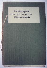
Francisco Segovia, Alquimia de la luz, 1979.

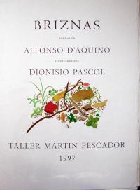
Alfonso D’Aquino, Briznas: poemas;
ilustrados por Dionisio Pascoe, 1997.


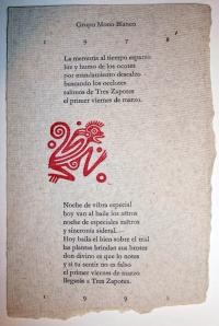
Tarjeta para el 20 aniversario del Grupo Mono Blanco (White Monkey, Pascoe’s musical ensemble), 1998.

Born in Chicago in 1946, Pascoe was educated in the United States, while spending vacations at his father’s home in Mixcoac, outside Mexico City. He learned the art of letterpress printing at the age of 25 as an apprentice to Harry Duncan at the Cummington Press in West Branch, Iowa. When Pascoe moved full-time to Mexico in 1973, he set-up a print shop with a renovated nineteenth-century R. Hoe Washington handpress and sets of Spectrum and Garamond type, with Castellar for titling and initials. In 1975, Pascoe established his own imprint, named the Taller Martín Pescador (Kingfisher Workshop) at the suggestion of the writer Roberto Bolaño.

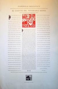
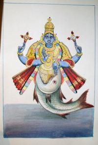
Cartel de El Cuento del Venerable Mono, 2003.

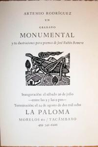
Artemio Rodriguez exhibition poster

From the beginning, Pascoe set all the type by hand, inked and printed each page, and personally sewed each quire into their unpretentious paper covers. As his reputation grew, the projects became more elaborate but the technology remained the same. Authors published at the press include some of the major name in Latin American literature such as Octavio Paz, Gabriel Garciá Márquez, Efraín Huerta, Juan José Arreola, Roberto Bolaño, José Luis Rivas, and Francisco Segovia.

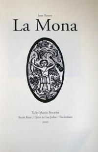
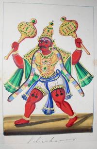
Juan Pascoe, La Mona, 2002

Poemas de Raul Renan: catulinarias & saficas, grabado de Dionisio Pascoe, 1979

Since 1981, Pascoe has worked in a shop outside Tacámbaro, Michoacán. After years researching and published texts on the history of Mexican typography and printing, Taller Martín Pescador has become the foremost source for traditional Mexican graphic arts as well as innovative Latin American literature and poetry.

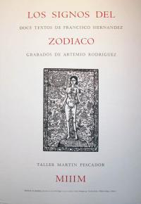
Cartel de Los signos del zodiaco: doce textos/ escritos por Francisco Hernandez, 1997

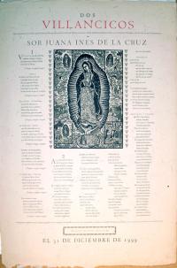
Cartel de Dos Villancicos de Sor Juana Ines de la Cruz, 1999


For more information, continue below.

First Japanese Book Printed from Movable Type

Ariwara Narihira (825-880), 伊勢物語 (Ise monogatari or Tales of Ise) [S.l. : s.n., 慶長戊申 i.e. 1608?]. Second edition. Graphic Arts (GAX) 2008- in process.

“In 1593, in the wake of the Japanese invasion of Korea, a printing press with movable type was sent from Korea as a present for Emperor Go-Yōzei. …The printing press may have been offered to the emperor more as a curiosity than as a practical invention, but that same year he commanded that it be used to print an edition of the Confucian Kobun Kokyo (Classic of Filial Piety). Four years later, in 1597, a Japanese version of the Korean printing press was built with wooden instead of metal type, probably because of the difficulties of casting; and in 1599 this press was used to print the first part of the Nihon Shoki (Chronicles of Japan).

By this time printing was developing into the hobby of the rich … and many editions began to appear. These editions, associated with Emperors Go-Yōzei and Go-Mizunoo and with such figures as Toyotomi Hideyoshi and Tokugawa Ieyasu, were intended for presentation and not for sale. The finest printed books of the time were designed by the artist Hon’ami Kōetsu (1558-1637)… [and] the masterpiece of this press was the illustrated edition of Ise Monogatari (Tales of Ise) published in 1608.”

from Donald Keene, World Within Walls: Japanese Literature of the Pre-Modern Era, 1600-1867 (New York: Holt, Rinehart and Winston, c1976) East Asian Library (Gest): Western, PL726.35.K4

Complete digital book: http://digitalgallery.nypl.org/

Complete text, see: http://etext.lib.virginia.edu/japanese/

Face powder and cold cream

| 2 Comments

Jarden Lithographing Company, Catalogue and price list of original label designs, talcum wraps, and sachet envelopes in stock (Philadelphia: Jarden Lithographing Company, no date). Graphic Arts (GAX) 2008- in process

This sales catalogue from the Jarden company of Philadelphia offers 60 leaves of chromolithographic plates presenting 181 labels for hair tonic, face powder, cold cream, perfume, and more. The images are not pasted in but printed directly onto the pages.

Lithography was perfected in Europe during the 1790s but it was in American printing companies, such as Jarden in Philadelphia, where the commercial use of color printing really evolved in the second half of the 1800s. For the first time, relatively cheap color images became possible, surpassing the use of stencil or hand-applied color for commercial applications. Up to two dozen oil-based color inks might be used, each from a separate printing stone in perfect registration, to achieve a density and richness of tone. The integration of golds and silvers heighten the metallic shine of the final chromolithograph.

Dürer's marginalia

Albrecht Dürer (1471-1528), Oratio dominica polyglotta singularm linguarum characteribus expressa et delineationibus Albert Dueri (Munich: Stuntz, [1820]). Graphic Arts (GAX) 2008- in process

In 1515, Albrecht Dürer created a series of designs on the margins of a Prayer Book in the Royal Library at Munich, formerly belonging to the Emperor Maximilian I. The book became known as Dürer’s Christlich-Mythologische Handzeichnungen. In 1808, one of the first lithographed publication to use multi-colored inks was a reproduction of Dürer’s border designs by Johann Nepomuk Strixner (1782-1855) published at Aretin-Senefelder Verlag. When Rudolf Ackermann (1764-1834) started his Lithographic Press in London in 1817, a facsimile of the 1808 German edition was its first important production.

The 1820 Munich edition shown here fills the borders with the Lord’s prayer in 43 different languages lithographed in colors by Strixner, published under the new title of Oratio Dominica Polyglotta.

Also available: Albrecht Dürer (1471-1528), Albrecht Dürers christlich-mythologische Handzeichnungen ([Munich: A. Senefelder, 1808]). Graphic Arts Collection (GAX), Oversize 2007-0749Q

Die Nibelungen, an ancient tale of knightly honor

| 2 Comments

Die Nibelungen. Interpreted by Franz Keim (1840-1918) and illustrated by Carl Otto Czeschka (1878-1960) (Wien; Leipzig: Verlag Gerlach u. Wiedling, [1909?]). Graphic Arts Collection (GAX), PT1580 .K44 1909

This unassuming little book gives the reader no indication of the riches it holds inside. The design of the text and eight double page illustrations are the work of Carl Otto Czeschka, a leading member of the Vienna Secession. Czeschka studied at the Vienna School of Arts and Crafts and worked as a designer for the Wiener Werkstätte from 1905 until 1908 when he left for a teaching post at Hamburgs’ Kunstgewerbeschule. Czeschka went on to design for a variety of media including jewelry, metalwork, textiles, furniture and book design.

This copy of Die Nibelungen will be included in an exhibition at the Princeton University Art Museum from March 21 to June 7, 2009. The show, entitled “Myth and Modernity: Ernst Barlach’s Images of The Nibelungen and Faust” will offer the first American showing of the Nibelungen drawing cycle by Barlach.

Recent Comments

  • Howard Coblentz: I have a round seal shaped like a pear a read more
  • John Overholt: Wikipedia's entry for Sir Francis says: "Throughout Baring's lifetime his read more
  • Serge Rodrigue: It is a precious thing you have a book from read more
  • Colin Wicks: I have a copy of “A Round Game.” And it read more
  • Laurence Hilonowitz: I was a Customer, Friend of Bob Wilson. I Live read more
  • allen scheuch: Absolutely STUNNING! Those colors, those designs made my day! Thanks, read more
  • Olivier: Hello Diane, If you are still looking for an examplare read more
  • Stella Jackson-Smith: I have a framed picture by A.Brouet, signed with the read more
  • John Podeschi: I remember Dale fondly from my days at Yale (1971-1980). read more
  • Joyce Barth: I have some or all of this same poem. I read more