March 2010 Archives

Oreilles gardées

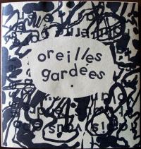
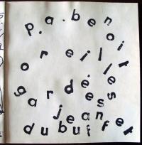
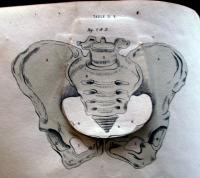
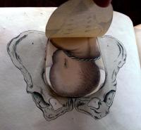
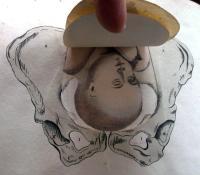
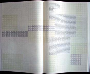
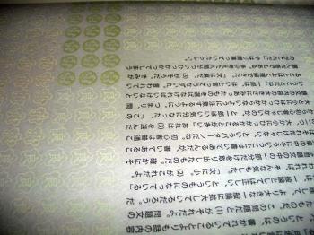
Jean Dubuffet (1901-1985) and Pierre André Benoit (1921-1993), Oreilles gardées [Alès: P.A. Benoit, 1962). One of 300 printed in black and white. Graphic Arts GAX 2010- in process.

The French poet and publisher Pierre-André Benoit (known as P.A.B., 1921-1993) lived and worked from Alès in the south of France. Artists either came to him or mailed their art to him (often simple sheets of celluloid scratched with a needle), to which he would add his own poetry and print limited editions for their friends.

Jean Dubuffet (1901-1985) and Benoit worked together on a number of projects, including Vache bleue dans une ville (with André Frénaud, 1944); Élégies (with Eugène Guillevic, 1946); Ler dla canpane (1948); La Lunette farcie: en l’honneur de P. A. Benoit (with François Delagénière, 1962); Oreilles gardées (1962); and Couinque (1963).

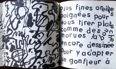
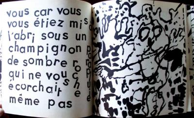
In the case of Oreilles gardées, Dubuffet was experimenting wildly with rubber stamps and lithographic plates (a transitional point at the beginning of his “hourloupe” period). Benoit was able to take Dubuffet’s originals and produce an equally wild, energetic, and self-consciously naïve book.

Deborah Wye, Museum of Modern Art, noted,

“It was not until he was forty-one, after a career in the wine business that Jean Dubuffet turned decisively to art and, during the next forty years he became a prolific painter, sculptor, printmaker, and experimental writer. With no systematic training, he railed against prevailing notions of good taste and official culture, preferring the spontaneous energy of graffiti and the art of children and the mentally ill. In postwar Paris, Dubuffet worked in a style called l’art brut, depicting fanciful figures in everyday activities that seem irrational, given his flattened perspectives, crude drawing, and unexpected juxtapositions.”
See: Les Livres réalisés par P.A. Benoit, no. 413

Negen Houtsneden by Jan Cockx

| 1 Comment

Jan Cockx (1891-1976), Negen Houtsneden [Nine Woodcuts] ([Antwerp : s.n., 1921]. Copy 57 of 100. Graphic Arts GAX 2010- in process

Following World War I, young artists throughout Europe were attempting to reinvent art and culture. In Antwerp, a small group of writers, poets, and social activists came together to publish a monthly journal called Ça ira, Revue mensuelle d’Art et de Critique. From April 1920 to January 1923, twenty issues were released with poems by Paul Colin, Theo van Doesburg, and Paul Éluard. Rough black and white woodcuts and linocuts filled the issues created by Floris Jespers, Paul Joostens, Frans Masereel, and Jan Cockx. Ça ira broke with its German and French colleagues in 1922 when Clément Pansaers published his “assassination of Dada” in a special number entitled ‘Dada, Its Birth, Life and Death.”

The Belgian artist and poet Jan Cockx (1891-1976) had his first exhibition in Paris at the age of twenty-nine, the same year he began publishing in Ça ira. In 1921, Cockx found the financial backing to publish a small portfolio of nine woodcuts with a striking color linocut on the wrapper. Graphic Arts’s copy is from the collection of Maurice van Essche, the editor of Ça ira.

An interesting note: the only other copy listed on OCLC is at the Library of Congress. Their edition note is quoted in French, our portfolio’s text is in Dutch. There must have been either two editions, or two distributors of this portfolio.

For more information, see Rik Sauwen, L’esprit Dada en Belgique (Leuven: Katholieke Universiteit, [1969]). Marquand Library (SA), PQ307.D3 S28 1969

Spratt's "Obstetric Tables"


George Spratt, Obstetric Tables: Comprising Graphic Illustrations, with Descriptions and Practical Remarks: Exhibiting on Dissected Plates Many Important Subjects in Midwifery (Philadelphia: James A. Bill, 1850). Lithographs. Gift of Joseph V. Meigs, Class of 1915. Graphic Arts GAX 2010. In process


In 1538, Vesalius created Tabulae Sex, attaching a second printed image on top of the first that could be lifted to show the inside and outside of the human body. Euclid’s Elements of Geometry in 1570 incorporated flaps to help the reader envision three dimensional objects (Ex Oversize 2654.331.570q). By the early nineteenth century, the British printmaker George Spratt (ca. 1784-1840) used the same overlay technique for an anatomy atlas entitled Obstetric Tables. Spratt’s volume, first published in London in 1833, includes fifty hand-colored, tipped on flaps, sometimes layered four or five to the same image.

Spratt was a member of the Royal College of Surgeons, a fellow of the Linnaean Society, a male midwife, and an active printmaker. His first major project was the botanical Flora Medica in 1829. Completed four years later, Obstetric Tables found a wide audience, with a second edition released in 1837, a third in 1841, and many more. An edition was first printed in Philadelphia in 1847. This is the 1850 James A. Bill edition, from the title page: “First American edition from the fourth and greatly improved London edition”.

A Pynson Woodblock Revived

| 1 Comment

1503 woodcut from Early English Books Online

1643 printing of same block

M. Web, The Malignants Conventicle (London: printed for Anti-Dam-mee, in Tell-troth Lane, at this signe of the Holly-wand, 1643). Graphic Arts GAX 2010. -in process

Edward Hodnett (Five Centuries of English Book Illustration) reminds us that “although Richard Pynson (died 1530) was the first printer in England to produce well-designed books, his output of fewer than 200 illustrated books was not one-half that of Wynkyn de Worde” (Caxton’s chief printer and successor). One of the 200 texts “shrewdly chosen” by Pynson to illustrate was Beuys of Southamtowne.

Pynson’s 1503 edition of Beuys (London: Emprynted by Rycharde Pynson in Fletestrete at the sygne of the George), which today can only be seen at the Bodleian Libraries, Oxford (shelflist Douce B subt. 234, fol.7) contains twelve woodcuts (Hodnett 1933-44). While we know it was common for printers to save the blocks and reuse them in other books, it is not so common to find them lasting 140 years, which is the case with one of the blocks from Pynson’s Beuys.

The block as described by Hodnett (English Woodcuts no.1937) shows a shepherd boy beating a man with his crook. A hat and stick on the pavement (upper l.). Wall and gate (r). A shepherd boy striking with his crook a courtier seated at a table. A man and woman behind the courtier. A lady at his right. A man seated on a bench. An overturned bucket on the table. Triangular black and white tile floor. Two windows. The two scenes are separated by a column and a zigzag partition.

In 1643, a satire called The Malignants Conventicle or a Learned Speech Spoken by M. Web … was published with Pynson’s woodcut on the title page. Web’s speech tells of a secret group plotting insurrection on the city of London. The plotters “drew up a most damnable abusive Booke amongst our selves, to scandalize the parliament … called the Cities Complaint to the House of Commons…” He continues, “This booke we got a foolish printer that did not know what he did, to print, for it was such a most wicked, invective Pamphlet, that … if he knew what it was, he would not have meddled with it.”

A great text made even better by the 140 year old woodblock used to print the title page. Thanks to Christopher Edwards for finding this woodcut and tracking its history.

See more: Edward Hodnett, Five Centuries of English Book Illustration (Aldershot [Hampshire] : Scolar Press, 1988). Graphic Arts GARF NC978.H55 1987Q
Edward Hodnett, English Woodcuts 1480-1533 (Oxford: Printed at the University Press, 1973). Graphic Arts GA NE1143 .xH6 1973

Metamorphosis cards

The Chinese Question Solved (New York: Donaldson Brothers, ca. 1882). Lithography. Graphic Arts GA2010- in process

This metamorphosis or transformation card is an advertisement for the Peerless Wringer washing machine, printed in the 1880s by the Donaldson Brothers based in the Five Points (lower Mulberry Street) in New York City. It features Dennis Kearney (1847-1907), an Irish immigrant who settled in San Francisco. The charismatic Kearney was the leader of the Workingmen’s Party of California, whose platform announced, “The Chinese laborer is a curse to our land, is degrading to our morals, is a menace to our lives, and should be restricted and forever abolished, and the Chinese must go.”

Their efforts resulted in the Chinese Exclusion Act, signed into law on May 8, 1882. Chinese immigration was suspended for ten years, including Chinese “skilled and unskilled laborers and Chinese employed in mining” already settled and working in the United States.

On the card, Kearney is seen enticing a Chinese laundry worker named Ah Sin (after Bret Harte’s poem “The Heathen Chinee”) to insert his queue (braid) into the modern washing machine. The text reads, “‘What makee dis?’ said bland Ah Sin. Said Dennis, ‘Put your pig-tail in.’” The lifted flap shows Ah Sin caught in the wringer and finishes the verse, “Ah Sin Obeys! Though rather slow! The Question’s solved, Chinese must go.”

Donaldson Brothers printing company was established by George, Frank, John, and Robert Donaldson in 1872. Their high-speed steam presses produced, among other things, trade and advertising cards with bright chromolithographed images in large quantities. The Donaldsons merged with the American Lithographic Company in 1891 to form one of the largest commercial printing company in New York.

Hancock. Hancock. Cock-a-doodle-doo (New York, privately printed, 1880). Lithography. Graphic Arts GA 2010- in process

This transformation book was produced for the 1880 presidential campaign of Republican James A. Garfield (1831-1881), running against the Democrat Winfield Scott Hancock (1824-1886). Garfield was a fervent abolitionist. This card not only predicts Hancock’s failure, depicting him as a cock that looses his feathers, but accuses him of racism in the verse on the back. In his campaign, Garfield used this slogan, “Hancock. Hancock. Cock-a-doodle-doo. Hancock. Hancock. Boo-Hoo-Hoo.”

It is curious to find the copyright owned by George H. Hanks, who, in the 1860s, was a Colonel of the 18th Infantry, Corps d’Afrique (a Union corps composed entirely of African-Americans) and later became Superintendent of Negro Labor. I have not found any record of Hanks’s role in Garfield’s campaign.

Victor Hugo

| 1 Comment


Gustave Brion (1824-1877), Illustrations to “Les Misérables,” of Victor Hugo. Scenes and Characters Photographed by A. A. Turner, after the Original Designs of G. Brion (New York: Carleton, 1863 [c1862]). Graphic Arts Collection (GAX) 2003-0617N

This is a volume of illustrations published without the novel they illustrate.

In 1840, the French painter and illustrator Gustave Brion (1824-1877) joined the studio of the portrait and history painter Gabriel-Christophe Guérin (1790-1846). He then earned his living mainly by teaching, drawing, and copying paintings. In the summer of 1850 Brion moved to Paris, where he took a studio in a house shared by Realist artists. He exhibited regularly but little of his work has been remembered by historians. Brion’s most notable project came in 1862, when he created portraits of the characters in Victor Hugo’s novel Les Misérables.

Brion’s paintings were photographed by the American artist Austin Augustus Turner (ca. 1831-1866) and the albumen prints were pasted onto printed mounts for this volume. Note the extreme warping as the photograph, the paste, and the paper all age at different rates.

The earliest information on Turner has him employed as an operator at the photography gallery of B.F. Campbell in Boston, Massachusetts. By 1854, he moved to New York City, where he worked at Mathew B. Brady’s photography gallery for a brief period. After stays in Paris, Boston, and Lynchburg, Virginia, Turner finally resettled in New York where he established a business in partnership with D. Appleton & Company specializing in photolithography. It is around this period that he received the commission to photograph Brion’s paintings of Les Misérables, published first by Pagnerre in Paris and two months later by Carleton in New York.

Flaubert did not care for Hugo’s novel but Baudelaire’s review for Le Boulevard was quite positive. To read it, see: http://www.biblisem.net/etudes/baudmise.htm. Since the first illustrated edition of Les Misérables in 1862 there have been many reprints. Several Paris editions, 1870 and 1879 in particular, used etchings of Brion’s painting for illustrations.

Seventh Ward Beggars

Henry R. Robinson (active 1833-1851), Seventh Ward Beggars, ca. 1836. Lithograph with hand coloring. Graphic Arts GA 2010- in process

This print shows Andrew Jackson (1767-1845), the seventh president of the United States, sitting on the government’s surplus funds, holding a bag of $100,000. Jackson had succeeded in destroying the Bank of the United States in 1832. He and his “kitchen” cabinet established a series of pet banks—state institutions used by the federal government as depositories for public funds. One such pet bank was the Seventh Ward Bank, seen in the back center, which was established in 1833.

Jackson had the power to distribute bank funds and in this print we see nine bankers begging for money, two are literally kissing his feet. Jackson tells them to first pay honest Rueben M. Whitney, a former director of the Bank of United States, now working for Jackson. In the back left stands a Courier Enquirer reporter who later opened an investigation into the bonus fund money used to pay off Whitney.

The beggars say, “Revered Chief at the head of the Government - We are all friends of the Administration - We solicit a portion of your fiscal patronage - The terms most favorable to Government - We gave no portion to the Brokers in Wall Street - Pray do, Pray do.”

In 1928, a portrait of Grover Cleveland was removed from the twenty dollar bill and replaced with a portrait of Andrew Jackson. According to the U.S. Treasury, “Treasury Department records do not reveal the reason that portraits of these particular statesmen were chosen in preference to those of other persons of equal importance and prominence.”

See also: John M. McFaul and Frank Otto Gatell, “The Outcast Insider: Reuben M. Whitney and the Bank War,” The Pennsylvania Magazine of History and Biography 91, no. 2 (April 1967): 115-44.

Title in Japanese: Kokugo nyüshi mondai hisshöhö
or in German: Sichere Anleitung zum Bestehen jeder Universitäts-aufnahmeprüfung im Fach Japanish
or in English: A Safe Method to Pass University Entrance Exams in the Subject of Japanese
An artists’ book by Veronika Schäpers, story by Shimizu Yoshinori (Tokyo: [Schäpers], 2003). GAX 2010 -in process. Copy 28 of 40.

The black letterpress text is printed by zinc-clichees in German and Japanese. Japanese rubber stamps for school marks are printed by hand various colors on Mitsumata paper. The book has a Japanese binding with twisted paper cord and cover made of Kozo Ganpi cardboard. Its padded case is made of cotton fabrics in the shape of a Japanese Omamori-charm, with the Japanese title embroidered in ivory.

In his short story, Shimizu Yoshinori (born 1947) describes the Japanese system of entrance examinations. This procedure (also known as the “examination hell”) is not only applied to universities but, depending to the status and type of school, also to high schools, elementary schools, and even Kindergartens. To prepare there are many cram schools, each specializing in a particular exam since every school is different. The public interest is so great that newspapers publish parts of the examinations and reports are broadcast on television.

Veronika Schäpers (born 1969) writes that she

“read Shimizu Yoshinori’s text for the first time when I was preparing for a Japanese proficiency test for foreigners which is held once a year by the Japanese Ministry of Education. Talking about this to Japanese friends, I recognized that almost everyone had experienced the ‘examination hell’ and understands the situation of the protagonist Asaka Ichiro very well. In the book I printed the Japanese original as well as the translation into German by Katja Cassing. As the German and Japanese way of reading differ (German: left - right, Japanese: right - left) the book has two beginnings: the German text starts in ‘front’, the Japanese in the ‘back’. Both of them meet in the middle with the imprint.”

“In addition to this each page of the German translation refers in color and content to its Japanese counterpart. The fonts I’ve used are Transit and Kozuka Gothic, both sans-serif fonts that are plain but not stiff. The continuous text is interrupted by examples of examination questions in a bold font. The text was printed by zinc-clichés in letterpress printing.”
“Each double-spread page is under-layed with a pattern of stamps that in Japan are usually used to mark student homework. These marks range from ‘Done very well’ to ‘Normal’ up to ‘Try harder’. I’ve reduced the original stamps so much that on the very first glimpse they give the impression of a wallpaper-like pattern and even the Japanese reader has to watch carefully to recognize the well-known stamps.”
“Because of the thin Mitsumata paper the marks shine through the pages. Every single page is stamped by hand. To get the colors I had in mind, I mixed them from lithograph printing ink. The book is stitched with a Japanese binding and as a cord I used a twisted paper strip. The cover consists of Kozo cardboard with a thin layer of Ganpi paper giving a fine shine. I printed a pattern of one single stamp in the original size on it saying: ‘You have to try harder’. This stamp is the worst mark you can get in Japan and stands in contrast to the one I’ve used at the end of the text for the imprint (good).”

Schäpers was born in Gescher (Westphalia) Germany and moved to Japan in 1998, where she has been working ever since. There is a good video of Schäpers speaking about this and her other artists’ books at: http://www.nypl.org/audiovideo/veronika-sch%C3%A4pers-book-artist

"Un Eldorado aux enfers," A Hold-To-Light Photograph

| 1 Comment

“Un Eldorado aux enfers,” number 22 from a set of Stereo-Diableries (Paris, 1870s?). Graphic Arts GA 2005.01266. See more at: http://www.visual-media.eu/diableries.html

Engraved scenes that could be viewed through a set of lenses were a popular phenomenon in eighteenth century. The prints or vues d’optique were designed with an enhanced perspective so that, when viewed with a zograscope or in peep show boxes, the scene appeared to be three-dimensional. To further enhance the views, lights, stars, candles, or other bright parts of the image were pricked with a needle so that when the print was lit from the back, the picture turned into a nighttime scene. Colors were also painted on the back of the print, which were only visible with back lighting.

Once photography was invented, pricked or back-lit views continued to be made using photographs. Carlo Ponti (1823-1893), in particular, developed the megalethoscope for viewing pricked photographs with both front and back lighting so that the image appeared to shift from day to night. Stereoscopic views were invented by Charles Wheatstone (1802-1875) in 1840 but were not mass produced until the 1860s. The fanciest stereos, such as these, were pricked and had a second layer of tissue with added color. These elements were only visible when the stereo holder was pointed at the window or a candle. It is interesting here to look at the cards both with and without back lighting.

Graphic Arts also holds a complete set of La Biche au bois (The Doe in the Forest). Twelve stereoscopic views (Paris: Actualites de Theatre, after 1865). Graphic Arts 2005.01264-2005.01276

These “hold-to-light” stereoscopic photographs show scenes from the light opera: La biche au bois (5 acts, by the Cogniard Brothers), in Porte Saint-Martin, 1865. Katherine Singer Kovács commented on a performance of La Biche au bois in an article about the early filmmaker Georges Méliès:

An extremely successful feerie called La Biche au Bois contributed to this trend. In this work by the Cogniard brothers grotesque and comic forms were introduced on a large scale. Prior to this time (1845) characters in feeries had confined their travels to allegorical or mythological lands, in the heavens or beneath the seas. This all changed with La Biche. In addition to investigating these conventional locales, characters in La Biche au Bois explore new domains, such as the kingdom of bells, the kingdom of fish, and the kingdom of vegetables where they talk with fruits and vegetables of colossal dimensions. Each of these tableaux contains a grotesque ballet in which men dress as animals and the intention is comic.

Katherine Singer Kovács, “Georges Méliès and the ‘Féerie’,” Cinema Journal, 16, no. 1 (Autumn, 1976): 1-13.

See also: Jac Remise, Diableries: la vie quotidienne chez Satan à la fin du 19e siècle (Paris: Balland, 1978). Interlibrary loan for now.

Black Panthers

Thanks to the Chair of Princeton University’s Center for African American Studies, Eddie Glaude, Jr., we have been able to acquire this wonderful 1968 poster: Bobby. Huey. Political Prisoners of USA Fascism (San Francisco: Ministry of Information Black Panther Party, 1968). Poster 27 1/2 x 23 1/4 inches. Graphic Arts GA 2010. in process

Launched in the fall of 2006, the Center for African American Studies (CAAS) expands upon the initiatives begun by the Program in African American Studies at Princeton University. Since its founding in 1969, the program has offered an interdisciplinary certificate that has allowed students to draw on the insights and techniques of various disciplines in an effort to understand the experiences, history and culture of African-descended people. The new center will build upon that earlier vision and extend its reach broadly across the campus and throughout the curriculum. http://www.princeton.edu/africanamericanstudies/

Power to the People (California, ca. 1970). Red felt banner, 30 x 12 inches. Graphic Arts GA 2010 -in process.

In 1966, Robert George “Bobby” Seale (born 1936) and Huey Percy Newton (1942-1989) founded the Black Panther Party for Self Defense in Oakland, California.

The BPP differed from other groups with its message of “revolutionary intercommunalism” - essentially a socialist way of approaching issues within a community, where all shared in the responsibility of building the community. They also developed survival programs, where social institutions were developed within the community itself to benefit the community without seeking relief from outside organizations or agencies. The Ten-Point Program formed the foundation of ideology for the Black Panther Party; it became the list of demands of the party and the goals of the struggle to regain their Black communities.
Quoted from: http://www.pbs.org/hueypnewton/people/people_seale.html

For more information, see: San Francisco State: on strike / a film from California Newsreel (San Francisco, CA: California Newsreel, [1998]) Humanities Resource Center (VIDL): Video Coll. East Pyne VCASS 439

Not directly related but also of interest, this conference is coming up soon: http://www.librarycompany.org/africanamericanprint/
Early African American Print Culture in Theory and Practice
Philadelphia, March 18-20, 2010

Su Friedrich Talks about The Heretics

Heresies (New York, NY: Heresies Collective, 1977-1993), Firestone Library (F), HQ1101 .H4

At 7:30 p.m. on Friday, March 12 there will be a screening of The Heretics in the Solley Theater at the Paul Robeson Center for the Arts, 102 Witherspoon St., Princeton, New Jersey. https://web47.mysecureserver.com/artscouncilofprincetonorg/default.asp?p=CAL#heretics

The Heretics, a feature film by Joan Braderman, documents the 1970’s Heresies Collective and their magazine Heresies. The Collective is presented as a microcosm of the larger international women’s movement, in which thousands of small, private groups of women met together in forms unique to their own settings, to consider their situation—as women in a man’s world—and to devise strategies for unlocking the potential in women’s lives.

Princeton professor Su Friedrich, an original member of the collective, will speak after the screening. More about Su Friedrich: http://helios.hampshire.edu/nomorenicegirls/heretics/#friedrich http://helios.hampshire.edu/nomorenicegirls/heretics/photo/friedrich1.html

The Shinplasters of 1837

Treasury Note, [1837]. Lithograph. Designed by Napoleon Sarony (1821-1896) and published by H.R. Robinson, New York. Graphic Arts GC2010- in process

This is a parody of the “shinplasters” or worthless paper money issued by banks leading up to the U.S. Panic of 1837.

Although President Andrew Jackson (1767-1845) had been able to pay off the national debt in 1835, the surplus cash was distributed by state governments only in paper notes. Before leaving office, Jackson issued the Specie (coin) Circular, declaring that the Treasury would not accept these paper notes. By 1837, the new president, Martin Van Buren (1782-1862), was faced with a national panic.

Sarony’s original satirical “Treasury Note” had a central panel framed by panels on either side. In the center is a winged chimera with the head of Van Buren riding a wagon, labeled Treasury Department, driven by John Calhoun (1782-1850). They are pulled by men rather than horses and roll over the bodies of others as they rush to Wall Street.

On the left is an image of Jackson dressed as a woman saying “More glory.” Princeton’s copy is missing the section on the right, possibly removed through censorship because of the graphic nature of the design. It shows an ass with Jackson’s face excreting “mint drops” collected by a monkey with the head of Van Buren.

The text of the treasury note states:

“We promise to Pay out of the joint Fund of the United States Treasury Seven Years after it is convenient the Sum of Seventy Five cents Payable at their Office.”

Read more: Harry Twyford Peters (1881-1948), America on Stone: the Other Printmakers to the American People (Garden City, N. Y.: Doubleday, Doran, 1931), p.338. Graphic Arts: Reference Collection (GARF), Oversize NE2303 .P4q

Auguste Roubille, 1872-1955

| 1 Comment

Auguste Roubille (1872-1955), Abdul Hamid II, ca. 1900. Lithograph. GC103 French Political Caricatures Collection. Abdul Hamid II, Le sultan rouge = His Imperial Majesty, Sultan Abdülhamid II, Emperor of the Ottomans, Caliph of the Faithful (1842-1918) was the 34th sultan of the Ottoman Empire, ruling from 1876 to 1909.

There is little information in the art history books about Auguste Jean-Baptiste Roubille (1872-1955). He was an engraver and a painter (he did café murals), a book illustrator, and a designer of posters and dioramas. Thanks to Stanley Appelbaum’s French Satirical Drawings from ‘L’Assiette Au Beurre’ for this little bit of biography. Beginning in 1897, Roubille worked for many of the Paris humor magazines, such as Le Courrier Français, Le Rire, Le Sourire, Le Cri de Paris, Cocorico, and others. L’Assiette claimed his services for its very first issue in April 4, 1901 and frequently in the years that followed.

Around 1900, he completed a series of 13 lithographic posters for the writer/publisher Antonin Reschal at Librairie Parisienne Arnaud et Cie. They titled the set Le musée de sires, feuille de Caricatures Politiques (Museum of Lords or Rulers, sheets of political caricatures). My colleague Eduardo Tenenbaum offers a reading of the pun they make with the series title Gueulerie contempoiriane (after the series Galerie contemporaine): “gueule” (f.) in French is the muzzle or face of an animal, but in slang it means a person’s face or mouth, and is often used derogatorily. When used as a verb, “gueuler” can mean “to yell” or “to scream.” The phrase “gueulerie contemporaine” suggests to me humans braying like a bunch of animals, or in this case, politicians.

The rulers in this museum are surprisingly international in scope. Here are a few more:

Auguste Roubille (1872-1955), Shah de Perse, ca. 1900. Lithograph. GC103 French Political Caricatures Collection. Shah de Perse, Mozaffer Ed-Dine = Mozaffar ad-Din Shah Qajar (1853-1907) was the fifth Qajarid Shah of Persia, ruling from 1896 to 1907.

Auguste Roubille (1872-1955), Cleopold II, ca. 1900. Lithograph. GC103 French Political Caricatures Collection. Cléopold II. Roi des Belges = Leopold II (1835-1909) was King of Belgium, ruling from 1865 to 1909.


Auguste Roubille (1872-1955), Sir Paul Kruger, ca. 1900. Lithograph. GC103 French Political Caricatures Collection. Sir Paul Kruger = Paul Kruger (1825-1904) was President of the Transvaal Republic (South Africa), ruling from 1883 to 1900.

Auguste Roubille (1872-1955), The Gracious Queen, ca. 1900. Lithograph. GC103 French Political Caricatures Collection. “The Gracious Queen” = Queen Victoria (1819-1901), the longest-ruling monarch of the United Kingdom of Great Britain and Ireland, ruling from 1837 to 1901.

Recent Comments

  • Howard Coblentz: I have a round seal shaped like a pear a read more
  • John Overholt: Wikipedia's entry for Sir Francis says: "Throughout Baring's lifetime his read more
  • Serge Rodrigue: It is a precious thing you have a book from read more
  • Colin Wicks: I have a copy of “A Round Game.” And it read more
  • Laurence Hilonowitz: I was a Customer, Friend of Bob Wilson. I Live read more
  • allen scheuch: Absolutely STUNNING! Those colors, those designs made my day! Thanks, read more
  • Olivier: Hello Diane, If you are still looking for an examplare read more
  • Stella Jackson-Smith: I have a framed picture by A.Brouet, signed with the read more
  • John Podeschi: I remember Dale fondly from my days at Yale (1971-1980). read more
  • Joyce Barth: I have some or all of this same poem. I read more