July 2010 Archives

Frith's Holy Bible

firth holy.jpg

Frith's Holy Bibl

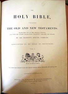
The Holy Bible … Illustrated with Photographs by [Francis] Frith. Glasgow: Printed and published by William Mackenzie, 1862-1863. Albumen silver print. Graphic Arts Collection. Purchased in 2002 with assistance from the Friends of the Princeton University Library in honor of Peter Curtis Bunnell upon the occasion of his retirement as the David Hunter McAlpin Professor of the History of Photography and Modern Art and Faculty Curator for Photography at the Princeton University Art Museum.

Frith's Holy Bible

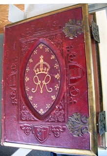
This is the deluxe (one of three editions) illustrated Holy Bible published by William Mackenzie with fifty-six photographs taken by the British artist and publisher Francis Frith (1822-1898). Our copy is specially bound in red morocco with gilt and blind stamped decorations, and brass mounts and clasps.

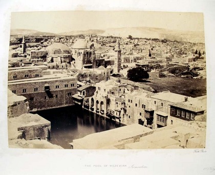
A devout Quaker and a successful grocer, Frith sold his business in 1855 to devote himself to photography. Between 1856 and 1860, he traveled extensively in Egypt, Sinai, Ethiopia, and Jerusalem, documenting Middle Eastern architecture and culture. For these Bibles, the titles of the photographs were changed slightly to better associate them with a particular chapter and verse of the King James text. Because this lavish publication was dedicated to Queen Victoria, who was an amateur photographer and enthusiast, it has become known as the Queen’s Bible.

Frith's Holy Bible

Frith's Holy Bible

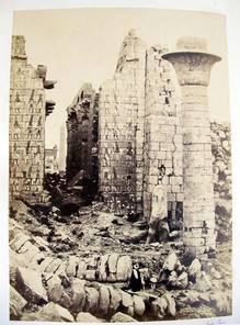
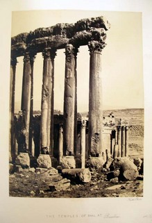
Frith’s photographic work is important in both technique and methodology. In the first instance, he used the new wet collodion process that had replaced the paper-based calotype used by earlier travel photographers. The wet plate negatives rendered rich detail and broad tones, and the resulting contact prints on albumen paper rival even today’s gelatin silver papers. Frith’s method was meticulous and thorough; he photographed most of the major monuments several times, and combined general views with close studies of their significant details.

The acquisition of the Queen’s Bible makes Princeton’s collection of Frith’s photographically-illustrated books one of the most outstanding and complete in the United States. It joins Frith’s works: Egypt, Sinai and Jerusalem; Egypt and Palestine; Cairo, Sinai, Jerusalem, and the Pyramids of Egypt; and Upper Egypt and Ethiopia, held by Graphic Arts and his Lower Egypt, Thebes, and the Pyramids, held by the University Art Museum.

The Adventures of Peregrine Pickle

| 1 Comment

pickle8.jpg

Scottish author Tobias Smollett (1721-1771) first published The Adventures of Peregrine Pickle in 1751. The popular story of Hawser Trunnion, a retired naval officer, went through three editions until one was published with illustrations.

Peregrine Pickle

Peregrine Pickle


Swiss artist Henry Fuseli (1741-1825) created a frontispiece for the fourth edition in 1768 and many other illustrated editions followed designed by Thomas Stothard (1755-1834), Robert Dodd, (1748-1815), and Richard Corbould (1757-1831) among others. In 1805, Thomas Rowlandson (1756-1827) took on the project and add two color plates to Smollett’s story. Graphic Arts (GA) Rowlandson 1805

Peregrine Pickle

peregrine pickle

peregrine pickle

Peregrine Pickle

The Graphic Arts collection also holds the rare volume Rowlandson’s Humorous Illustrations of the Works of Fielding and Smollett, consisting of forty etchings by Rowlandson, [George Moutard] Woodward, &c. (GA) Rowlandson 1808.8. Among these forty prints are six designed by various artists for editions of the Peregrine Pickle. Rowlandson’s are seen above on the right.

Louis Prang, 1824-1909

Between 1864 and 1876, the American printmaker Louis Prang (born in Poland, 1824-1909) issued a series of collectable albums, offering examples of his company’s brilliant chromolithographs, or Prang’s Chromos, as they were called. The cards were issued in sets of twelve, presented together on double page spreads as seen here. This album contains twelve scenes each of the Hudson River, Central Park, birds, ferns and mosses, leaves, roses, butterflies, fruit blossoms, wild flowers, and pansies.

Chiaroscuro watermark

This sheet of handmade paper comes from the Fabriano Paper Mill in Milan. In regular light, it looks like a blank sheet but when you hold it to the light, the watermark becomes visible. The image, which is a reproduction of Gentile da Fabriano’s “Coronation of the Virgin,” comes from the variations in thinness or thickness in the paper.

The watermark begins with the Italian artisan Annarita Librari carving the engraving in wax; a process that may take from five months to a year to complete. Copper dies (positive & negative) are made from the wax sculpture. The dies are pressed into a brass screen, which will form the papermaking mould. Then, tiny wads of screen must be stuffed and stitched invisibly into the mould as reinforcements in all the cavities, such as the forehead or cheeks.

We are fortunate to have acquired two examples of Ms. Librari’s work, one of which is seen here. To see Gentile da Fabriano’s original tempera and gold leaf panel, see: http://www.getty.edu/art/gettyguide/artObjectDetails?artobj=736

Light-and-shade watermark depicting the “Coronation of the Virgin” by the Renaissance painter Gentile da Fabriano (Milan, Fabriano Paper Mill, 2006). Graphic Arts GAX 2010- in process.

Wiener Werkstätte linocuts

The Wiener Werkstätte or Vienna workshops were founded in 1903 with the backing of Fritz Wärndorfer to “make all facets of human life into one unified work of art.” Architects, artists, designers, metalworker, typographers, and many other artisans joined. Their motto: Better to work ten days on one product than to manufacture ten products in one day.


The primarily female textile and fashion division was not formed until 1910. From 1914 to 1915, this division published a series of twelve portfolios, each with twelve original linocuts of fashions designed by their members. Here are a few examples from portfolio number five.

Mode (Wien, 1914-1915). Graphic Arts GAX Oversize 2007-0318Q

Paper Manufacturing in France

If you can’t get to Rare Book School this summer to attend “H-60. History of European and American Papermaking” taught by experts Timothy Barrett and John Bidwell, you might want to peruse the issues of Le Papier. This beautifully designed journal, recently acquired by graphic arts, covers the history, manufacturing, and distribution of paper in France.

Modern paper production began in 1799, when Nicolas Louis Robert (1761-1828) patented a machine to produce a continuous roll of paper rather than form it one sheet at a time. (Note Le Papier still uses a hand paper mould on its cover). Although the modern production methods spread quickly to other countries, France continued to be a center of the paper industry. Le Papier offers articles and advertisements documenting the specific companies selling the equipment, producing the raw materials, and distributing the final product throughout Europe.

Le Papier: revue technique des industries du papier et du livre. Paris, 1898-19??. Graphic Arts GAX 2010- in process

For more on the history of papermaking, see Dard Hunter, Papermaking: The History and Technique of an Ancient Craft (New York: Alfred A. Knopf, 1943). Graphic Arts GAX TS1090 .H816 1943

Die Olympischen Spiele 1936

Ludwig Haymann, Die Olympischen Spiele 1936 (The Olympic Games 1936). With 100 stereographs by Heinrich Hoffmann (Dießen/Ammersee: Raumbild-Verlag Otto Schönstein 1936). Graphic Arts GAX 2010- in process

The German artist Heinrich Hoffmann (1885-1957) was the friend and official photographer for Adolf Hitler (1889-1945). He wrote and illustrated a number of books about Hitler, as well as creating propaganda images for the Hitler government.

Hoffmann was assigned to document the 1936 summer Olympics in Berlin, at which American athlete Jesse Owens (1913-1980) won four gold medals. This volume presents 100 gelatin silver stereographic photographs of the games pasted to leaves and housed in slots along the back cover. A stereo viewer is inserted at the front.

Readers can view three-dimensional images of the opening ceremonies, the architecture of the Olympic Stadium and Village, Adolf Hitler, marching Hitler Youth, competing athletes, Leni Riefenstahl, and many other recognizable figures at the Olympic Games.

Le Theatre Alfred Jarry de l'Hostilite Publique

| 1 Comment

In 1925, the French playwright Roger Vitrac (1899-1952) and artist/director Antonin Artaud (1896-1948) were expelled from the surrealists by André Breton (1896-1966). Together, they conceived and established the Théatre Alfred-Jarry, named in honor of Alfred Jarry (1873-1907) author of Ubu trilogy and inventor of pataphysics. The theater presented radically innovative productions over four seasons, from 1926 to 1929.


Le Theatre Alfred Jarry et l’Hostilite Publique (Paris: Antonin Artaud and Roger Vitrac, 1930). Photomontages by Eli Lotar. Illustrated wrappers by G.L. Roux. Graphic Arts GAX 2010-in process

This small volume offers an overview of the coming season (which was never realized). To illustrate the pamphlet, they hired Romanian photographer Eli Lotar (born Eliazar Lotar Teodoresco, 1905-1969) who prepared nine photomontages, superimposing multiple posed images of the actress Josette Lusson, Vitrac, and Artaud. These are not scenes from a particular play but images directed by Artaud from his imagination.

Susan Sontag wrote a biography of Artaud, noting that his

"work denies that there is any difference between art and thought, between poetry and truth. Despite the breaks in exposition and the varying of "forms" within each work, everything he wrote advances a line of argument. Artaud is always didactic… Artaud is someone who has made a spiritual trip for us—a shaman. It would be presumptuous to reduce the geography of Artaud’s trip to what can be colonized. Its authority lies in the parts that yield nothing for the reader except intense discomfort of the imagination."

Grabhorn Press ephemera

This new years card turned up in our collection of fine printing and ephemera from Grabhorn Press. Note the text: Hurry up now with my Printing. To helle with his, Gimme mine. Heere’s to another yeere of this sort of thinge.

The Grabhorns—Edwin, Robert, Jane, and Mary—moved from Indianapolis to San Francisco in 1919 where they renamed their printing shop “Grabhorn Press”. They produced a wide variety of materials, including limited edition books, pamphlets, cards, and any other type of letterpress printing their customers ordered. The most famous project may have been a handset edition of Walt Whitman’s Leaves of Grass, published by Random House in 1930 (Graphic Arts GAX Oversize 2007-0343Q). Grabhorn Press officially closed in 1965.

Fine Press Printing Ephemera Collection, 1898-2010 (bulk 1924-1948): Finding Aid GC186, Box 2. From the Grabhorn Press collection of Myles Standish Slocum, class of 1909, presented by Isabel Shaw Slocum.

A Peep at the Creed-Worshippers

| 1 Comment

Bruce Dorsey writes

“At the end of the 1820s, American Quakers suffered a bitter and long-term division known as the Hicksite schism. Following a … Yearly Meeting in April 1827, a group of Quaker reformers separated themselves from the main body of Friends, and formed their own independent meeting. The schism in the Philadelphia meeting spread rapidly outward in concentric circles disrupting other Quaker meetings throughout North America. By the end of the decade, Philadelphia Quakers had divided into two distinct and hostile factions.” (“Friends Becoming Enemies: Philadelphia Benevolence and the Neglected Era of American Quaker History,” Journal of the Early Republic, 18, no. 3 (Autumn 1998)).

The reformers or Hicksite Quakers thought Orthodox publications linking the Friends with traditional Protestant doctrines were attempts to impose a creed on Quakerism, “an engine of oppression and restraint against the freedom of mind….” They responded with their own publications, of which this is one. Published anonymously, the “hole in the wall” refers to James Parnell, a Quaker martyr, who was jailed and forced to sleep in a hole far up on the cell wall. One day, while climbing up he fell and died.

The leader of the reform movement and their namesake was Elias Hicks (1748-1830). Hicks preached obedience to the light within, a phrase used in Hole in the Wall, leading some to believe the anonymous author was Hicks. The book is surprisingly illustrated with three copper plate engravings, rather than the customary wood engravings. Hicks’s cousin painter Edward Hicks (1780-1849) was also a member of the Hicksite Quakers and may have helped Elias with the creation of these naïve works.

Hole in the Wall: or a Peep at the Creed-Worshippers. Embellished with cuts by the author. [S.l.: s.n.], 1828. Graphic Arts GAX 2010- in process. Gift of David B. Long, in honor of Gillett G. Griffin.

Comte de Boulet's drawings for Chateaubriand's Atala

Here are a few drawings illustrating Chateaubriand’s Atala from a portfolio donated by Princeton University Professor Emeritus and Chateaubriand scholar Gilbert Chinard. For the complete story of how he acquired them from the Librairie Philosophique J. Vrin at 6, Place de la Sorbonne in Paris, see the Princeton University Library Chronicle XXVI, no. 3 (Spring 1965) http://libweb5.princeton.edu/visual_materials/pulc/pulc_v_26_n_3.pdf.

Mr. Vrin told Chinard that the drawings were by an amateur artist from Dijon known as Comte de Boulet, presumably executed around 1810-20 for an illustrated edition of Atala, ou les Amours de deux sauvages dans le désert written by François-Auguste-René, vicomte de Chateaubriand (1768-1848). The edition was never published and Princeton’s two blue buckram portfolios housing thirty-two drawings appears to be the only remaining evidence of the project.

When Atala was published in 1801 it was an immediate success. Inspired by Chateaubriand’s trip to the American South ten years earlier, the story is told through the reminiscences of Chactas, an elderly native of the Louisiana territory raised with a Seminole Indian tribe. Chactas loves Atala, who is a dedicated Christian, and the novella contrasts their two backgrounds and religious philosophies. Chateaubriand describes the book as a “painting of two lovers who walk and talk in solitude; all lies in the picture of the turmoil and love in the midst of the calm of the wilderness.”

Boulet’s drawings have been exhibited at least once, in the 1976 exhibition at the Grand Palais organized by Hugh Honour under the title L’Amérique vue par l’Europe. Firestone Annex A N6754 .H762

To listen to a French reading of the story, see: http://www.litteratureaudio.com/livre-audio-gratuit-mp3/chateaubriand-francois-renede-atala.html.

Theophile de Boulet, Chateaubriand’s Atala, ca. 1810. Pencil, crayon, and ink drawings with gouache highlights. Graphic Arts GC100.

Asamblea de Artistas Revolucionarios de Oaxaca

| 1 Comment

The Asamblea de Artistas Revolucionarios de Oaxaca (Assembly of Revolutionary Artists of Oaxaca or ASARO) grew out of the 2006 Oaxaca teachers’ strike and the violence that followed. ASARO formed as a collective, no individual artist’s names are used, working in a variety of mediums to commemorate public actions and critique political responses. For instance, the print above documents the army’s use of helicopters to drop chemicals on peaceful protesters. Graphic Arts has acquired forty-nine woodcuts, stencils, and poster by ASARO, many as large as 100 x 70 cm.

http://asar-oaxaca.blogspot.com/

http://www.artslant.com/chi/articles/show/16050

A bilingual interview with ASARO was published by the Houston (Texas) Independent Media Center in 2008.

Here are a few segments: Retomamos la forma de asamblea, porque creemos en la posibilidad de recuperación de la fuerza comunitaria en el arte, y porque la asamblea es al forma en que los pueblos dialogan y toman decisiones basadas en los intereses colectivos. De esta manera, respondemos también ante el llamado de la APPO, conformar un frente amplio de resistencia civil. (We have retaken the form of the assembly because we believe in the possibility to recover the power of the collective in art and because the assembly is the form in which the pueblos have a dialogue and hold decisions based on collective interests. In this way, we respond as well before the call of the APPO to create an ample front of civil resistance.)

Proponemos, iniciar un movimiento artístico, donde el fin sea el contacto directo con la gente, en las calles y espacios públicos. (We seek to initiate an artistic movement where the final goal is direct contact with people in the streets and in public spaces.)

Creemos que el arte publico (diversas disciplinas artísticas) es una forma de comunicación que permiten el dialogo con todos los sectores de la sociedad y hacen posible la visualización de las condiciones reales de existencia, las normas y contradicciones de la sociedad que habitamos. (We believe that public art (in all its diverse artistic disciplines) is a form of communication that allows a dialogue with all sectors of society and which makes possible the visualization of the real conditions of existence—the norms and contradictions of the society which we all inhabit.)

For the full interview, see http://houston.indymedia.org/news/2008/06/64061.php

See also: Louis E.V. Nevaer. Protest Graffiti-Mexico: Oaxaca (New York, NY: Mark Batty, 2009.) RECAP: Marquand Library GT3913.16.O29 N48 2009

Reference book with added decoration

These are pages from a reprint of the Roman part of the History and Biography section of the Encyclopaedia Metropolitana, published in Glasgow 1853. A dry book? This copy has been carefully decorated by a reader in the early twentieth century with original borders and illustrations on more than fifty of its pages.

Encyclopaedia Metropolitana or System of Universal Knowledge... (Glasgow: Richard Griffin and Co., 1853). Graphic Arts GAX 2010 -in process.

U. S. Navy photographs. The end of World War II.

| 1 Comment

Here are two photographs published by the U.S. Navy photography unit, headed by Edward Steichen, to document the end of World War II.

Top. Allied prisoners of war cheering their rescuers, as the U.S. Navy arrives at the Aomori prison camp, near Yokohama, Japan, on 29 August 1945. They are waving the flags of the United States, Great Britain and The Netherlands. Gelatin silver print. Graphic Arts GA 2010.02142. Gift of Moses Bigelow.

Princeton owns a print of this Official U.S. Navy photograph. The original negative is now in the collections of the National Archives.Photo #: 80-G-490444. Department of the Navy, Naval History Center. 901 M Street SE, Washington Navy Yard, Washington D.C. 20374-5060. For more, see http://www.history.navy.mil/branches/org11-2.htm

Bottom. Japanese Prisoners of War on Guam stand with heads bowed after listening to Emperor Hirohito announce Japan’s acceptance of Allied surrender terms, 15 August 1945. Gelatin silver print. Graphic Arts GA 2010.02141. Gift of Moses Bigelow.

Princeton owns a print of this Official U.S. Navy photograph. The original negative is now in the collections of the National Archives.Photo #: 80-G-490320. Department of the Navy, Naval History Center. 901 M Street SE, Washington Navy Yard, Washington D.C. 20374-5060.

The Song of the Barbecue for the 4th of July, not by Walt Whitman

H.L. Stephens is said to have had the idea for an American humor magazine while drinking at Pfaffs, a saloon where Walt Whitman and other writers spent their evenings in 1859. Once Vanity Fair was launched, frequent references to Whitman appeared in their pages, along with parodies of his writing. The Song of the Barbecue was printed in the September 29, 1860 issue, referring to a gathering for Stephen A. Douglas held at Jones Wood on September 12.

I sing not of the cue of Phelan,
I sing not of the actor’s cue,
I sing not of the Roman Q,
I sing not of the cu-rious,
I sing of the Barbe-cue.

I sing to thee of fools,
I sing to thee of apes,
I sing to thee of idiots,
I sing to thee of knaves—
Managers of the barbecue.

Meat was stale, order not kept;
Roughs were bosses, chiefs and all,
And the only calves and pigs,
Also sheep who were to be there,
Were low-legged, in shoes and shirts.

For more on Whitman, see Princeton Professor C.K.Williams’ new book On Whitman reviewed in today’s NYTs:

http://www.nytimes.com/2010/07/04/books
/review/Vendler-t.html?ref=books

For issues of Vanity Fair, see Graphic Arts GAX Oversize Hamilton 1219q

Hand-painted books by Robaudi and Grivaz

The French painter and illustrator Alcide Theophile Robaudi (1850-1928) first studied with sculptor Gustav Bonardel (1837-1896) and landscape painter Flix Malard in Nice before being accepted into the prestigious École des Beaux-Arts in Paris. There he worked under Jean Leon Gerome (1824-1904) and his later work still shows the influence of Gerome’s academic style. Robaudi became a sought after illustrator, designing plates for such authors as Dumas, George Sands, Balzac, Munger, and Verlaine.

Princeton University was recently given a unique copy of La cité des eaux by the French symbolist poet Henri de Régnier (1864-1936). The volume is completely hand- painted by Robaudi, including the text, in watercolor with gouache highlights. It was created and sumptuously bound for Louis Bougier in 1912, ten years after Régnier’s book of poems was released.

Our anonymous donor also presented us with Edmond Rostand’s Les romanesques (Paris, 1904). Unlike the Robaudi volume, this book is one of ten copies privately published by the painter Eugène Grivaz (1852-1915). Graphic Arts now owns copy no. 3. Each deluxe volume was hand-painted in watercolors and bound in an elegant, decorative binding.

Is Your Dance Card Full?

Here are a few examples of nineteenth- and early twentieth-century dance cards from our ephemera collection.

Recent Comments

  • Howard Coblentz: I have a round seal shaped like a pear a read more
  • John Overholt: Wikipedia's entry for Sir Francis says: "Throughout Baring's lifetime his read more
  • Serge Rodrigue: It is a precious thing you have a book from read more
  • Colin Wicks: I have a copy of “A Round Game.” And it read more
  • Laurence Hilonowitz: I was a Customer, Friend of Bob Wilson. I Live read more
  • allen scheuch: Absolutely STUNNING! Those colors, those designs made my day! Thanks, read more
  • Olivier: Hello Diane, If you are still looking for an examplare read more
  • Stella Jackson-Smith: I have a framed picture by A.Brouet, signed with the read more
  • John Podeschi: I remember Dale fondly from my days at Yale (1971-1980). read more
  • Joyce Barth: I have some or all of this same poem. I read more