June 2011 Archives

The Death of General Mercer at the Battle of Princeton

| 1 Comment
trumbull seven.jpg

Dublin born, Harvard educated John Trumbull (1756-1843) had only one good eye but he didn’t let that stop him from pursuing a career as a painter. At the age of twenty-four, he moved to London to study with Benjamin West (1738-1820), painting alongside another of West’s students, Gilbert Stuart (1755-1828).

Under West’s influence, Trumbull completed The Death of General Montgomery, The Death of General Wolfe, The Death of General Mercer, The Death of General Warren, The Surrender of Lord Cornwallis, and Surrender of General Burgoyne.

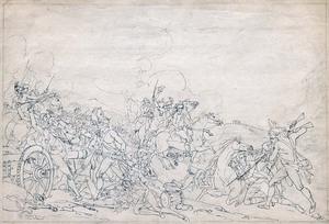
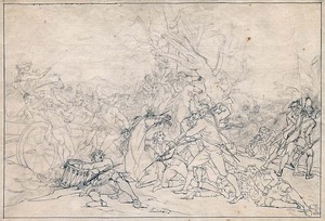
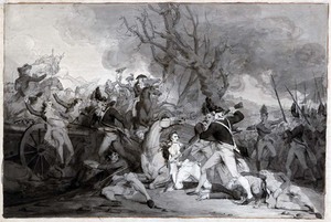
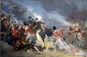
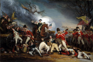
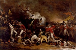
In the case of The Death of General Mercer at the Battle of Princeton, “complete” is not the right word since he worked on the subject on and off for forty-five years, leaving at least twelve sketches and three oil paintings. Princeton University is fortunate to own seven of the twelve sketches, which many critics have valued for their spontaneity and freshness over the final oils.

In 1950, Theodore Sizer worked out the sequence of works and their owners: (Princeton University Library Chronicle 12, no.1):

Trumbull Figure Sketch 1938 2771.JPG

1, 1786, pencil sketch, Yale University 1938.277(1)

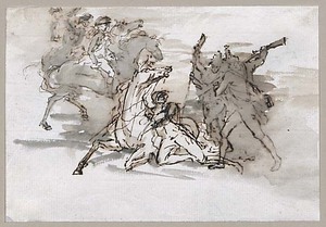
2, 1786, pen and ink wash sketch, Princeton University [at the top]. General Mercer has been beaten to his knees. George Washington and his officers are on horseback.

trumbull four.jpg

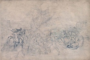
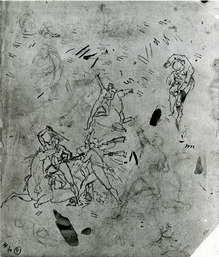
3, 1786, pencil sketch, Princeton University. General Mercer has been moved to the right. On the left Lieutenant Charles Turnbull is backed against a cannon. Washington can be seen in the center with Nassau Hall in the distance.

trumbull two.jpg

4, 1786, pencil sketch, Princeton University. Mercer is back in the middle, Turnbull is at the right, and Washington on the left.

trumbull six.jpg

5, 1786, pencil sketch, Princeton University. Turnbull is at the left, Washington on the right, and Mercer at the center.

trumbull five.jpg

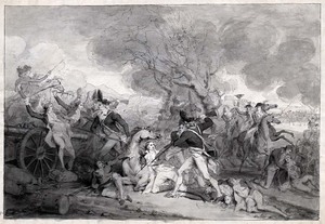
6, 1786, pen and ink wash sketch, Princeton University. This combination has been finished in an ink wash but Trumbull still is not satisfied.

trumbull one.jpg

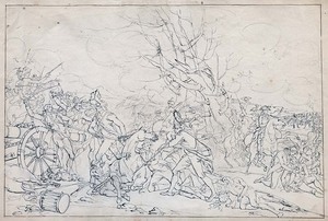
7, 1786, pencil sketch, Princeton University. Washington is back in the center and Turnbull on the left, balanced with two soldiers walking out of the frame.

trumbull three.jpg

8, 1786, pen and ink wash sketch, Princeton University. A file of British infantrymen march in from the right. The triangle is complete and Trumbull creates a finished sketch, before working in oil.

yale1.jpg

9, ca. 1786-88, oil painting, Yale University. 1832.6.2

10, 1790, pencil sketch, private hands [not illustrated]

trumbull ten.jpg

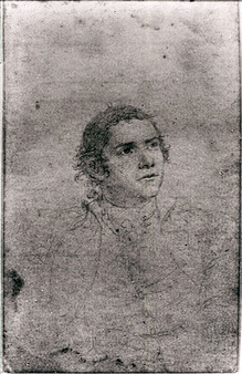
11, 1791, pencil sketch, Metropolitan Museum of Art. Gift of Robert W. de Forest, 1906 (06.1346.2). Image © The Metropolitan Museum of Art. Source: www.metmuseum.org. This drawing represents Brigadier General Hugh Mercer. Because his subject was deceased, Trumbull used for his model Mercer’s son Hugh Jr.; he twice sketched the young man in Fredericksburg, Virginia, in April 1791.

12, 1791, pencil sketch, Fordham University [not illustrated]
13, 1791, pencil sketch, Fordham University [not illustrated]

yale2.jpg

14, ca. 1789-ca. 1831, oil painting, Yale University. 1832.6.1

trumbull eight.jpg

15, 1844, oil painting, Wadsworth Atheneum Museum of Art, #1844.5. This painting was In the possession of the artist until his death in 1843, when it was purchased by Daniel Wadsworth and committee members of the Wadsworth Atheneum from Benjamin Silliman, executor of the artist’s estate, in 1844.

Trumbull gave sketches no. 3-8 to his nephew-in-law Professor Benjamin Stillman in the late 1830s, who passed them on to his son, Stillman II, and then to Stillman III. In 1896, the sketches were sold at auction to Junius Spencer Morgan, Class of 1888, who donated them to Princeton University in 1904 (GA 2005.00005-10). The seventh drawing, no. 2, was purchased in 1957, thanks to the generosity of Edward Duff Balken, Class of 1897 (GA 2006.02348).

Our sincere thanks to Yale University, the Metropolitan Museum of Art, and the Wadsworth Atheneum for allowing us to post their images. More of Trumbull’s work at Yale can be seen at: http://discover.odai.yale.edu/ydc/Author/Home?author=Artist%20John%20Trumbull
Simultaneous Contrasts

delaunay1.jpg
delaunay2.jpg

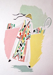
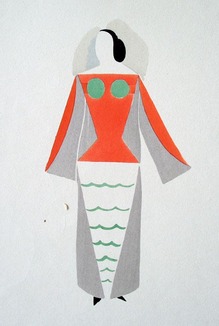
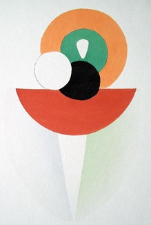
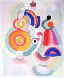
Early in her career, Sonia Delaunay (1885-1979) took the geometry of color and form that she and her husband, Robert, were exploring on canvas and translated it to printed fabrics. She called these textile and costume designs “simultaneous contrasts.”

delaunay3.jpg
delaunay6.jpg

While living in Portugal during the First World War, Delaunay opened a store in Madrid called Casa Sonia, where she sold “simultaneous” dresses, coats, home furnishings, and accessories. She also designed the costumes for Serge Diaghilev’s Ballets Russe performance of Cléopâtre (1918) and other avant-garde productions.

Back in Paris, Delaunay created a sensation with her two-dimensional cardboard “poem-dresses” for Tristan Tzara’s 1923 Dada production La Coeur a gaz (The Gas Operated Heart) . She and Robert were offered numerous exhibitions of both their canvases and textiles, including the influential Grand Bal Travesti-Transmental.

delaunay5.jpg
delaunay4.jpg

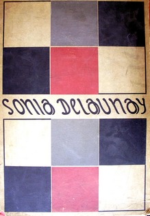
In 1924, Delaunay opened a Paris textile printing workshop, Atelier Simultané, to produce her line, Maison Delaunay. In addition, she collaborated with Jacques Heim on a display for the 1925 Exposition des Arts Décoratifs. As a result, a limited edition portfolio of her designs was printed in pochoir and published by Librairie des Arts Décoratifs.

Sonia Delaunay (1885-1979), Sonia Delaunay: ses peintures, ses objets, ses tissus simultanés, ses modes, préface d’André Lhote; poèmes de Cendrars, Delteil, Tzara, Soupault (Paris: Librairie des Arts Décoratifs, [1925?]). Charles Rahn Fry Pochoir Collection, Graphic Arts (GAX) Oversize 2004-0020E

McCosh memorial

mccoshbust.jpg

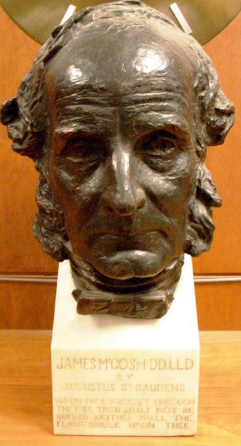
“The class of 1879 makes a departure this year in its decennial gifts to the College. It will present an heroic portrait in bronze of ex-President McCosh, executed by Augustus St. Gaudens. The statue, for it is nothing less than this, though executed in relief upon a flat groundwork, has been made from numerous sittings lately given to the sculptor by the venerable Scotchman whose most vigorous work for the college was done while the class of 79 was undergoing its course of instruction … Placed on the wall of the Chapel to the left of the apse, it will be for all time a lasting tribute to the vigorous administration of Dr. McCosh and a worthy record of the best art of the day. (Harold Godwin, “The St. Gaudens Bronze of Dr. McCosh,” Princeton College Bulletin 1, no. 3 1889).
A fire during house parties weekend in 1921 destroyed Marquand Chapel, leaving only the bust intact, which was moved to the collection of rare books and special collections in Chancellor Green Library (now in Firestone Library).

Augustus Saint-Gaudens (1848-1907), James McCosh, 1889. Bronze. Graphic Arts collection.

The Effusions of a Troubled Brain

charges14.jpg
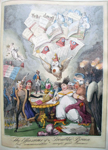
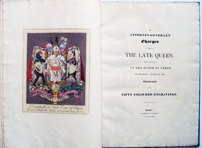
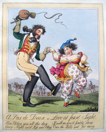
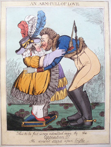
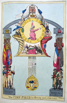
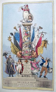
Attributed to Theodore Lane (1800-1828), The Effusions of a Troubled Brain or Evil Communications Corrupt Good Manners in The Attorney-General’s Charges Against the Late Queen, Brought Forward in the House of Peers, on Saturday, August 19th, 1820 (London: George Humphrey [1821]). Gift of Richard Waln Meirs, Class of 1888. Graphic Arts Collection (GA) Oversize Cruik 1820.29E.
charges2.jpg
charges1.jpg
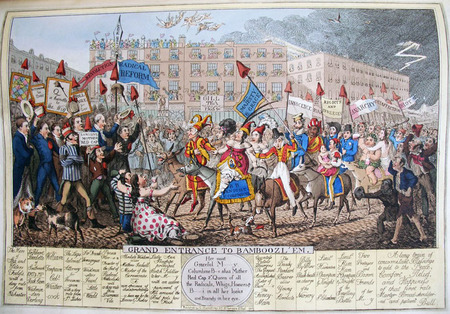
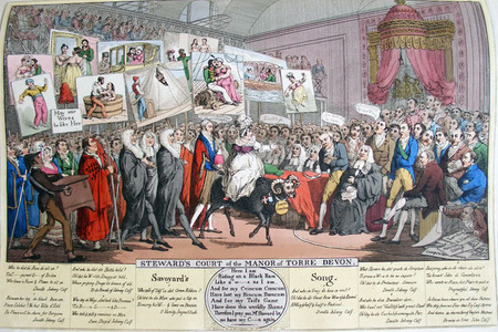
The British print publisher George Humphrey (1760?-1831?) issued this series of caricatures concerning the charges brought against Queen Caroline (1768-1821), consort of George IV, King of Great Britain. The volume contains a transcript of the charges followed by fifty hand colored etchings by George Cruikshank (1792-1878), Robert Cruikshank (1789-1856), and (attributed to) Theodore Lane (1800-1828).

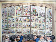
The caricatures all make fun of Caroline and were commissioned by George IV because he was sick of the fact that about 80-90% of the almost 1000 caricatures of his proposed divorce were pro-Queen. The series begins with the print Honi soit qui mal y pense (above left), which shows forty-two of the plates from this book on view in Humphrey’s shop at 27 St. James’s Street (the same shop owned by his aunt Hannah Humphrey). The first prints are dated January 1821 and the last August 1821, indicating that the book was published one year after the charges were filed and five days after Caroline died at the age of fifty-three.

charges9.jpg

In 1795, Princess Caroline of Brunswick was married to her cousin, the Prince of Wales, as part of an agreement to settle his debts. They separated soon as their only child was born and Caroline eventually moved to Italy. When her husband was to be crowned King George IV, she returned to London only to have him introduce a bill into Parliament accusing her of adultery so that he could get a divorce. Although the bill failed and public sympathy was with Caroline, she was still barred from the coronation and died not long after under unexplained circumstances.

charges4.jpg
charges7.jpg

There are only five recorded copies of this book in the United States and many are incomplete. Besides ours at Princeton, they can be found at Southeast Missouri State University, Columbia University, the Huntington Library, and Northwestern University. The British Museum does not own a copy.

charges12.jpg
charges13.jpg
charges10.jpg

18th-Century Typography on the Road to Princeton

| 2 Comments

This post is in honor of James Mosley, written in the hope that he will correct me.

bridge question12.jpg

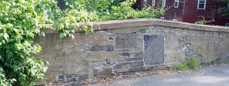
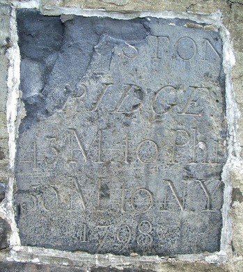
The second oldest stone bridge in New Jersey (and the oldest with a period sign), sits just outside Princeton along Route 27. Additional information can be found at: [http://www.alpsroads.net/roads/nj/nj_27/o.html]. The abbreviated text says: Kingston Bridge, 45 miles to Philadelphia, 50 miles to New York, 1798.

bridge question10.jpg

I was introduced to the bridge and its sign by Steve Ferguson, Curator of Rare Books, as we were returning from Rare Book School, where I studied typography with Mr. Mosley (http://typefoundry.blogspot.com/).

In 1776, Benjamin Franklin (1706-1790) chose the British typeface “Caslon” for the first printing of the American Declaration of Independence and for the Constitution. So the question is, when the Kingston Bridge was built in 1798, only twelve years after the American revolution, did they label it with a British font or a French font?

bridge question11.jpg

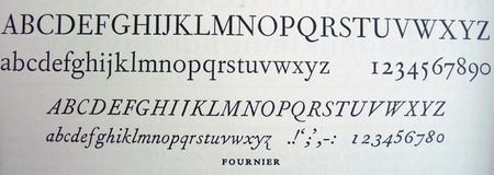
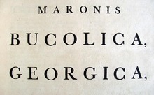
I was convinced that P. Dorn (the builder) did not use “Caslon,” so I looked at the British face by John Baskerville (1706-1775) developed in 1757 and a French romaine du roi designed by Fournier, le jeune (1712-1768) in 1742.

bridge question8.jpg
bridge question7.jpg

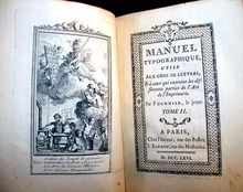
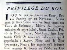
Examples of each were available in their books:


bridge question3.jpg
bridge question2.jpg


Virgil, Publii Virgilii Maronis Bucolica. Georgica. Aeneis. (Birminghamiae: Typis Johannis Baskerville, 1757) Graphic Arts Collection (GAX) Baskerville 1771


bridge question4.jpg
bridge question6.jpg
Fournier, le jeune (1712-1768), Manuel typographique (Paris: Imprimé par l’auteur …, 1764-66). Graphic Arts Collection (GAX) 2007-0822N


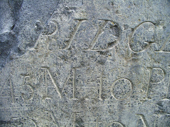
The M, N, Y could be either but the R appears French. The clearest distinction, to my eye, is in the figures or numbers, with a sweeping French lower case 7 and 9, and a curling 5. It is unfortunate there is no Q in Kingston.

So, does our little American bridge have a French face? I think so but I will wait to see whether my classmates agree. Or if the master will correct me.

*********

Well, I did, in fact, guess wrong. Mr. Mosley has kindly corrected me:

“That inscription of 1798 on the bridge is very handsome. I think its style is more Baskerville than Fournier — that is, more British than French — but then that is what one would expect.”

He continues, “Letters cut in stone in the old British colonies would naturally tend to show an influence from the former homeland, just as those made further north among the snows of Québec might — I imagine — have a certain echo of the work of French stonemasons.”

Casting Type

Graphic Arts is the fortunate new owner of a handheld type mould made by Stan Nelson. Rather than try to photograph the mould, here’s a youtube video of Mr. Nelson using one to cast type. This is one of four videos he made, each one better than the next.

In case you do not know of Mr. Nelson, here is a small section of his online biography:
Stan Nelson is Museum Specialist Emeritus in the Graphic Arts Collection, Smithsonian Institution, National Museum of American History. In three decades of employment he worked with the history of printing technology, mainly from the first four centuries of printing, and focused on typefounding, including punchcutting and casting type from hand moulds. He has given numerous lectures and conducted workshops and seminars on typefounding and printing. Since retiring, he has taught the History of Typography at the University of Virginia’s Rare Book School. His honors and awards include the Typophiles Award and the American Printing History Association’s 25th annual Laureate Award.

Victorian Photography Album

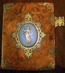
victorianalbum1.jpg
victorianalbum4.jpg

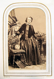
Rosa Bonheur

victorianalbum5.jpg

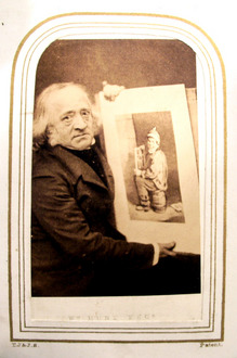
William Hunt

victorianalbum7.jpg

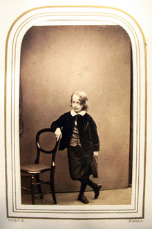
Duke of Argyll’s son


victorianalbum6.jpg

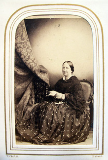
Miss Marsh

victorianalbum3.jpg

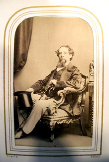
Charles Dickens

This anonymous photography album of British carte-de-visite (cdv) comes with notes from, perhaps, a previous owner listing the names of each sitter. As is often the case, the volume begins with royalty and continues through celebrity artists and writers until you get to the last few pages, which hold rather obscure portraits.

Unknown photographer, Untitled Victorian photography album, ca.1880. Albumen carte-de-visite. GAX 2011- in process.

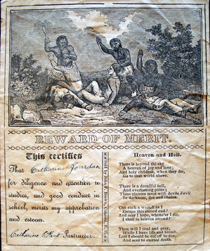
Did you get a Reward of Merit this year?

merit1.jpg
merit3.jpg
merit8.jpg
merit4.jpg

merit7.jpg
merit2.jpg
merit6.jpg

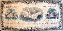
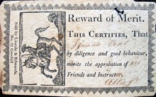
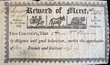
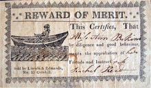
Princeton owns Awards of Merits from over thirty-five presses in the United States from the 1820s on. For information, see Patricia Fenn, Rewards of Merit: Tokens of a Child’s Progress and a Teacher’s Esteem as an Enduring Aspect of American Religious and Secular Education (Charlottesville, Va.: Ephemera Society of America, 1994). Graphic Arts Collection (GA) Oversize LA230 .F46 1994bq

Mathew Brady's 1859 Senate

bradysenatecompositepostvalerieMaster2.jpg

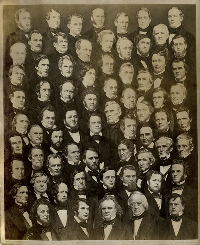
Mathew Brady (1822-1896), Composite of the Members of The United States Senate, 1859. Salted paper print, 11.75 x 9.5 inches on mount trimmed to 12.5 x 10 inches. Graphic Arts GA 2011- in process

Mathew Brady was the most celebrated of the early American photographers. In 1844, he opened his first commercial studio in New York City and added a Washington D.C. branch in 1856. His success was, at least in part, thanks to the expert operators he employed, included Alexander Gardner, Timothy H. O’Sullivan, George N. Barnard, among others. Many of these men left Brady’s studio during the Civil War and a few years later, Brady was forced to declare bankruptcy. He was never able to regain his early success and died penniless.

Princeton’s graphic arts collection has acquired a salt print composite of the United States Senate; one of only three known imperial prints of this historic image. To create the print, Brady and his operators photographed each member of the Senate individually, then cut and collaged the photographs and finally, re-photographed the composite.

brady key.JPG

It would have been worth the trouble, had South Carolina not seceded from the Union shortly after the composite was finished. By the time Brady was ready to sell copies of this photograph, it was already out of date.

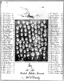
Only two other copies have been located, thanks to the research of William Becker. One is in the Prints & Photographs Division of the Library of Congress. That print carries the handwritten notation, “Deposited in Clerk’s office Southern Dist. New York Sept. 20, 1859.” Library of Congress also holds a copy negative of the “key,” a reduced-size copy identifying each of the sitters (copied here on the left).

The other copy of Brady’s Senate photograph is owned by the New-York Historical Society.

The print now at Princeton University was originally the property of U. S. Rep. Henry Waldron (1819-1881), six term Congressman from Hillsdale, Michigan.

Becker has also identified ten of the fourteen members seen in Brady’s composite as ones who were expelled from the Senate for supporting the Confederate rebellion. At least twelve others resigned or withdrew after their states seceded from the union. The composite also depicts Sam Houston of Texas, who served in the US Senate from 1846 to March 4, 1859; Sen. Hannibal Hamlin of Maine, who resigned January 17, 1861 to become Vice President of the United States under Lincoln; and Sen. David C. Broderick of California, who died September 16, 1859 after being mortally wounded in a duel with the chief justice of the supreme court of California.

Brady’s 1859 Senate composite includes the following members who did not complete their terms due to the outbreak of the Civil War:

Alabama: Benjamin Fitzpatrick (withdrew January 24, 1861); Clement Claiborne Clay (withdrew January 24, 1861)
Arkansas: William K. Sebastian (Expelled July 11, 1861); Robert Ward Johnson (Term Ended (?) March 3, 1861)
Florida: Stephen R. Mallory (withdrew January 21, 1861); David L. Yulee (withdrew January 21, 1861)
Georgia: Robert A. Toombs (withdrew February 4, 1861); Alfred Iverson, Sr. (withdrew January 28, 1861)
Indiana: Jesse D. Bright (Expelled February 5, 1862 for support of the Rebellion)
Kentucky: John C. Breckinridge (14th Vice President of US; Democratic Candidate for President of US, 1860; Expelled Dec. 4, 1861; CSA General, CSA Secretary of War)
Louisiana: Judah P. Benjamin (withdrew February 4, 1861; Attorney General, Secretary of State, and Secretary of War, CSA); John Slidell (resigned February 4, 1861)
Mississippi: Albert Gallatin Brown (withdrew January 12, 1861); Jefferson Davis (withdrew January 21, 1861; President, CSA)
Missouri: Trusten Polk (Expelled January 10, 1862 for support of the Rebellion)
North Carolina: Thomas L. Clingman (withdrew March 28, 1861; Expelled July 11, 1861); Thomas Bragg (Withdrew March 6, 1861; Expelled July 11, 1861; Became Attorney General, CSA)
South Carolina: James Chesnut, Jr. (Expelled July 11, 1861); James Henry Hammond (Retired November 11, 1860)
Tennessee: Andrew Johnson (Resigned March 4, 1862; Vice President of U.S. under Lincoln; 17th President of the U.S.); Alfred O. P. Nicholson ( Expelled July 11, 1861)
Texas: Matthias Ward (Resigned December 5, 1859)
Virginia: James M. Mason (Withdrew March 28, 1861; Expelled July 11, 1861); Robert M. T. Hunter (Withdrew March 28, 1861; Expelled July 11, 1861)

For more information, see
Mary Panzer, Mathew Brady and the Image of History (Washington: Smithsonian Institution Press, 1997), Firestone TR140.B7 P36 1997

Complete zoomified Mr. O'Squat's Trip to Town

| 1 Comment

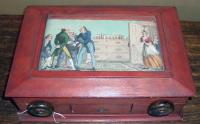
Artist unknown, Trip to Town (London: William Sams, 1822). Box embossed: E.P. Sutton & Company; Sangorski & Sutcliff. GA 2005.01039

Last year, we posted this twelve-plate panorama in a few images. We now have the complete panorama digitized. If you would like to view the continuous strip, click below. The zoomified image will open in the center of the strip. Either hold the directional arrows down, right or left, or you can move the strip with the mouse. Special thanks go to Paula Brett, Manager of the New Media Center and Beth Wodnick, Digital Imaging Technician for making this possible.

TRY IT! You will not be sorry.

http://www.princeton.edu/~plbrett/library/DukeYork.html

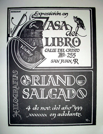
La Casa del Libro

salgado.jpg

When the first curator of graphic arts, Elmer Adler (1884-1962), left Princeton University in 1955, he accepted an invitation from Teodoro Moscoso to visit Puerto Rico. Adler was enchanted and quickly moved to Old San Juan, where he opened La Casa del Libro. With the support of a group of local residents, they formed a non-profit organization Amigos de Calle del Cristo 255, Inc., to operate the La Casa as a museum and library dedicated to the art of the book.

Adler began La Casa with his personal collection of illuminated manuscripts, incunables, and contemporary fine press books. New acquisitions were also made, along with a series of public exhibitions, printmaking classes, and many other events. Together with his protégé David Jackson McWilliams, Adler lived and worked in Puerto Rico for the last seven years of his life.

La Casa del Libro remains at 255 Calle del Cristo today, under the direction of the Institute of Puerto Rican Culture, which owns La Casa’s two buildings. Unfortunately, the doors have been closed recently, awaiting repairs and renovations. For information, see http://www.lacasadellibro.org/

The Island of Rota

rota11.jpg

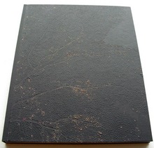
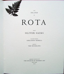
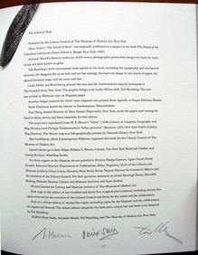
Abelardo Morell, Ted Muehling, and Oliver Sacks, The Island of Rota (New York: Library Council of the Museum of Modern Art, 2010). Copy G of 25 deluxe copies. Graphic Arts 2011- in process.

rota9.jpg
rota7.jpg

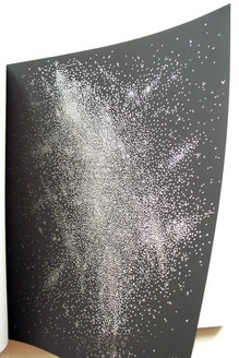
Graphic Arts is the proud new owner of The Island of Rota, a collaboration between the neurologist and writer Oliver Sacks, designer Ted Muehling, and photographer Abelardo Morell (who was recently at Princeton University as a Class of 1932 Fellow in Visual Arts in the Council of the Humanities).

rota5.jpg
rota4.jpg

The Island of Rota considers the unique natural history of a particular island in Micronesia. The prospectus notes, “Sacks’s text is excerpted from his book The Island of the Colorblind, which takes its name from its study of a Micronesian island population that harbors an extreme form of color blindness—a handicap for which the islanders are compensated with a heightened perception of pattern, shadow, texture, and tone.”

rota2.jpg
rota6.jpg

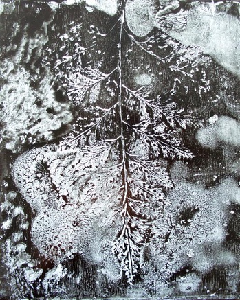
“… Inspired by Sacks’s observations on color blindness as well as by his description of the plant life of Rota, Morell and Muehling have created a tactile volume in black-and-white and sepia that reconceives the author’s text and responds to his sense of deep geological and botanical time. Morell has made thirteen cliché-verres, images made by hand in ink and plant matter on glass and then digitally printed as photographs. Twelve are bound into the book; the thirteenth is placed loose in the book’s box.”

rota1.jpg
rota3.jpg

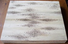
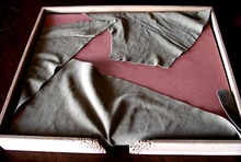
“…Muehling’s contributions encompass almost every aspect of the book, including the typography, the papers, the structure, and a pair of altered historical maps. A master of metalwork, porcelain, and glass based on organic forms, Muehling designed the covers of the book, the box, and castings of cycads and sea fans in handmade paper for the interior. He also designed a pattern of small apertures for two leaves of the book, to be seen at different angles as the pages are turned.”

http://www.moma.org/explore/multimedia/videos/146/885 Click here to see a video of Sacks reading from his book.

Recent Comments

  • Howard Coblentz: I have a round seal shaped like a pear a read more
  • John Overholt: Wikipedia's entry for Sir Francis says: "Throughout Baring's lifetime his read more
  • Serge Rodrigue: It is a precious thing you have a book from read more
  • Colin Wicks: I have a copy of “A Round Game.” And it read more
  • Laurence Hilonowitz: I was a Customer, Friend of Bob Wilson. I Live read more
  • allen scheuch: Absolutely STUNNING! Those colors, those designs made my day! Thanks, read more
  • Olivier: Hello Diane, If you are still looking for an examplare read more
  • Stella Jackson-Smith: I have a framed picture by A.Brouet, signed with the read more
  • John Podeschi: I remember Dale fondly from my days at Yale (1971-1980). read more
  • Joyce Barth: I have some or all of this same poem. I read more