Recently in Prints, Drawings, Paintings Category

After the Manner of Rembrandt

Thomas Worlidge (1700-1766), A Select Collection of Drawings from Curious Antique Gems: Most of Them in the Possession of the Nobility and Gentry of this Kingdom: Etched after the Manner of Rembrandt (London: Printed by Dryden Leach, for M. Worlidge … , [between 1768 and 1780]. Graphic Arts Collection (GAX) 2005-2376N

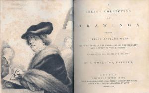
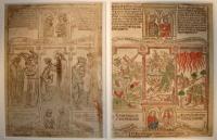
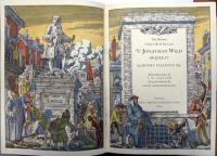
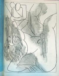
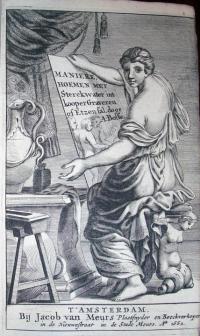
Around 1740, painter and printermaker Thomas Worlidge settled in the Covent Garden section of London. He found success painting portrait miniatures and later, as an etcher working “after the manner of Rembrandt”. This refers to his drypoint technique of drawing with a sharp needle directly into the surface of the copper plate. It also alludes to Worlidge’s admiration for Rembrandt the man, such as in this frontispiece self-portrait, which is a clear imitation of a Rembrandt self-portrait.

When Worlidge died in 1766, he was in the middle of a massive project etching a series of 182 drypoint portraits. Princeton owns several variant editions of the collection. The following is a description of the project taken from the Dictionary of National Biography, vol. 21:

The series was published in parts, some of which seem to have been issued as early as 1754 but Worlidge died before the work was completed. It was finished by his pupils William Grimaldi and George Powle, and was published by his widow in 1768 at the price of eighteen guineas a copy. In its original shape the volume bore the title, A select Collection of Drawings from curious antique Gems … printed by Dryden Leach for M. Worlidge … and M. Wicksteed, Seal-engraver at Bath.
The frontispiece, dated in 1764, shows Worlidge drawing the Pomfret bust of Cicero; behind on an easel is a portrait of his second wife, Mary. No letterpress was included originally in the volume, but between 1768 and 1780 a few copies were issued with letterpress. After 1780 a new edition in quarto, deceptively bearing the original date of 1768, appeared with letterpress in two volumes at five guineas each. The title-page omits mention of M. Wicksteed’s name, but is otherwise a replica of the first.

Pantomime Actor Joseph Grimaldi

Attributed to William Heath (1795-1840), Mr. Grimaldi and Mr. Norman in the Epping Hunt, from the Popular Pantomime of the Red Dwarf (1812). Engraving with hand-coloring. Graphic Arts Division, British Caricatures

This print depicts the British actor Joseph Grimaldi (1778-1837) in one of his many popular pantomimes. Grimaldi, who always played the clown in these physical comedies, worked as a professional actor from the age of three. Unfortunately, his body was worn out by the age of forty-five and he was forced into retirement. One of his best-loved songs begins

A little old woman, her living she got
by selling codlins, hot, hot, hot.
And this little old woman, who codlins sold,
tho’ her codlins were not, she felt herself cold.
So to keep herself warm she thought it no sin
to fetch for herself a quartern of gin.


Joseph Grimaldi, (1779-1837), Memoirs of Joseph Grimaldi, edited by “Boz” [Charles Dickens (1812-1870)]; with illustrations by George Cruikshank (London: R. Bentley, 1838). Graphic Arts Collection (GA) Cruik 1838.5

After retirement Grimaldi worked on his memoirs, which eventually filled two volumes. When the actor died in 1837, Charles Dickens was asked to edit the massive work and he succeeded by rewriting a good deal of the text. Dickens comments in the introductory chapter: “The present editor … accepted a proposal from the publisher to edit the book, and has edited it to the best of his ability, altering its form throughout, and making such other alterations as he conceived would improve the narration of the facts without any departure from the facts themselves.”

Princeton is also fortunate to also hold a songbook owned and signed by Grimaldi, seen below.

Thomas Tegg (1776-1845), Tegg’s prime song book, bang up to the mark! :the fourth collection (London: T. Tegg, [1814?]). Frontispiece and title vignette by Thomas Rowlandson. Rare Books (Ex) PR1188 .T43 1814.

Anopisthographic Biblia Pauperum

leaf 39 “t” Beatitude and leaf 40 “v” Coronation

blank verso of leaf 40 and leaf 38 “s” Hell


Three leaves from a Biblia pauperum, Schreiber edition X (38-40, .s, t, v.), late 1460s. Hand-colored woodblock prints. Sheet size 27 x 41 cm. GC110 Book Leaves Collection.

Princeton’s historical leaf collection holds three leaves from an edition of the Biblia pauperum, one of the best-known of the fifteenth-century blockbooks. According to Nigel Palmer’s article in the current Journal of the Printing Historical Society (no. 11, 2008, Firestone Z119 .P95613), the Biblia pauperum was “an ensemble of texts and images which narrated the history of man’s redemption from the Annunciation through to the Last Judgement and the coronation of the blessed soul in heaven” represented in 40 plates. During the 1460s, the 40 woodblocks for this volume were recut three times, along with seven intermediate issues in which just some of the blocks were replaced.

Mr. Palmer examined the sheets in Princeton’s collection and wrote that he believed they belong to the edition X, “almost certainly printed in Germany”. Of the known copies of this edition, Palmer identified one in Blackburn, England, originally from Gotha, which lacks these numbers and might be a match for our leaves.

The three leaves shown here are anopisthographic (printed on one side). Two of the sheets have been pasted together to form recto and verso of one sheet. Because there are so few Biblia pauperum surviving in their original structures, it is difficult to be certain about their construction but several editions were sewn into single-quire volumes in chancery folio (approximately 310-20 x 440-50 mm., only slightly larger than Princeton’s sheets).

Blockbooks were made from about 1450 to the 1470s, and Palmer cautions us to regard them as intertwined with all experimentation in printing technology of the period, included single-leaf woodcuts, single-leaf metalcuts, single-leaf engravings, books and single leaves with text printed with moveable type, and books with typographic text and woodcut illustrations.

For a complete reading of the iconography in each plate (in English), see Avril Henry’s Biblia Pauperum Marquand Library Oversize Z241.B6B52 1986Q

The History of the Life of the Late T. M. Cleland

| 16 Comments

Henry Fielding (1707-1754), The History of the Life of the Late Mr. Jonathan Wild the Great. Illustrations by T.M. Cleland (1880-1964) and an introduction by Louis Kronenberger (New York: Limited Editions Club, 1943). Gift of Elmer Adler. Graphic Arts collection (GAX) PR3454.J663 1943


Soon after Thomas Maitland Cleland left school, at the age of 16, he taught himself to set type, bought a small Gally Universal, and began making books in his basement. In 1900, he moved to Boston and published under the imprint Cornhill Press, named after the street where he lived. D. B. Updike of Merrymount Press was an early mentor, who provided commissions and endless criticism, leaving Cleland chronically unsatisfied with anything less than perfection.

Cleland went on to work as art designer for McClure’s Magazine, the Locomobile Company of America, the Westvaco Corporation, the Cadillac Motor Car Company, and Fortune Magazine, although he wrote “I am not, and never have been, particularly interested in advertising and have done much of my work for it only because it was, or seemed to be, necessary in order to make a living.”

In the 1930s, he made a series of calendar illustrations for the Harris, Seybold, Potter Company of Cleveland Ohio, which manufactured high-quality sheet-fed offset lithographic printing presses. The company tried to convince the printing world that sheet fed-offset presses could produce quality 4-color process work and Cleland’s prints were meant to provide the proof. “God Bless America,” seen below, is one of these prints.

In between commercial work, Cleland illustrated fine press editions, often using a series of stencils. Writing to Merle Armitage about his process, Cleland explained “It is made entirely with stencils which I cut myself by hand in thin metal (thirteen of them in all) and which I then printed successively by brushing through them with pure water colours. … so far as I know, no one has attempted before to make a complete picture with them as a medium, and I hope no one will try it again. It was an insane amount of work for such a trifling result, and took about four months work to make a hundred of them—fifty for the special edition of Adler’s book of my work, and fifty for sale.” (GAX Oversize NE539.C57 A3 1929q)

One of his most complex projects was Jonathan Wild, seen above, printed under Cleland’s supervision by the Marchbanks Press and published by the Limited Editions Club. In a letter to editor George Macy in 1942, Cleland wrote, “I am anxious to have this large line drawing photographed for the plate so … I should have proofs of the plate on which I can paint in the color for each stencil … so that they will have only the actual coloring of the edition to do after the book is off the press.” The coloring was accomplished by Charlize Brakely, who charged $10 per thousand pages. The book has 30 pages with color in an edition of 1,500, so that means a total of 45,000 pages to color.

Robert Rauschenberg 1925-2008

Robert Rauschenberg (1925-2008), Rauschenberg. XXXIV Drawings for Dante’s Inferno (New York: H. N. Abrams, 1964). Limited to 300 sets signed by the artist. Princeton set also signed by Harry Abrams. Graphic Arts Collection GA 2006.00181-00213

Sadly, Robert Rauschenberg died on Monday night at the age of 82. One of many obituaries for this great artist can be read at http://www.nytimes.com/2008/
05/14/arts/design/14rauschenberg.html?partner=rssnyt&emc=rss

The Graphic Arts division is fortunate to hold a set of publisher’s proofs for Rauschenberg’s print edition of XXXIV Drawings for Dante’s Inferno, published in 1964 by Harry Abrams. This collotype portfolio reproduces the 34 drawings in the collection of the Museum of Modern Art in New York. A great source of information about the Dante project and many of Rauschenberg’s other works of art is Mary Lynn Kotz’s Rauschenberg, Art and Life, revised 2004 Marquand Library SA ND237.R187 K679 2004.

Mister O'Squat by Rowlandson or Lane?

Attributed to Thomas Rowlandson (1757-1827), [Mister O’Squat: A Panorama] (London: Published by William Sams, Booksellers to his Royal Highness the Duke of York opposite the Palace, St. James Street, 1822). Box embossed: E.P. Sutton & Company; Sangorski & Sutcliff. GA 2005.01039

Thomas Rowlandson (1757-1827) was one of the greatest of the British caricaturists. Critic Robert Hughes wrote “William Hogarth invented the panorama of social class as a subject in English painting. Rowlandson, who was eight when Hogarth died, continued the tradition, with an equal gusto but greater humor. The dark side of Hogarth, his capacity for moral rage, is largely missing in Rowlandson, and his interest in art theory is entirely absent.”

Theodore Lane (1800-1828) on the other hand, was a lesser known British caricaturist who worked around the same period as Rowlandson. A savant, who had his debut at the age of 16 with an exhibition of paintings at the Royal Academy, Lane is only known today for his humorous work, such as his caricatures of George IV.

The graphic arts collection holds a scrolling panorama made up of 12 unsigned, hand-colored etchings, with a narrative in verse, attributed to Rowlandson and titled Mister O’Squat. This year, a search for more information about this item uncovered an unbound series of 12 panoramic colored prints that were sold in a 1906 book sale under the title Mister O’Squat and the Widow Shanks. This title corresponds to a listing in OCLC for a series of prints with verse attributed to Lane and titled The Misadventures of a Pair of Newlyweds who Leave the Country for the Superior Pleasures and Society of London, also called Mister O’Squat and Widow Shanks. Published in 1818, this is also a panorama in 12 sections, each 13 x 73 cm. the same as Princeton’s.

Were these prints just reconfigured to be viewed as a continuous scene through the window of a small box (sometimes called a myriopticon)? Did Rowlandson know of Lane’s prints and reproduce them for the publisher William Sams? Is the 1818 series misattributed to Lane and really the work of Rowlandson? These are still unanswered questions that deserve further research before an answer is given.

Matisse and Joyce

“Cyclops” by Henri Matisse, 1935. Soft-ground etching.

James Joyce (1882-1941), Ulysses (New York: Limited Editions Club, 1935). 6 etchings and 20 photomechanical reproductions by Henri Matisse (1869-1954) Copy no. 700 of 1500, signed by Henri Matisse and James Joyce. Graphic Arts Collection (GAX) Oversize PR6019.O9 U4 1935q

Ever since George Macy, founder and editor of the Limited Editions Club, published an English language edition of Ulysses in 1935, pairing James Joyce’s text with prints by Henri Matisse, there has been a controversy as to whether Matisse ignored Joyce by submitting images based on Homer’s Odyssey. There is no question that the six original soft-ground etchings— “Calypso,” “Aeolus,” “Cyclops,” “Nausicaa,” “Circe,” and “Ithaca”—have a relationship to Homer. The question is whether this was a conscious choice, sanctioned by Joyce, to relate the story and structure of the one book to the other.

In James A. Knapp’s article “Joyce and Matisse Bound” http://muse.jhu.edu/journals/elh/v067/67.4hnapp.html the question is answered yes, with documentation offered from letters between Macy and the artists, and comments from their colleagues, such as Alfred Barr who wrote “Matisse remarked that he had observed how Joyce’s Ulysses was divided into episodes based on Homer’s Odyssey … Macy accepted the suggestion and Matisse went to work.” (Matisse: His Art and His Public, 1951).

Either way, the work of two masters comes together in a powerful way. Macy designed the sequence, including reproductions of the drawings Matisse also sent, which led up to the final etchings. These are bound on top of the final prints in an overlapping fashion that echoes the overlapping stories of the text. Princeton’s copy is one of the 250 (out of the total edition of 1500) signed by Joyce, which originally sold for $15.

The Murder of Edith Cavell

George Bellows (1882-1925), The Murder of Edith Cavell, 1918. Black chalk and black crayon over charcoal on cream wove paper. Courtesy of Princeton University Art Museum. Museum purchase, Laura P. Hall Memorial Fund

George Bellows (1882-1925), The Murder of Edith Cavell, 1918. Lithograph. Graphic Arts division. GA 2008- in process


On August 5, 1915 Edith Cavell, head of the Training School for Nurses in occupied Brussels, was arrested for assisting Belgian, British, and French soldiers to escape from the country. Two months later, she was shot by the German authorities. As news of her execution spread, with no fewer than 41 stories in The New York Times alone from October 16-30, her case became somewhat of a cause célèbre.

The American artist George Bellows included this incident in a series of 12 lithographs he produced depicting atrocities committed by the German armies in Belgium. The Graphic Arts collection is fortunate to own 7 of the 12 prints from this series, including The Murder of Edith Cavell. In 1959 the Princeton University Art Museum found and acquired Bellow’s finished, full-size drawing (53.5 x 68.5 cm.) for this print. Interestingly, only after completing the drawing and print did Bellows paint the same scene in oil. The painting now belongs to the Springfield Art Museum in Springfield, Massachusetts.

For a comparison of the work in three mediums, see the entry by Robert A. Koch “George Bellows’ Murder of Edith Cavell” in Record of the Art Museum, Princeton University 18, no.2 (1959): 46-62.

For more about the Cavell case, see Correspondence with the United States Ambassador Respecting the Execution of Miss Cavell at Brussels (London, Darling, 1915). Rare Books (Ex) 2004-1558N

Come and Join Us Brothers

| 1 Comment

Come and Join Us Brothers, ca. 1863. Published by the Supervisory Committee for Recruiting Colored Regiments. Lithograph printed by P. S. Duval & Son. Graphic Arts division GA2008- in process.

Early in the Civil War, the Northern or Federal Army was desperate for more men. In his preliminary emancipation proclamation in the fall of 1862, President Lincoln announced that the federal government would enroll African American soldiers as of 1863. By the end of the Civil War there were 166 black units of infantry, cavalry and artillery totaling 185,000 men.

This lithographed poster is one of the best-known of the recruiting posters used to persuade African Americans to join the Northern Army. There are two versions; each has the same image but with different captions. The one held by the Princeton Library has the caption: Come and Join Us Brothers, while the other reads United States Soldiers at Camp “William Penn” Philadelphia. Camp William Penn was just north of Philadelphia and the largest facility for the organization and training of African American soldiers. Special thanks to Phil Lapsansky, Curator of Afro-Americana, at the Library Company of Philadelphia for the note that the original photo from which these posters were made appeared in the Civil War Times in July of 1973 but has since vanished.

For more information about the original photograph and a recent controversy surrounding it, see http://people.virginia.edu/~jh3v/retouchinghistory/essay.html

Trompe l'oeil prints

| 3 Comments
The Old Violin. Chromolithograph printed by Frank Tuchfarber (fl. 1870-1890) after the painting by William Michael Harnett (1848-1892). Published by Donaldson Art and Sign Company, Kentucky, 1887. Graphic Arts division GA2008- in process

One of the highlights of Cincinnati’s thirteenth annual Industrial Exposition in 1886 was the trompe l’oeil painting by the American artist William Harnett called The Old Violin. Publisher Frank Tuchfarber, who specialized in art reproductions, bought the painting both for his love of music and his interest in selling a commercial reproduction of the painting.

The resulting chromolithograph was printed in seventeen colors, each from a separate stone. The thickness of the inks, along with the varnish, gives the impression (if not the exact look) of an oil painting. Two versions exist; one published in Cincinnati and one in Covington, Kentucky under the Donaldson Art Sign Company (also known as Donaldson Lithographing Company). Although neither was issued with a printed date, Princeton’s copy is a printer’s proof and so probably from around 1887. The sheet is not trimmed to the image but retains its margins, with their registration crosses, color keys and ink bleeds.

The popularity of this print and the question of the artistic achievement in making the chromolithographic reproduction led to a court battle over the copyright for the print. To read more about this, see http://www.law.uconn.edu/homes/swilf/ip/cases/bleistein.htm

Princeton Print Club

Antonio Frasconi, Albert Einstein, 1952. Woodcut and woodblock. GA2007.01286

This portrait of Albert Einstein was completed by Antonio Frasconi in 1952, three years before Einstein’s death, as a commission for the Princeton Print Club. The Print Club was organized in 1940 as an undergraduate activity with the stated aim of furthering student interest in the field of the Graphic Arts. Dues were $5 and in the first year the Club numbered 180 members. The Club’s founder Kneeland McNulty, class of 1943, went on to become a print curator at the Philadelphia Museum of Art.

The members decided on three main activities:

To build up a lending collection of examples of contemporary American Graphic Art and to offer them each term, framed and free of charge, to undergraduates for the decoration of their rooms.

To hold exhibitions, invite authoritative lecturers, and provide demonstrations by artists of the various techniques of print making. An extra-curricular seminar, conducted by Elmer Adler was held on the history and identification of the Graphic Art techniques. These seminars were open to all students regardless of Club membership.

To invite to Princeton each year an outstanding American artist in the Graphic Arts to make sketches of the Princeton campus for the annual Club Dividend Print. A signed proof of this print was presented to each member. Prints were completed by T.W. Nason (1941), Louis Rosenberg (1942), Charles Locke (1943), Louis Novak (1944), Harry Shokler (1945), Samuel Chamberlain (1946), George Jo Mess (1947), John Meniham (1948), Leonard Pytlak (1950), Hans Mueller (1950), Herbert Waters (1951), Antonio Frasconi (1952), and Francis A. Comstock (1952).

Soft-cutting

Abraham Bosse (1602-1676), Tractaet in Wat Manieren men of Root Koper Snijden oste Etzen Zal… (Amsterdam: Jacob van Meurs, 1662). Graphic Arts, GA2008. in process

In 1645, Abraham Bosse, an instructor at the Académie royale in Paris, published an engraving manual specifically focused on the technique called taille-douce or soft cutting, which is the cutting of straight lines on soft copper plates. Sixteen wonderfully detailed illustrations show the individual steps of cutting and printing a plate, including the use of a new, rolling press. As the manual continues, Bosse also introduces etching, the more modern printing technique using of baths of acid to cut the lines in the copper.

The book proved quite popular, revised many times and translated into several languages. With each new edition, there are additions and corrections as the practice of etching itself was changing. To collect each variation is to document the progression of technical printing information both practical and historical.

Princeton is fortunate to have not only the first French edition and the first German translation, but has now acquired the rare first Dutch translation. The Dutch edition has, in particular, a section on recipes for the composition of hard varnishes that can be used as an etching ground. Both summer and winter recipes are included, taking into account the changes in humidity that effects the artist’s materials. To compare earlier editions, see:

Abraham Bosse (1602-1676), Traicté des manieres de graver en taille dovce svr l’airin (Paris: Chez ledit Bosse, 1645) Marquand Library (SAX): Rare Books NE1760 .B67
Abraham Bosse (1602-1676), Kunstbüchlein: handelt von der Radier- und Etzkunst (Nürnberg: In Verlegung Paulus Fürsten…, 1652) Rare Books (Ex), NE1760 .B7315 1652s

Mirth Verses Misery

John Britton (1771-1857), The Pleasures of Human Life (London: Printed for Longman, Hurst, Rees, and Orme …, 1807). Graphic Arts Collection (GA) Rowlandson 1807.3

In 1806, Reverend James Beresford (1764-1840) published a series of humorous dialogues entitled, The Miseries of Human Life (Graphic Arts, Rowlandson 1806.3). The book proved so popular that three editions sold out in a matter of weeks.

Several imitations appeared the following year, including Robert Heron’s Comforts of Human Life (Graphic Arts, Rowlandson 1807.4) but the most successful by far was The Pleasures of Human Life published under the name of Hilaris Benevolus and Company, Fellows of the “London Literary Society of Lusorists.” In fact, the book was written by John Britton, a young man whose only other books to date were historical and topographical essays on England.

Britton followed Beresford’s use of dialogues and his use of hand-colored etchings by Thomas Rowlandson (1756-1827), commissioning five prints only loosely connected to the text. The frontispiece literally turns Beresford’s book topsy-turvy, complimented by an illustrated title page, drawn by another popular artist of the time, R. William Satchwell (1732-1811) and engraved by William Bond.

Britton wrote that members of the Society of Lusorists, including Benevolus, Simon Specific, David Demurrer, and others, held meetings to “examine, canvass, and discuss the most noted and popular acts, deeds, and things done, performed, and committed in the British metropolis.” The pleasures are separated between male, female, and neuter, “interspersed with various anecdotes, and expounded by numerous annotations.”

Britton went on to become an celebrated advocate of historic preservation and in 1845, a Britton Club was formed in his honor.

Daumier's Comic Paris


Paris comique: revue amusante des caractères, moeurs, modes, folies, ridicules, excentricités, niaiseries, bètises, sottises, voleries et infamies parisiennes (Comic Paris. Amusing review of the Characters, Manners, Modes, Madnesses, Ridiculous, Eccentricities, Sillinesses, Silly things, Stupidities, Flailings and infamies Parisian. Nonpolitical text.) Paris: Chez Aubert, [1840?]. Texts written by Charles Philipon, 1800-1862; Louis Huart, 1813-1865; Henri Michelant, 1811-1890; Illustrations by Frédéric Bouchot, b. 1798; Cham, 1819-1879; Honoré Daumier, 1808-1879; Paul Gavarni, 1804-1866; J.J. Grandville, 1803-1847. Graphic Arts Collection (GAX) Oversize 2006-0467Q

Pictured here is a lithograph by the French artist Honoré Daumier created for the journal Paris comique or Comic Paris. The caption reads, “Malheur au Pêcheur à la ligne qui se trouve sur celle d’un bateau à vapeur!” Or in English, “Woe to the angler who finds himself in the wave of a steamer!”

For this work, Daumier received 40 francs, approximately equal to a month’s salary for an unskilled worker at the time. This was Daumier’s standard payment from the publishing house of Aubert and Aubert’s son-in-law Charles Philipon. Daumier had been working for these men since 1830, most notably supplying lithographs for their weekly La Caricature. His politically charged images so enraged the government of King Louis-Philippe that censorship laws were enacted in 1835 and as of 1836, Daumier stopped making political cartoons and moved exclusively to social satire. La Caricature ceased publication, but other journals soon took its place. Note that Paris comique states on its title page that it does not contain political texts.

Various copies of one issue of Paris comique might contain different prints, as Maison Aubert had a stockpile and simply used whatever was convenient to finish the run. This used to make researching and viewing all of Daumier’s work difficult, as researchers often had to go to several libraries. Today, the broad scope of Daumier’s work can be researched on a free database written by Dieter and Lilian Noack, which records and images all of his 4,000 lithographs and 1,000 wood engravings. A search for lithographs about fishing results in 51 prints, with complete information and images, including the one shown here. Take a look: http://www.daumier-register.org/werklist.php?lingua=en&search=intro

Edward Gordon Craig's first publications

| 2 Comments
Edward Gordon Craig (1872-1966), Gordon Craig’s Book of Penny Toys (Hackbridge, Surrey: Published at the Sign of the Rose; London : Sold by Lamley, 1899). 43 prints.Graphic Arts Collection (GAX) Oversize NE1326.5.T68 C73 1899q


The British actor, director and artist Edward Gordon Craig (1872-1966) was the son of actress Ellen Terry and designer Edwin Godwin. He began his professional career as an actor with Henry Irving’s company at his Lyceum Theatre in London. Craig played Hamlet in 1894 and again in 1896, but gave up acting soon after. His interest in art and design became more important to him and ultimately, occupied all his time and energies.

It was in Uxbridge around 1893 that Craig met the artists James Ferrier Pryde and William Nicholson, from whom he learned to make prints and in particular, fell in love with the woodcut. In 1898, Craig started a magazine, The Page, which he edited, illustrated, and published as an outlet for his own work. In less than two years, he had completed nearly 200 woodblocks and published Gordon Craig’s Book of Penny Toys.

Craig printed 500 copies of Penny Toys and began to hand color them but before long, tired of this work. His solution was to burn 250 copies to reduce the edition size. Craig continued coloring the books and is said to have finished approximately 100 of the remaining 250 before he turned the rest of the coloring over to Jess Dorynne.

Craig moved to Germany in 1904, where he wrote and published On the Art of the Theatre. A few years later, Constantin Stanislavski invited him to direct Hamlet with the Moscow Arts Theatre. Craig also designed the sets, using a series of neutral, movable screens. He later presented a set to William Butler Yeats for use at the Abbey Theatre in Dublin, Ireland.

The Page (Carshalton, Eng.: E.G. Craig, 1898-1901) Graphic Arts Collection (GAX) NE1000 .P333

Certificate of Membership in the Pilgrim Society

| 2 Comments

Pilgrim Society certificate. Engraved by J. Andrews at the firm of Rawdon, Wright, Hatch & Edison after a design by Hammatt Billings (1818-1874). Published J. Andrew, Massachusetts, 1856. Inscribed: “This certifies that John Warner, Esq. is a member of the Pilgrim Society, instituted at Plymouth, Mass., A.D. 1820 in grateful remembrance of the first settlers of New England who landed at that place December 21st 1620. Plymouth, June 1, 1864. Elliott Russell Secy. Richd Warren Prest.” Graphic Arts collection, GA2008. -in process

The Pilgrim Society was incorporated in 1820 “for the purpose of procuring, in the town of Plymouth, a suitable lot or plat of ground for the erection of a monument to perpetuate the memories … of their ancestors, who first settled in that ancient town” Four years later, the Society established Pilgrim Hall in Plymouth, which is today the oldest continuously-operated museum in the United States. http://www.pilgrimhall.org/plgrmhll.htm

The monument the Society originally planned took much longer to fund and to build. The 81 foot tall granite structure was not dedicated until August 1889, but clearly the plans were drawn much earlier because it appears in the central vignette of this 1864 engraved membership certificate for the Pilgrim Society. The monument’s central figure is the female personification of Faith and surrounding her are the symbols of Morality, Education, Law, and Liberty.

The copy of the Society’s membership certificate owned by Princeton is for John Warren, presumably a descendent of Richard Warren (ca. 1580-1628), one of the passengers aboard the Mayflower and a signer of the Mayflower compact. A partial genealogy of the Warren family can be found at http://www.geocities.com/Heartland/Plains/4803/warrenb.htm

Printed Paintings and Engraved Drawings

| 1 Comment

Le Couronnement
(The Crowning)

Antoine Gautier de Montdorge (1701-1768), L’art d’imprimer les tableaux (Paris: Le Mercier, 1756). Graphic Arts Collection (GAX) 2004-3391N. Gift of Elmer Adler.

In 1725, the German artist Jakob Christoffel Le Blon (1667-1741) published Scheme of Colours in Coloritto, outlining his discovery of a multi-color intaglio printing technique, which he used to print reproductions of chalk and pastel drawings. For the first time, full-color prints could be created from just three colors: blue, yellow, red (and later black) printed in that order, one on top of the other. Many eighteenth-century French printmakers learned and practiced this technique, which became known as chalk manner engraving. Variations were developed to also reproduce gouache and watercolor paintings.

Philibert-Louis Debucourt (1755-1832) was particularly able at wash manner printing and a good example of his work is “Le Couronnement” or “The Crowning” [at the left] from Héro et Léandre, translated by Le Chevalier de Quérelles (Paris: Pierre Didot l’ainé, 1801). Graphic Arts Collection (GAX) Oversize PQ2384.Q45 H4 1801q. This particular print required six different plates with six different inks: blue, green, yellow, red, brown, and black, in that order.

In the nineteenth century, these time-consuming and expensive printing techniques were replaced with stencil and hand coloring, which was usually done by low-paid female workers.

Princeton owns a later publication by Antoine Gautier de Montdorge with Le Blon’s text in English and French, along with a complete explanation of the technique. For additional information on chalk manner printing, see the exhibition catalogue: Margaret Morgan Grasselli, Colorful Impressions: the Printmaking Revolution in Eighteenth-Century France ([Washington, D.C.]: National Gallery of Art, 2003). Graphic Arts Collection (GA) Oversize 2005-0445Q

For more on color, see the new rare books acquisition announced at http://blogs.princeton.edu/rarebooks/2008/04/
recentlyacquiredwiener_farbe.html

Rowlandson Revives Gillray's English Beauties

James Gillray (1757-1815). A Sale of English Beauties in the East Indies. Published by William Holland, 16 May 1786. Etching and aquatint with added watercolor. 43 x 55 cm. GA Rowlandson

The English artist James Gillray was a leading force in the Golden Age of British caricature, completing at least 1,000 prints between 1779 and 1811. As a young student in London’s Royal Academy, at the same time as William Blake, Gillray supported himself by engraving for hire and published a number of prints under fictitious names.

The caricature shown here comes from early in his professional career. The scene reverses the roles of slave and slave owner, with English women being marketed to East Indian men. The ship has barely unloaded its cargo, when the auction begins. There is a warehouse on the right “for unsaleable goods from Europe, to be returned by the next ship,” where unwanted women are already exiting. The auctioneer stands at a podium made of bales of “britches” of British Manufacture, much the same as the women. At his feet are boxes of books of sexual content marked “for the amusement of Military gentlemen.” Barrels of “Leakes Pills” line the bottom of the print, a contemporary remedy for venereal disease.

Thomas Rowlandson (1756-1827) after James Gillray (1757-1815). A Sale of English Beauties in the East Indies. Published by Thomas Tegg, [1810]. Etching with hand coloring. 24 x 34 cm. GA Rowlandson

Thomas Wright, editor. The Works of James Gillray, the Caricaturist. London: Chatto and Windus, 1873. GA Rowlandson 989.2

A Sale of English Beauties was a very popular image but in the early nineteenth century Gillray was hospitalized and stopped printing. Publisher Thomas Tegg commissioned another caricaturist, Thomas Rowlandson, to copy the plate for a new edition. Smaller in size and less complex in design, Rowlandson went out of his way to make the satirical text in the image readable and finished the print in bright, bold colors that grabbed the attention of pedestrians passing Tegg’s printshop. Finally, the new publisher and date were inscribed at the bottom right, without any credit to Gillray.

Portraits of Artists

Harry Sternberg (1904-2001), Picasso, 1944. Serigraph. Sheet size: 55.7 x 36.4 cm. GA2008- in process
Auguste Rodin (1840-1917), Balzac. Published by Musée Rodin 1981. Bronze bust. GA 2006.01576

The artist Harry Sternberg (1904-2001) was an influential instructor at the Art Students League in New York from 1933 to 1966 and helped a generation of artists find their voice in color and line. While his own work is best-known for its social realism, Sternberg also produced a series of bright and sometimes humorous portraits of his favorite artists, such as the serigraph of Pablo Picasso (1881-1973) shown here.

The graphic arts collection includes over 800 portraits of visual artists from around the world, as well as portraits of over 800 authors, 100 actors, and 300 politicians. These include prints, drawings, photographs, paintings, and sculptures. To find the face of your favorite artist, go to the Visuals database: http://libweb5.princeton.edu/
RareBooks/database.asp


Weber & Fields as Mike and Meyer: a photo comedy complete. Published by Marcus Loew, no date. Lithographic poster. GA 2006.00018

Voting Rights Amendment

Thomas Kelly after James C. Beard, The Fifteenth Amendment. Celebrated May 19th 1870. New York, 1870. Lithograph with added watercolor. GA2008-in process

This print was designed to celebrate the passage of the Fifteenth Amendment to the U.S. Constitution that guaranteed African American men the right to vote. Its central vignette records a parade held in Baltimore, Maryland, on May 19, 1870, and peripheral vignettes feature portraits of Schuyler Colfax, Martin Delany, Frederick Douglass, Ulysses S. Grant, and Hiram Revels. Also included are generic scenes of African Americans participating in various political and cultural activities.

Section one of the amendment reads:The right of citizens of the United States to vote shall not be denied or abridged by the United States or by any State on account of race, color, or previous condition of servitude.

Opposition to the amendment took many forms including intimidation and physical violence. Literacy tests were authorize, along with poll taxes, grandfather clauses excluding all whose ancestors had not voted in the 1860s, and other obscure regulations, all enacted to disenfranchise African Americans.

1 2 3 4 5 6 7 8 9 10 11 12 13 14 15 16 17 18 19

Recent Comments

  • Howard Coblentz: I have a round seal shaped like a pear a read more
  • John Overholt: Wikipedia's entry for Sir Francis says: "Throughout Baring's lifetime his read more
  • Serge Rodrigue: It is a precious thing you have a book from read more
  • Colin Wicks: I have a copy of “A Round Game.” And it read more
  • Laurence Hilonowitz: I was a Customer, Friend of Bob Wilson. I Live read more
  • allen scheuch: Absolutely STUNNING! Those colors, those designs made my day! Thanks, read more
  • Olivier: Hello Diane, If you are still looking for an examplare read more
  • Stella Jackson-Smith: I have a framed picture by A.Brouet, signed with the read more
  • John Podeschi: I remember Dale fondly from my days at Yale (1971-1980). read more
  • Joyce Barth: I have some or all of this same poem. I read more