DESCRIPTIVE STATISTICS
USING EXCEL AND STATA
(Excel
2003 and Stata 10.0+)
If you
do not see the menu on the left click here to see it
These
notes are meant to
provide a general overview on how to input data in Excel and Stata and how to
perform basic data analysis by looking at some descriptive statistics using
both programs.
Excel
To open Excel
in windows go Start -- Programs -- Microsoft Office -- Excel
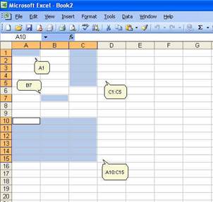
When it opens
you will see a blank worksheet, which consists of alphabetically titled columns
and numbered rows. Each cell is referenced by its coordinates of columns and
rows, for example A1 is the cell located in column A and row 1; B7 is the cell
in column B and row 7. You can reference a range of cells, for example C1:C5
are cells in columns C and rows 1 to 5. You can also reference a matrix,
A10:C15, are cells in columns A, B and C and rows 10 to 15.
Excel has 256
columns and 65,536 rows.
There are
some shortcuts to move within the current sheet:
·
"Home"
moves to the first column in the current row
·
"End
-- Right Arrow" moves to the last filled cell in the current row
·
"End
- Down Arrow" moves to the last filled cell in the current column
·
"Ctrl-Home"
moves to cell A1
·
"Ctrl-End"
moves to the last cell in your document (not the last cell of the current
sheet)
·
"Ctrl-Shift-End"
selects everything between the active cell to the last cell in the document
To
select a cell :
·
Click
on a cell (i.e. A10), hold the shift key, click on
another cell (C15) to select the cells between A10 and C15.
·
You
can also click on a cell and drag the mouse to the desire range
·
To
select not-adjacent cells, click on a cell, press ctrl and select another cell
or range of cells.
Excel
stores your work in a workbook, each workbook has one or more worksheets
(and/or charts) which you can view by clicking on the sheet tab (lower left corner
of the active (current) sheet).
You
can type anything on a cell, in general you can enter text (or labels),
numbers, formulas (starting with the "=" sign), and logical values (as in
"true" or "false").
Click
on a cell and start typing, once you finish typing press "enter" (to move to
the next cell below) or "tab" (to move to the next cell to the right)
You
can write long sentences in one single cell but you may see it partially
depending on the column width of the cell (and whether the adjacent column is
full). To adjust the width of a column go to Format -- Column -- Width or select
"AutoFit Selection".
Numbers
are assumed to be positive, if you need to enter a negative value use the minus
sign ("-") or enclose the number in parentheses ("(number)").
If
you need to enter percentages, dollar sign, or any other symbol to identify the
number just add the "%" or "$". You can also enter the number and change its
format using the menu: Format -- Cell and select the "number" tab which has all
the different formats.
Dates
are automatically stored as mm/dd/yyyy
(or the default format if changed) but there is some flexibility here. Enter
month and number and excel will enter the date in the default format. If you
press "ctrl" and ";" (Crtl-;) excel will enter the
current date.
Time
is also entered in a default format. Enter "5 pm", excel will write "5:00 PM".
To enter the current time press "ctrl" and ":" (Ctrl-:)
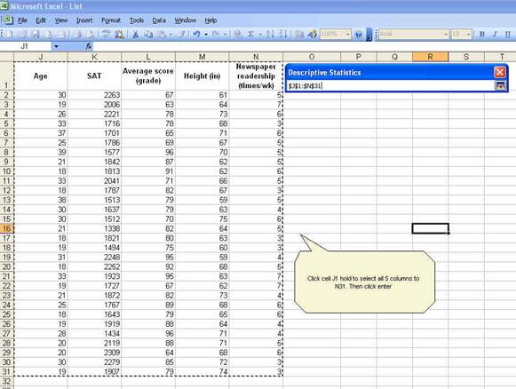
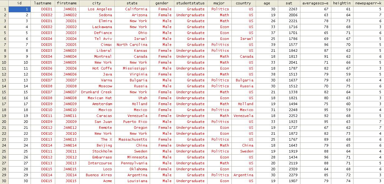
To
practice enter the following table (these data are made-up, not real)
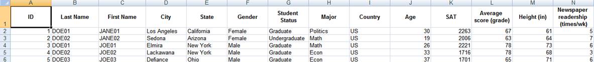
Each
column has a list of items. Column A has IDs, column B
has last names of students and so on.
Let"s say for example you do not want
capital letters for the columns "Last Name" and "First Name". You do not want
"SMITH" you want "Smith". Two options, you can re-type all the names or you can
use the following formula (IMPORTANT: All formulas start
with the equal "=" sign):
=PROPER(cell with the text you want to change)
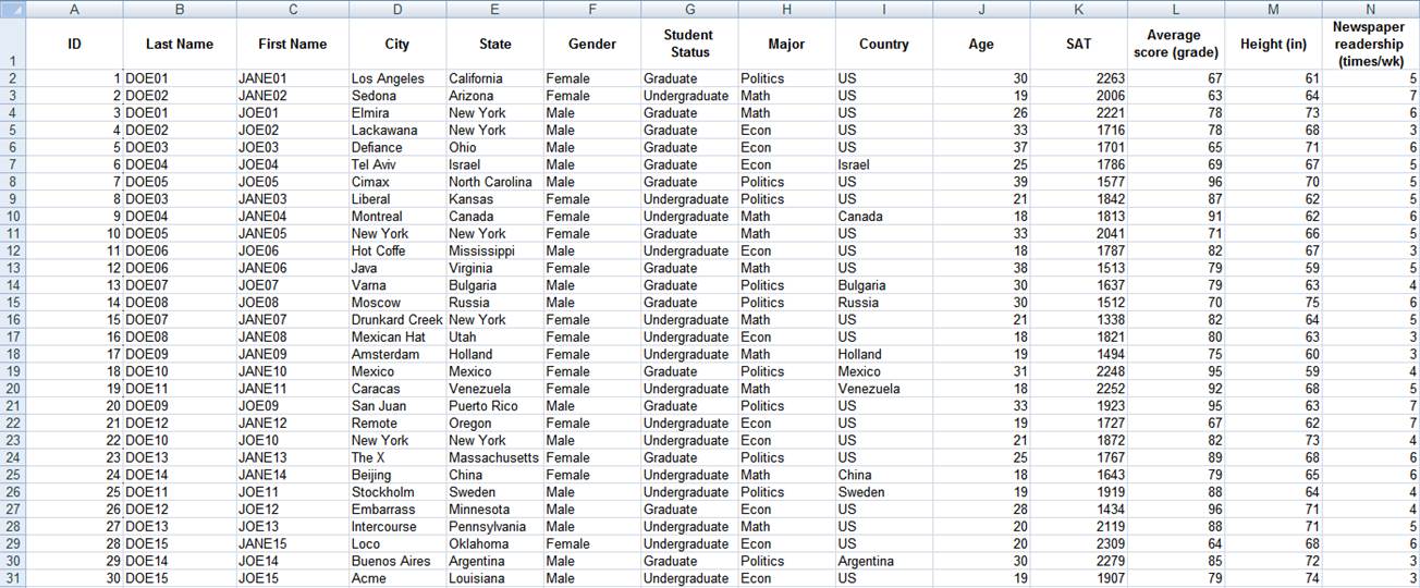
To
get the full table:Click here to get it.
The
full table should look like this. This is a made up table, it is just a
collection of random info and data.
Exploring data in excel
Descriptive
statistics (using excel"s data analysis tool)
Generally
one of the first things to do with new data is to get to know it by asking some
general questions like but not limited to the following:
·
What
variables are included? What information are we getting?
·
What
is the format of the variables: string, numeric, etc.?
·
What
type of variables: categorical, continuous, and discrete?
·
Is
this sample or population data?
After looking
at the data you may want to know
·
How
many males/females?
·
What
is the average age?
·
How
many undergraduate/graduates students?
·
What
is the average SAT score? It is the same for graduates and undergraduates?
·
Who
reads the newspaper more frequently: men or women?
You
can start answering some of these questions by looking directly at the table,
for some other questions you may have to do some calculations by obtaining a
set of descriptive statistics. These statistics are a collection of
measurements of two things: location and variability. Location
tells you the central value (the mean is the most common measure of this) of
your variables. Variability refers to the spread of the data from the center
value (i.e. variance, standard deviation). Statistics is basically the study of
what causes such variability.
|
Location |
Variability |
|
Mean |
Variance |
|
Mode |
Standard
deviation |
|
Median |
Range |
Let"s
get some descriptive statistics for this data. In excel go to Tools -- Data
Analysis. If you do not see "data analysis" option you need to install it, go
to Tools -- Add-Ins, a window will pop-up and check the "Analysis ToolPack" option, then press OK. Try running data analysis
again.
For Excel 2007 see http://office.microsoft.com/en-us/excel/HP100215691033.aspx
For Excel 2003 see http://office.microsoft.com/en-us/excel/HP011277241033.aspx
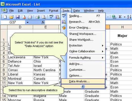
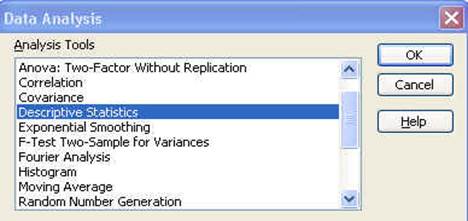
In
the pop-up window select "Descriptive Statistics" click OK.
Another
window will pop-up
Let"s
check this window:
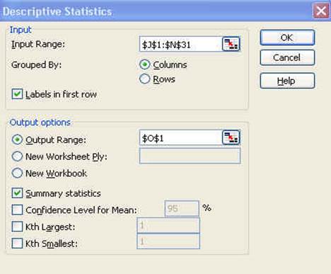
Once
you click in the input range you need to select the cells you want to analyze.
Back
to the window
Since
we include the labels in first row make sure to check that option. For
the output option which is the place where excel will enter the results
select O1 or you can select a new worksheet or even new workbook.
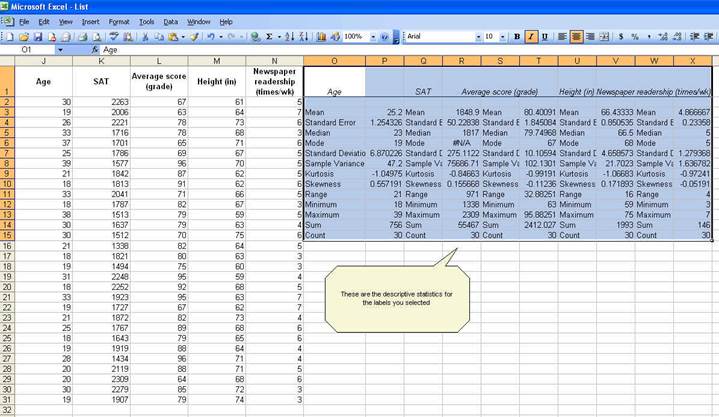
Check
"Summary statistics" and the press OK. You will get the following:
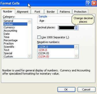
While
the whole descriptive statistics cells are selected go to Format--Cells to
change all numbers to have one decimal point. When you get the "format cells"
window, select the following:
Click OK. All numbers should now have one
decimal as follows:
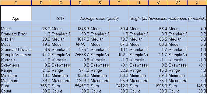
Now we know something about our data.
The
average student in this sample is 25.2 years, has a SAT score of 1848.9, got a
grade of 80.4, is 66.4 inches tall and reads the newspaper 4.9 times a week. We
know this by looking at the "mean" value on each variable.
The
mean is the sum of the observations divided by the total number of
observations. It is the most common indicator of central tendency of a
variable. If you look at the last two rows: "Sum" and "Count" you can estimate
the mean dividing "Sum" by "Count" (sum/count). You can also calculate the mean
using the function below (IMPORTANT: All functions start
with the equal "=" sign):
=AVERAGE(range of cells with the values of interest)
For "age"
=AVERAGE(J2:J31)
"Sum" refers to the sum of all the values in a range of
values. For age means the sum of the ages of all students. The excel function
for sum is:
=SUM(range of cells with the values of interest)
"Count" refers to the count of cell that contain values
(numbers). The function is:
=COUNT(range of cells with the values of interest)
"Min" is the lowest value in an array of values. The
function is:
=MIN(range of cells with the values of interest)
"Max"
is the largest value in an array of values. The function is:
=MAX(range of cells with the values of interest)
The "Standard
Error" (SE) indicates how close the sample mean is from the "true"
population mean. The average age of 25.2 years is just an estimate of this
sample of students but it can vary had you used a different set of students.
The standard error is calculated by dividing the standard deviation of the
population (or the sample) by the square root of the total number of
observations. The SE can be used to roughly define a range of certainty for the
mean. Using "age":
|
Z |
%
Certainty |
Lower
bound |
Upper
bound |
|
1 (0.99) |
68% |
23.9 |
26.5 |
|
2 (1.96) |
95% |
22.7 |
27.7 |
|
3 (2.58) |
99% |
21.4 |
29.0 |
Lower: Mean--(SE*Z) for example 25.2--(1.3 * 2) =
22.7
Upper: Mean + (SE*Z) for example 25.2 + (1.3 * 2) =
27.7
·
You are 68% certain that the average age is
between 23.9 and 26.5 years old
·
You are 95% certain that the average age is between
22.7 and 27.7 years old
·
You are 99% certain that the average age is
between 21.4 and 29.0 years old
Note
that the more certainty wider the gap.
The
median is another measure of central tendency. To get
the median you have to order the data from lowest to highest. The median is the
number in the middle. If the number of
cases is odd the median is the single value, for an even number of cases the
median is the average of the two numbers in the middle. The excel function is:
=MEDIAN(range of cells with the values of interest)
The
mode refers to the most frequent, repeated or common
number in the data. By age there are more students 19 years old in the sample
than any other group. In the SAT scores the mode is "#N/A" which means that all
values are unique. The excel function is:
=MODE(range of cells with the values of interest)
Range is a measure of dispersion. It is
simple the difference between the largest and smallest value, "max"--"min".
The
sample variance measures the dispersion of
the data from the mean. It is the simple mean of the squared distance from the
mean. It is calculated by:
SV
= sum of (X-mean of X)2 / Number of observation minus 1
Higher
variance means more dispersion from the mean.
The excel function is:
=VAR(range of cells with the values of interest)
The
standard deviation is the squared root of the
variance. Indicates how close the data is to the mean. Assuming a normal
distribution, 68% of the values are within 1 sd from
the mean, 95% within 2 sd and 99% within 3 sd. The
excel formula is:
=STDEV(range of cells with the values of interest)
Skewness measures the asymmetry of the data,
when in an otherwise normal curve one of the tails is longer than the other. It
is a roughly test for normality in the data (by dividing it by the SE). If it
is positive there is more data on the left side of the curve (right skewed, the
median and the mode are lower than the mean). A negative value indicates that
the mass of the data is concentrated on the right of the curve (left tail is
longer, left skewed, the median and the mode are higher than the mean). A
normal distribution has a skew of 0. Skewness can
also be estimated with the following function:
=SKEW(range of cells with the values of interest)
Kurtosis. The current view of kurtosis argues
that it measures the peak of a distribution. According to
Peter Westfall, that view is not quite correct. His article "Kurtosis as
Peakedness, 1905--2014. R.I.P." (http://www.ncbi.nlm.nih.gov/pmc/articles/PMC4321753/)
makes a compelling case against the current perception. In Westfall"s view, the
peak, or lack-thereof, is a symptom rather than a characteristic that shows the
presence of outliers. High kurtosis may suggest the presence of outliers.
Technically speaking, kurtosis focuses more on the tails for the distribution
than the peak, so positive kurtosis indicates too few cases in the tails or a
tall distribution (leptokurtic), negative kurtosis too many cases in the tails
or a flat distribution (platykurtic). A normal
distribution has a kurtosis of 0 (given a correction of -3, otherwise it will
have a kurtosis of 3). The excel function for kurtosis is:
=KURT(range of cells with the values of interest)
--Thank
you to Peter Westfall for useful feedback.
Exploring data using pivot tables
To
explore the data by groups you can sort the columns for the variables you want
(for example gender, or major or country, etc.) and obtain descriptive statistics
by selecting only the range of values that cover particular group. You can also
use pivot tables.
Let"s
say you are interested on looking at the average SAT score by gender and
student"s major. Let"s make the following crosstabulation
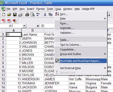
In
the excel menu go to Menu--PivtoTable and PivotChart
Report:
The
pivot wizard will walk you through the process, this is the first window
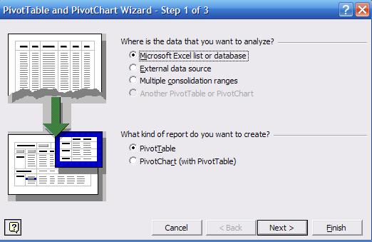
Press
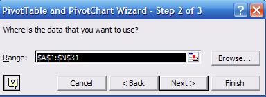
"Next". In step 2 select the range for the range of all values as in the
following picture:
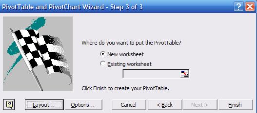
In
step 3 select "New worksheet" and press "Layout"
This
is where you make the pivot table:
On
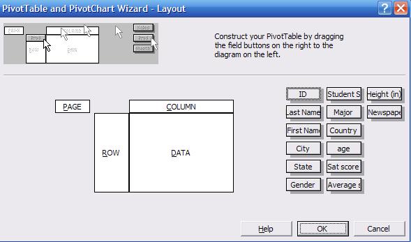
the right side of the wizard layout you can see the list of all variables in
the data. Click and drag "Gender" into the "ROW" area. Click and drag "Major"
into the "COLUMN" area, and click and drag "Sat score" into the "DATA" area.
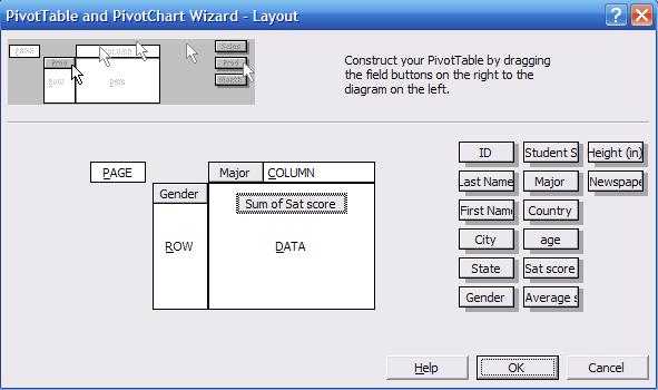
The wizard layout should look like this:
In
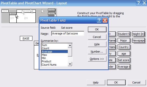
the "DATA" area double-click on "Sum of Sat score", a new window will pop-up
select "Average" and click OK.
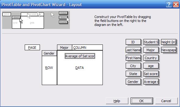
The
wizard layout should look like this. Click OK, in the wizard window step 3
click "Finish"
In
a new worksheet you will see the following (the pivot table window was moved to
save some space).
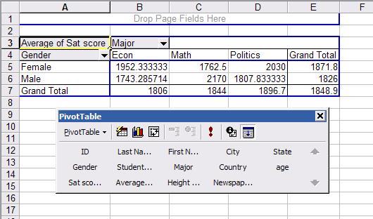
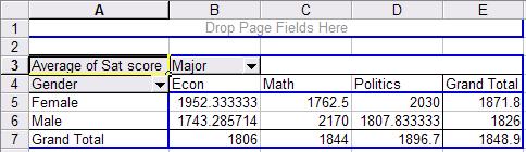
This
is a crosstabulation between gender and major. Each cell
represents the average SAT score for a student according to gender and major.
For example a female student with an econ major has an average SAT score of
1952 (cell B5 in the picture) while a male student also with an econ major has
1743 (B6). Overall econ major students have an average SAT score of 1806 (B7) .
In general, female students have an average SAT score in this sample of 1871.8
(E5) while male students 1826 (E6).
For
more information on pivot tables go to the following site.
http://www.microsoft.com/dynamics/using/excel_pivot_tables_collins.mspx
For
graphing in excel we recommend the following links.
(Histograms)
http://office.microsoft.com/en-us/excel/HA011109481033.aspx
(Histograms)
http://www.physics.upenn.edu/~uglabs/Histograms-with-Excel.pdf
http://www.fgcu.edu/support/office2000/excel/charts.html
http://www.csubak.edu/~jross/classes/GS390/Spreadsheets/ExcelCharts/CreateChart.htm
http://www.ncsu.edu/labwrite/res/gt/gt-bar-home.html
(Error bars)
http://peltiertech.com/Excel/ChartsHowTo/ErrorBars.html
(Error bars)
http://mtsu32.mtsu.edu:11009/Graphing_Guides/Excel_Guide_Line_Means.htm
One-way ANOVA using excel
Let"s
say you want to explore whether there is a relationship between the average
score (grade) of each student and his/her major. In the sample we have three
majors: Econ, Math and Politics. The grades are the final grades for the entire
academic year.
To
do this we use one-way ANOVA, which stands for "analysis of variance". ANOVA
"is a broad class of techniques for identifying and measuring the various
sources of variation within a collection of data" (Kachigan,
p. 273, 1986). It is closely related to regression analysis but with the
following difference: "[w]e can think of the analysis of variance technique as
testing hypotheses about the presence of relationships between predictor
and criterion variables, regression analysis as describing the nature of
those relationships, and r2 as measuring the strength of the
relationships" (ibidem.) In other words, ANOVA
"tests whether the means of y [grades
in this example] differ across categories of x [majors]" (Hamilton, p. 149)
With
the above in mind, let"s see if there is a relationship between student"s
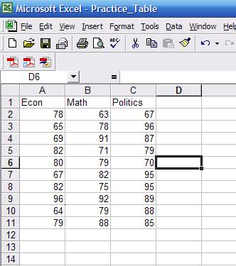
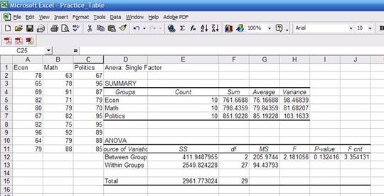
majors and student"s final grades. First we need to rearrange the data so excel
can run the ANOVA. Using only the columns "major" and "average score (grade)".
Copy and paste both columns into a new sheet, sort by major (Data--Sort,
select the column for major and sort ascending) separate by group. Final table
should look like this..
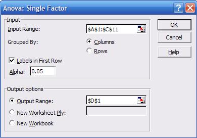
Go
to Tools -- Data Analysis, in the pop-up window select "Anova:
Single Factor", the following screen will pop-up
It
looks similar to the one we got when we obtained
"descriptive statistics". Select the input range, check "labels in First Row",
and select as output range "D1", click OK. You"ll get the following:

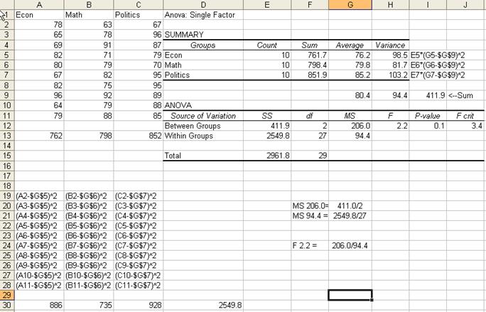
By
now you should be familiar with the summary statistics presented in the first
table. You may notice that the "sum" column has decimals while the data seems
to be integers. The sum has decimals because some of the scores have decimals;
they are just rounded to the nearest integer.
In
the ANOVA table:
·
Sources
of variation. The
analysis of variance requires the estimation of two variances: between groups
(econ, math and politics) and the within groups (students).
·
SS. Sum of square deviations
·
df.
Degrees of freedom. For between groups is 2 (number of majors minus 1) and for
within groups is 27 (number of students minus number of majors).
·
MS. Mean square of deviations (variance
estimates), which is equal to SS/df, Roughly 411/2
and 2549/27.
·
F. Is a probability distribution.
It is the ratio of two variances.
Roughly 205/94=2.18. According to Kachigan, the F is
the ratio of:
![]()
·
P-value. This is the value that answers your
question. We wanted to know whether there is some sort of relationship between
majors and grades. ANOVA assumes by default that there is no relationship. As a
general rule, a p-value greater than 0.05 means ANOVA"s assumption may be
right. We got a p-value of 0.13 which is greater than 0.05, so it seems there
is no relation between a student"s major and his/her final grade. Had the
p-value been lower than 0.05 then we would have found some kind of relationship
between majors and grades.
·
F-crit. It is the critical value to check
whether we reject of fail to reject ANOVA"s assumption. Check the table for
0.05 confidence at http://www.statsoft.com/textbook/sttable.html#f05
Here
is a general overview on how some numbers were estimated. Follow the
coordinates by columns and rows
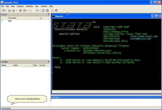
Stata
is a statistical package to help you perform data analysis, data manipulation
and graphics.
To
open Stata go to Start -- Programs -- Stata[ver.*] -- Stata[*]. For cluster
computers contact OIT for instructions. When you open Stata this is what you
will see:
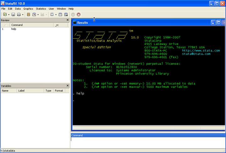
Here
are some brief explanations.
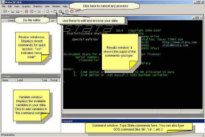
You can
always use the "point-and-click" method by using the menu. We recommend
however, for most of the procedures, to use the command line.
When you work
with Stata there are three basic procedures you may want to do first: create
a log file, set your working directory, and set the correct
memory allocation for your data)
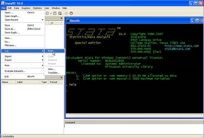
The
log file records everything you type and get while working in Stata. Commands
and output are send to a text file for you to review later. Think of it as a
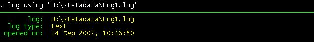
"tape recorder" for your Stata session. To create a log file go
to File -- Log -- Begin
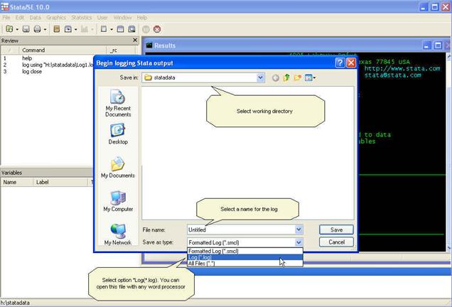
Select
the working directory. In this case will be H:\statdata\. Name the log and
select the type "Log (*.log)".
In
the results window you will something like
The second
thing to check is your working directory. To do this in the command window type
the following
pwd
Which stands
for "print working directory". This will show you your working directory, which
right now, in this example is H:\statadata.
![]()
To see what
is in that directory (good old DOS command). Type
dir
For the
purposes of this course we will work in the following directory
H:\statadata\
To change
directory type in the command window
cd H:\statadata\
![]()
You can check
your current directory by looking at the lower left of the Stata screen.
The third
initial step is to set the necessary memory allocation. In the picture above
you can see in green letters after "Notes:" that the memory allocation is 10 mb. This will be enough for a medium size database but
sometimes you may need more memory space to store your dataset. To determine
the size of your dataset follow the formula:
Size (in
bytes) = (8*Number of cases or rows*(Number of variables + 8))
Depending on your
Stata version and computer power, you can allocate up to around 2 gigabytes. To
allocate 1 g you can type:
set mem 1g
From Excel to
Stata
To
put Excel data to Stata you can simply copy-and-paste.
NOTE: Not recommended for really big
datasets or datasets with long string variables and lots of special characters
(like ";",",","#","%", etc.)
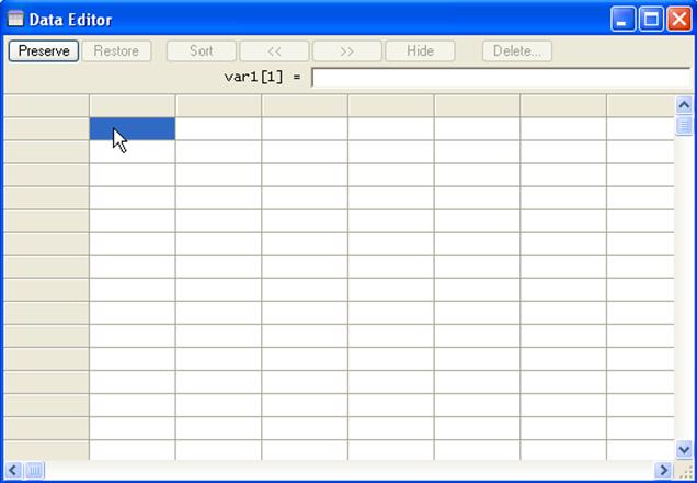
Got
to Stata, click on the "Data editor" icon

A
new window will pop-up, is the data editor window where you can input data or
simply paste it.
In
Excel, select the whole table (A1:N31). Press Ctrl-C. Go to the "Data Editor"
in Stata and paste the table (Ctrl-V)
Numbers
are always black. Red indicates error, in the editor"s case indicates that
values are not numbers, in this case letters or string characters. Close the
data editor by clicking on the "X" in the upper right corner
The
variable window will be populated with all the variables in your data
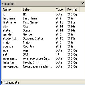
Stata
automatically eliminates the space in your original titles but keep the format
in the "Label" column. "Type" refers to whether the data is number or string (str*). "Format" shows the length of the variable. In the
command window type help format for
details.
The
whole screen will look like this
Descriptive
statistics
To
start exploring the data you may want to know how many
graduates and undergraduates are in the sample. For this type in the command
window (type help tab for more details):
tab studentstatus
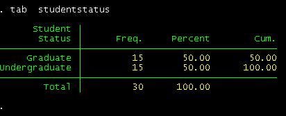
We
have 15 undergrads and 15 grads.
How
many females/males?
tab gender
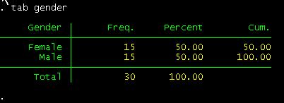
How
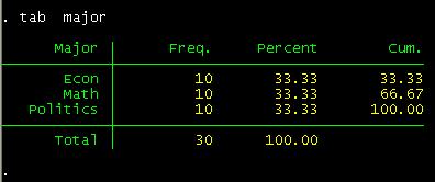
many are econ/politics/math major?
tab major
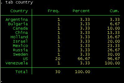
From
what country?
tab country
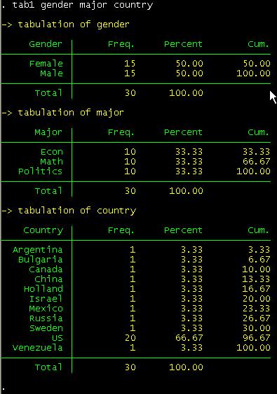
If
you want to run frequencies for more than one variable at the same time use tab1 not tab.
tab1 gender major country
You
should get something like this:
If you want
do a crosstabulation you type:
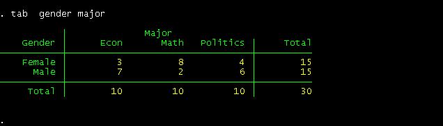
tab major gender
This is
tab [variable by rows] [variable by column]
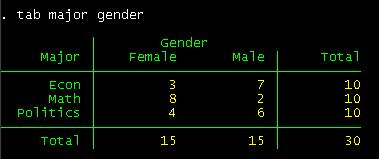
Crosstabulation shows you the subgroups formed by two
variables. You can see that in the sample there are 10 econ majors 3 of which
are females and 7 males. You could also say that there are 15 males 7 of which
are econ major, 2 math and 6 politics.
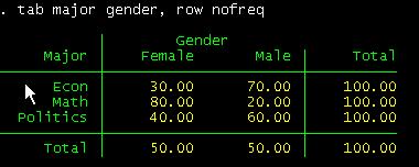
If you want
percentages by major instead of counts type:
tab major gender, row nofreq
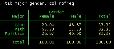
Or by column:
tab major gender, col nofreq
To see more
options type help tab in the command window.
To get more
information on your data we will use the commands: describe, summarize, tabstat and a combination of tab and summarize.
In the
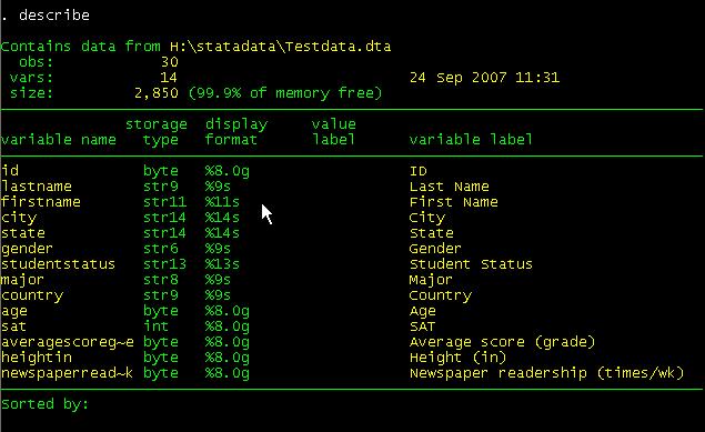
command window type describe.
The describe command will provide you info for the
active dataset and the format of the variables ("display format"). [Hit enter
or spacebar to see the rest of the list]. Type help describe for further details (if the "--more--
" message bugs you, type set
more off)
Summarize will provide you with some familiar
descriptive statistics.
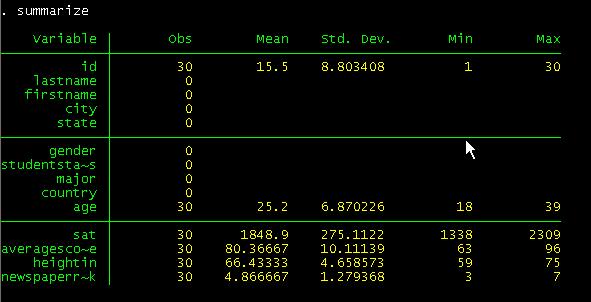
If
you type summarize, detail, you will get a more detail set of statistics (press
bar space to continue)
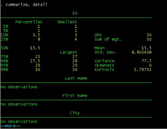
We
skip some results to accommodate some in one window.
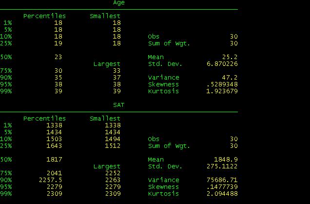
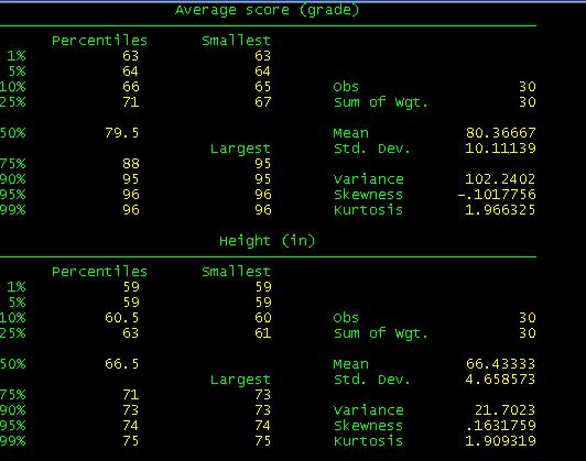
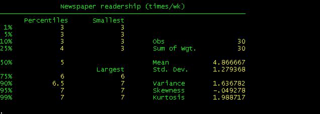
When
you compare these results with the excel file you will see they are basically
the same with the exception of Skewness and Kurtosis which Stata calculates
differently.
Tabstat is another command that provide
summary statistics
In
the command line type. To fastrack type tabstat and then click on each variable in the variables windowo. The "s" before the parenthesis stands for
"statistics" here you select the statistics you need.
tabstat age sat averagescoregrade heightin newspaperreadershiptimeswk, s(mean semean
median sd var skew k count
sum range min max )
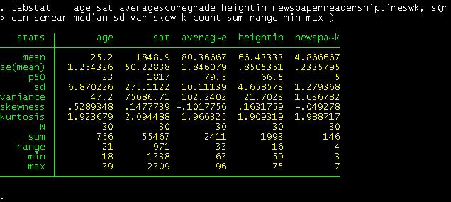
This
table looks similar to the one obtained in excel. Notice that "p50" is the
median.
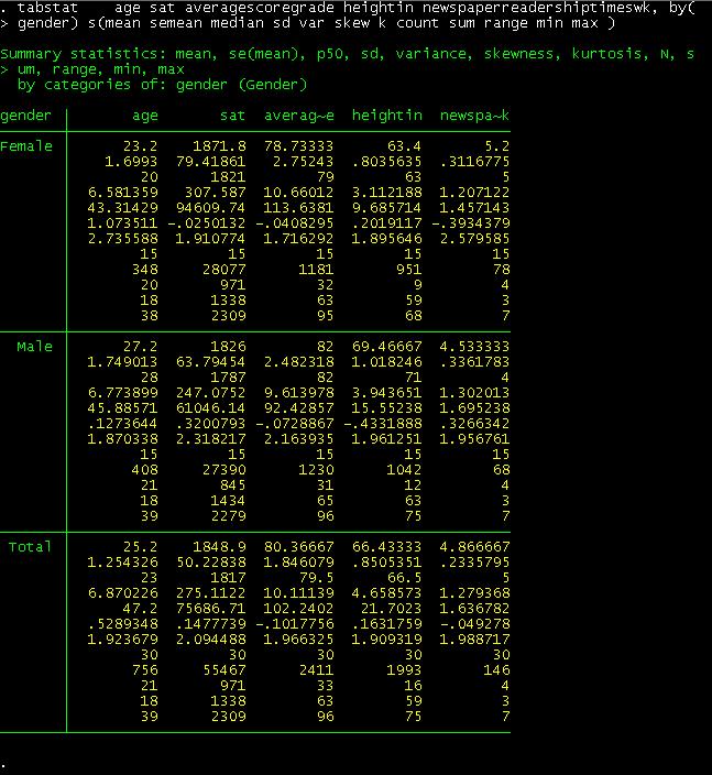
If
you are interested in getting these statistics by gender just add after the
comma the option by(gender)
To
recreate the pivot table we did in excel we just type the
following:
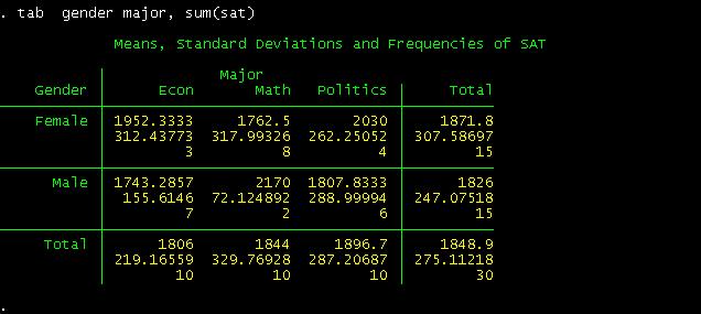
This
is a crosstab between gender and student"s major regarding SAT"s scores. The
following part provide us the way to read the table
![]()
For
example, for the cross between females and Econ. A female student with an econ
major has an average SAT score of 1952, with a standard deviation of 312 and in
the sample there are only three students in this category.
Without
the option sum(sat), we will get a simple crosstabulation
between gender and major
You
can have more options if you want (type help
tab for details). For
example if you want percentage by columns and row type:
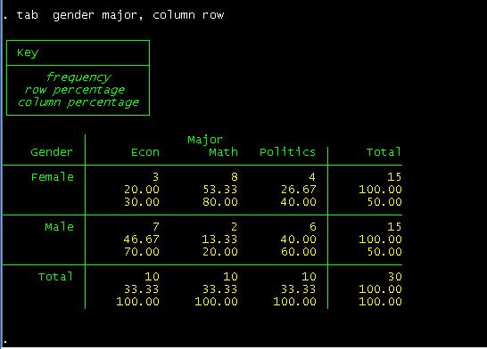
You
can read this table as follows. Among female students, 20% are econ major,
53.3% are math and 26.67% are in politics.
Among
econ majors, 30% are females and 70% are males.
Let"s
say you wan only column percents,
type
tab gender major, column nofreq
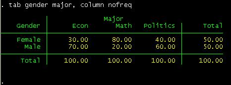
Notice
the "nofreq" option.
By the way, remember the little warm-up we had in excel
converting last and first names into proper format? Well, we can do that in
Stata as well. The following introduces a way to generate new variables (type help generate for more details)
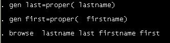
When
you hit enter after browse you will see the
difference.
Rolling standard deviation
*******If you do not see
the menu on the left click
here to see it
NOTE: Replace words in italics with your own
This
will produce a rolling standard deviation every three years as indicated in the
option window()
below, adjust it to your desired window:
cd H:\
use http://dss.princeton.edu/training/Panel101.dta,
clear
xtset country year
rolling x1_sd=r(sd),
window(3) saving(x1_sd): sum x1
use x1_sd
rename end year
save, replace
use http://dss.princeton.edu/training/Panel101.dta,
clear
merge 1:1 country year using x1_sd
drop _merge
For
more details type
help rolling
For
similar commands type
help tssmooth
ANOVA using
Stata
*******If you do not see
the menu on the left click
here to see it
One-way
ANOVA tests whether the mean of the dependent variable (y) is statistically significant among different categories of the
independent variable (x). The format
is
oneway [measurement] [categorical]
In
the example below, we are interested on testing whether a student"s major has
some effect on his/her grade. Type:
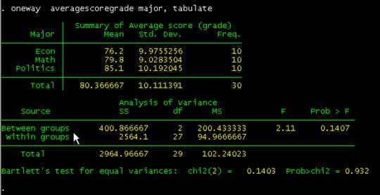
oneway averagescoregrade major, tabulate
Comparing
these with the results using excel (shown below) they are pretty close. "Prob>F" is the p-value which has to be lower than 0.05
(for 95% confidence) to be significant. Conclusions are basically the same.
For
more details and more options type help
oneway.
As
an exercise run one-way ANOVA by gender.
If
you go to the menu and click "Graphics" you will see all the graphing options available
in Stata. If you do not have it already, click
here to get the data to do these graphs.
Let"s
see one basic scatterplot. We will add some options later.
Scatterplots are good to explore possible relationships between variables and
to identify outliers. In this case we want to explore visually whether there is
some relationship between age and SAT scores. If there is some kind of
relationship we would be able to see a specific patter (linear, curve, concave,
etc.). For many more bells and whistles type help scatter
in the command window. The format is twoway scatter y x.
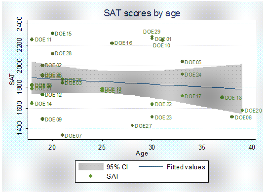
For starters let"s type:
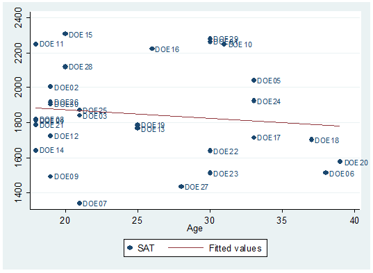
twoway scatter sat age
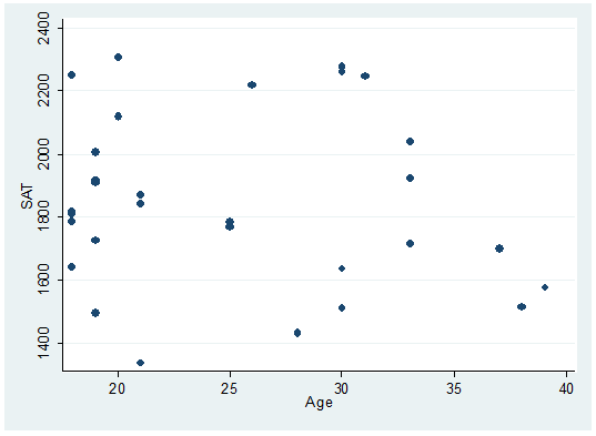
There
seems to be a downward relationship, older students may show lower SAT scores.
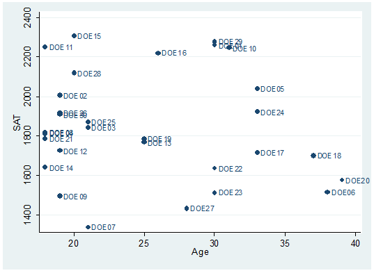
Each dot represents a student, the option mlabel below will help you identify and label the dots.
twoway scatter sat age, mlabel(lastname)
To
fit a regression line type:
twoway scatter
sat age, mlabel(last) || lfit
sat age
You
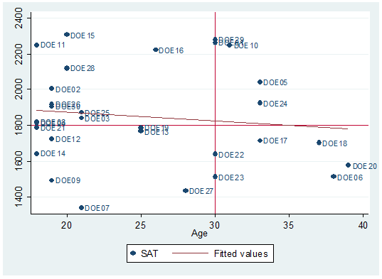
may want to add some quadrants as in the following.
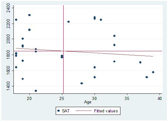
Quadrants
here represent the mean of both variables. Here is how to do it:
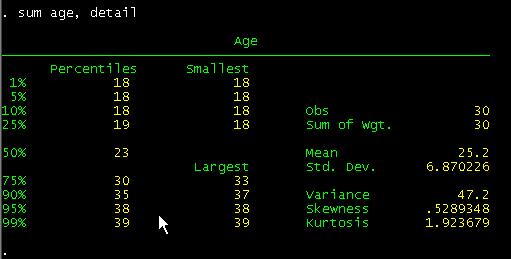
Type
sum age, detail
Then
type:
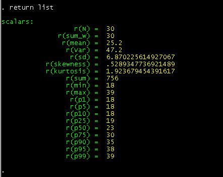
return list
In
this case we are interested in the mean of "age", so we save it as a temporary
variable by typing:
local meanage=r(mean)
![]()
We
do the same thing with "sat"
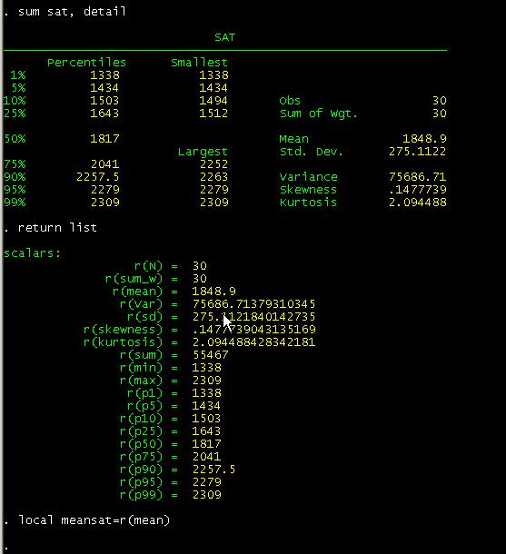
The
local command is used for macros an assigns strings names to macros. In this case we create temporary variables. To
make the graph with the quadrants type:
twoway scatter
sat age || lfit sat age, yline(`meansat') xline(`meanage')
Notice
the "yline" and "xline"
options after comma and the single quotes.
If
you want to set your own parameters for the quadrants just type the number in
the "yline" and "xline"
options. For example we want lines that cross age at 30 and SAT at 1800:
twoway scatter sat age, mlabel(lastname) || lfit sat age, yline(1800) xline(30)
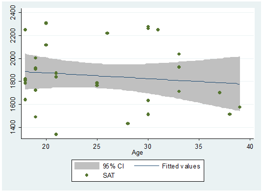
If
you want to include the confidence bands we have to reverse the order of the
graphs because the shaded area tends to cover the dots. So we graph the
confidence region first, then the scatter.
twoway (lfitci sat age) || (scatter sat age)
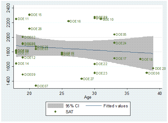
Or
with labels.
twoway (lfitci sat age) || (scatter sat age, mlabel(lastname))
You
may want to add a title to the graph and a title to the y-axis.
twoway (lfitci age sat) || (scatter age sat, mlabel(lastname)), title("SAT scores by age") ytitle("Age")

One
problem in the graph is that some labels overlap making it difficult to read
them.
We
can rearrange them by moving them around the marker in a 12-hour clock
position.
We
need to create the variable position
first. Type:
generate position=3
Position
= 3 is the default, notice that all labels are to the right of the marker (3
pm).
We"ll
move DOE29 to 12 o"clock and DOE10 to 6.
replace
position=12 if lastname=="DOE29"
replace
position=6 if lastname=="DOE10"
[IMPORTANT: If you get the message "(0
real changes made)" make sure you spell the names correctly, Stata is
case-sensitive.]
To
change the desired positions use the option mlabv()
twoway (lfitci sat age) || (scatter sat age, mlabel(lastname) mlabv(position)),
title("SAT scores by age") ytitle("SAT")
You
may want to see if there is some kind of relationship by particular groups,
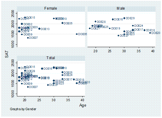
let"s say by gender.
twoway scatter sat age, mlabel(lastname) by(gender,
total)
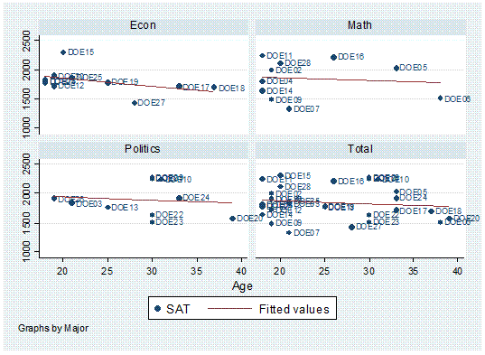
Or
by major,
twoway scatter age sat, mlabel(lastname) by(major, total)
|| lfit age sat
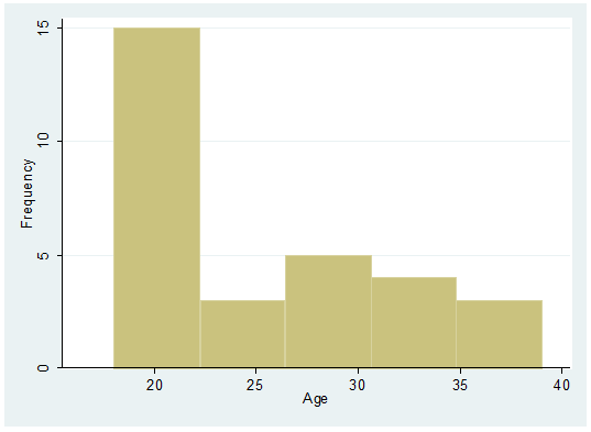
Histograms
are another good way to visually explore data, especially to check for a normal
distribution; here are some examples (type help histogram
in the command window for further details):
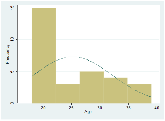
histogram age, frequency
Adding
a normal curve…
histogram age, frequency normal
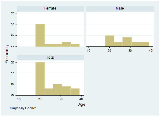
Age
by gender
histogram age, frequency by(gender,
total)
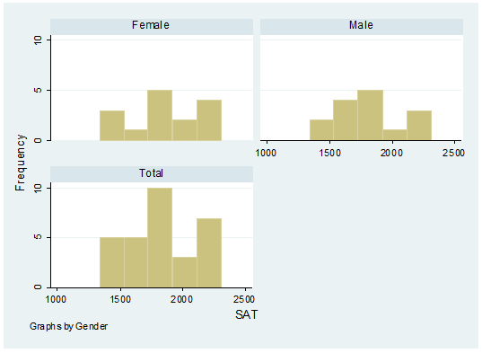
A
histogram with SAT scores by gender.
histogram sat, frequency by(gender,
total)
To
save graph right-click on the graph, select "save graph" or you can also copy
it to word by selecting "copy graph".
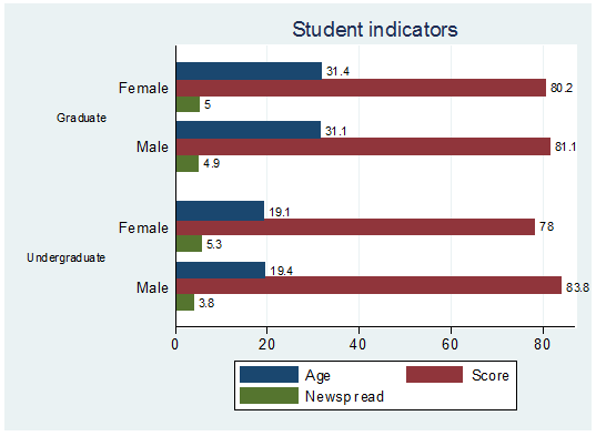
Bar chart
graph hbar (mean) age averagescoregrade newspaperreadershiptimeswk, over(gender) over( studentstatus,
label(labsize(small))) blabel(bar)
title("Student indicators")
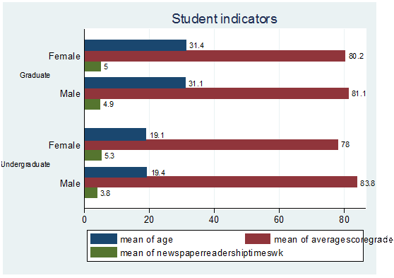
graph hbar (mean) age averagescoregrade newspaperreadershiptimeswk, over(gender) over(studentstatus, label(labsize(small)))
blabel(bar) title(Student indicators) legend(label(1
"Age") label(2 "Score") label(3 "Newsp
read"))
Graphing categorical data
To
graph categorical data in Stata you will need a special program called catplot. If your version of Stata does not
have it, you can install it by typing
ssc install catplot
Now
type:
tab agegroup
major, col row cell
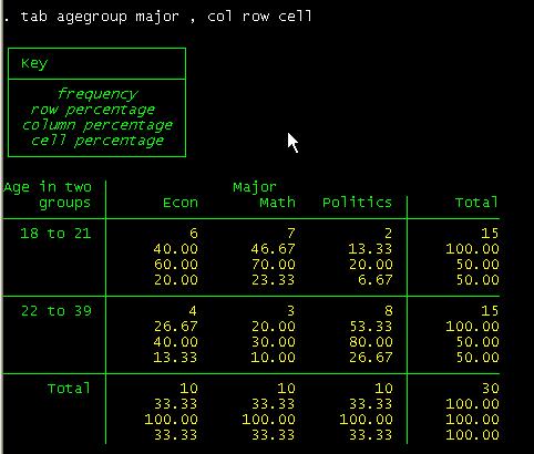
To
graph this table type:
catplot bar major agegroup, blabel(bar)
This will get you the following:
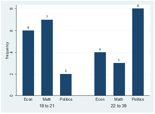
Notice you may have to create the variable "agegroup" which is a recode of "age" where 1 "18 to 21" 2
"22 to 39".
The
labels on the graph correspond to the number of students on each group. For
example there are 6 students econ majors with ages between 18 to 21.
If
you are interested on the percentages within "agregroup"
you can specify this as follows:
catplot bar major agegroup,
percent(agegroup)
blabel(bar)
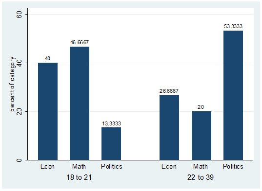
The
percent() option indicates the reference group
displayed in the graph. The labels on the previous graph correspond to the
second row in the crosstab between agegroup and
major.
If
you are interested on the percentages within "major" you can specify this as
follows:
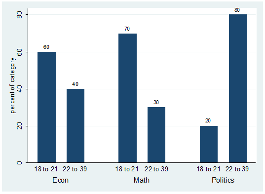
catplot bar agegroup major,
percent(major) blabel(bar)
References
and useful links
Hamilton, Lawrence C.Statistics with Stata (updated for Version 9). Brooks/Cole, 2006
Kachigan, Sam, Statistical analysis: an interdisciplinary introduction to univariate
& multivariate methods.
Textbook Examples.
Regression with Graphics. by Lawrence Hamilton
http://www.ats.ucla.edu/stat/examples/rwg/
Stata Library. Graph
Examples (may not work with STATA 10)
http://www.ats.ucla.edu/STAT/stata/library/GraphExamples/default.htm
DSS help-sheets for STATA
http://dss/online_help/stats_packages/stata/stata.htm
Introduction
to Stata (PDF),
Christopher F. Baum,
A 67-page description of Stata, its key features and benefits, and other useful information.
http://fmwww.bc.edu/GStat/docs/StataIntro.pdf
STATA Corporation"s links to resources for learning STATA
http://stata.com/links/resources1.html
STATA FAQ website
http://stata.com/support/faqs/
Useful links to data, software and analysis
http://www.princeton.edu/~otorres/
UCLA Resources to learn and use STATA
http://www.ats.ucla.edu/stat/stata/
Graphs in
Stata
http://data.princeton.edu/stata/Graphics.html