Recently in Acquisitions Category

Painting the book page

sterne5.jpg
sterne2.jpg

sterne4.jpg

Laurence Sterne (1713-1768). Voyage Sentimental. Traduction nouvelle par Alfred Hédouin. Paris: Librairie des Bibliophiles, 1875. Extra-illustrated with watercolors in the margins by Louis Emile Benassit (1833-1902) specially commissioned for this volume. Graphic Arts GAX 2011- in process.

sterne1.jpg
sterne3.jpg

Twenty-first Century WunderCabinet

wondercabinet6.jpg

The WunderCabinet. The Curious Worlds of Barbara Hodgson & Claudia Cohen ([Vancouver]: Heavenly Monkey Editions, 2011). One volume housed in a box decorated with onlaid wood veneers. Each box also contains a unique assortment of approximately two dozen objects, divided between several compartments, with a handwritten catalogue itemizes each object. Designed by Barbara Hodgson. Printed by Rollin Milroy at Heavenly Monkey. Paper made by Reg Lissel. Peter Braune and Lesley Anderson of New Leaf Editions printed the frontispiece copperplate etching. Hand coloring and other embellishments by the authors. Bound by Claudia Cohen. Copy 3 of 30. Graphic Arts GAX 2011- in process

wondercabinet5.jpg
wondercabinet4.jpg
“The WunderCabinet is Cohen and Hodgson’s interpretation of … 16th-to-18th century cabinets of curiosities. It is a glimpse into the authors’ own collections through essays, images and objects. … In the spirit and mode of the authors’ ongoing series of books exploring color …, the many & diverse images … take a variety of forms, whether engraved, hand drawn, hand coloured, layered or collaged. Objects included with the book follow this tradition and complement the topics covered in the book.”
wondercabinet2.jpg
wondercabinet1.jpg
wondercabinet3.jpg

Tired of Bridge? Play Dickens

dickens cards3.jpg
dickens cards4.jpg
dickens cards1.jpg

dickens cards2.jpg
Characters from Charles Dickens. A Game. [London, Jaques & Son, ca.1858.] 54 cards (94 × 65 mm).

One of many Victorian card games developed by the firm John Jaques & Son to capitalize on the popular novels of the period. We assume the date of these cards is around 1858, since there is no mention of A Tale of Two Cities (1859), Great Expectations (1861), or Our Mutual Friend (1865). According to the rules, any number can play up to eight. Each of the thirteen “quartettes” of characters equals a suit and when one player collects the whole suit, he gets the “trick.” The first player to get three “tricks” is the winner.

Photographing Venus and Thebes

| 1 Comment
abney6.jpg

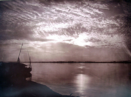
A Sunset at Thebes, negative 1874, woodburytype 1876

On June 8, 2012, the last transit of Venus (when the planet passes between the earth and the sun) will occur in our lifetime. This rare event takes place in pairs eight years apart separated by gaps of ~122 years. For our generation, this means 2004 and 2012. Before this, the last pair of transits took place in December 1874 and December 1882.

For the 1874 transit, the British Observatory sent five expeditions to different parts of the world; including Hawaii, the Mauritius Island, the Kerguelen Island, Cape Town, and Egypt. Charles Orde Browne led the party to Cairo, which included photographer William de Wiveleslie Abney (1843-1920).

abney2.jpg
abney5.jpg

According to the Oxford Dictionary of National Biography, Abney was educated at the Royal Military Academy at Woolwich and, after a brief service in Bombay, was stationed at Chatham in 1871. As assistant to the instructor in telegraphy at the School of Military Engineering, Abney was given a small laboratory and photographic darkroom.

abney10.jpg

By the end of that year, he published Instruction in Photography for Use at the School of Military Engineering and became an active member of the Royal Photographic Society of London. Thanks to the generous donation of David H. McAlpin, Class of 1920, we hold this and most of Abney’s other scientific studies.

The young officer’s work led directly to the formation of a new school of chemistry and photography in 1874, with Abney as assistant instructor. Then, at the age of thirty-one, he was asked to organize the photographic observation of the transit of Venus from Egypt.

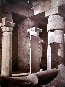
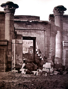
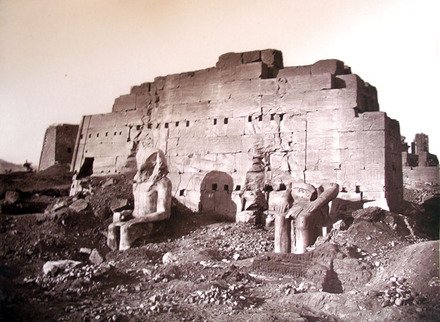
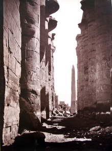
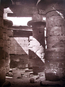
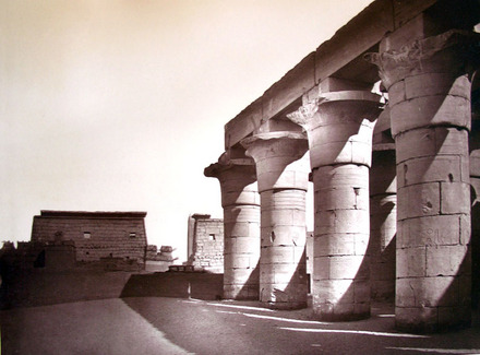
While in Egypt, Abney and his three assistants also created dozens of photographs not directly related to Venus, forty of which he later published in Thebes and its Five Great Temples (1876). A copy of Abney’s book with outstanding woodburytypes has been acquired by Princeton University.

abney8.jpg
abney9.jpg

In a letter sent to the London Photographic Society in 1875, Abney wrote, “…My chief work lay at Thebes, distant nearly 500 miles to the south of Cairo; and it was a matter of no small anxiety to me how I should transport all my instruments and observatory to that spot. The boats, or “dahabeaths” as they are called, would hardly have taken all unless I had engaged one which was out of all proportion to the passenger accommodation which I required.”

“…We started on the 25th October from Cairo, our baggage occupied three large trucks on the railway … On the 7th November we sighted Karnak just at sunset, and a glorious vision it was. The old ruins seemed like rubies set in the dark green of the palms which rose between us and them.”

“…We had taken out some ten dozen dry plates for solar work, which we had prepared at home, and began exposing them … I may mention one fact, viz., that dissolved dried albumen was used instead of white of eggs … On the day of the transit we exposed a plate about every one and a-half minute during the transit, beginning about twenty minutes after sunrise and finishing twelve minutes before internal contact.”

“As each plate was exposed it was passed into the dark room through a different aperture, taken out of the slide by a second sapper in the dark room, placed in its own groove, and the slide passed to be filled from the next box. I personally placed the slide in the photoheliograph, exposed each plate, taking up the time from my chronometer, and registered the number of the plate as shown on the back, together with the exact time of exposure.”

abney7.jpg

Abney’s photographs of Venus can be seen at National Maritime Museum, Greenwich. Here is one: http://www.nmm.ac.uk/server/show/conMediaFile.15732

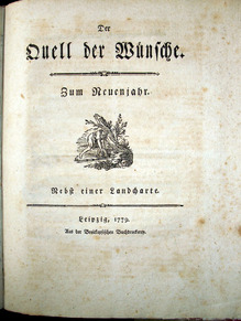
William de Wiveleslie Abney (1843-1820), Thebes and its Five Greater Temples (London: Sampson, Low, Marston, Searle & Rivington, 1876). 40 woodburytypes and descriptive text on the Egyptian city and its monuments, including Karnak, Luxor, Medinet Haboo, the Memnonium, and the Goorneh Temple. Graphic Arts GAX 2011- in process. OCLC lists only eight other copies in the United States.

Examples of Early Heraldic Seals

boutell1.jpg

Charles Boutell (1812-1877). Examples of Early Heraldic Seals. Unpublished, February 1857. Graphic Arts GAX 2011- in process.

boutell2.jpg
boutell3.jpg
boutell4.jpg

This unpublished volume with samples of royal and other seals was compiled by Charles Boutell, a writer on heraldry and antiquities, who published A Manual of British Archaeology in 1858 and A Manual of Heraldry, Historical and Popular in 1863. It appears to be an early model for a publication (never completed), with the author pasting together various illustrations and preparing handwritten captions in several colors. The endpaper is inscribed “Ellie HB from CB”, which presumably means that Boutell gave it to his daughter.

The Riot in Broad Street

wheatley riot9.jpg

James Heath (1757-1834) after Francis Wheatley (1747-1801), The Riot in Broad Street, 1790. Hand colored engraving. Graphic Arts 2011- in process

wheatley riot8.jpg

The British Parliament passed the first Act for Catholic Relief in 1778 and the following year, Lord George Gordon (1751-1793), president of the London Protestant Association, formed a campaign in opposition. On June 2, 1780, Gordon and 60,000 protesters marched for the withdrawal of Catholic emancipation.

In the following days about 100 buildings owned by Roman Catholics or by the Catholic Church were looted or burnt down. The Bank of England, Buckingham Palace and Downing Street were all attacked. On June 7, the militia was called in; nearly 450 people were arrested and 300 were shot.

wheatley riot7.jpg

A few years later, the artist Francis Wheatley (1747-1801) was inspired to paint the scene and on April 13, 1784, print publisher John Boydell (1719-1804) entered into a contract with Wheatley to use his painting as the basis for a large engraving. The original contract can be seen in the collection of William H. Tower, Class of 1894 (1871-1950) in Firestone Library (CO911, Box 7, folder 30). Boydell paid Wheatley £210 for the loan of the painting to make prints he then sold for 1 guinea each. James Heath (1757-1834) was commissioned to engrave the copper plate.

Before the work was completed, there was a fire at Heath’s house and the painting was destroyed. Unfortunately, the contract stipulates that Boydell was responsible to return the work, barring “Fire or other Inevitable Accidents.” The engraving was issued in 1790.

wheatley riot2.jpg
wheatley riot3.jpg

18th-century Dutch Gilt Paper

paper 1.jpg

According to Etherington & Roberts’ Dictionary of Descriptive Terminology, this type of 18th-century decorative paper was known as “Dutch Gilt,” although it was actually produced in Germany and Italy. The decoration was meant to imitate the brocades and damasks of the period. Many are embossed and the printing of colors was done by wood or metal rollers, along with added stenciling.

paper 2.jpg

This sheet has been identified as pattern number 4, a floral pattern on embossed, gilt, and color-stenciled paper made by Paul Raymund in Nuremberg, 1700s. These sheets were often used for temporary paper bindings, especially on small children’s books.

paper 3.jpg

Dutch Gilt or Brocade papers were imported and exported throughout Europe, as well as to the United States. Rare Books and Special Collections holds a number of volumes either bound in Dutch gilt papers or using them as endpapers. Below is an example from the Sinclair Hamilton Collection in Graphic Arts, published just north of us in Elizabeth, New Jersey.

paper 4.jpgTitle page
paper 5.jpgCover

Westminster Assembly (1643-1652), The New-England primer, improved, for the more easy attaining the true reading of English. To which is added, the Assembly of Divines Catechism (Elizabeth-town [N.J.], Printed and pub. by Shepard Kollock, 1795). Bound in Dutch gilt paper wrappers. Gift of Sinclair Hamilton. Graphic Arts Collection (GAX) Hamilton 1373

Mathew Brady's 1859 Senate

bradysenatecompositepostvalerieMaster2.jpg

Mathew Brady (1822-1896), Composite of the Members of The United States Senate, 1859. Salted paper print, 11.75 x 9.5 inches on mount trimmed to 12.5 x 10 inches. Graphic Arts GA 2011- in process

Mathew Brady was the most celebrated of the early American photographers. In 1844, he opened his first commercial studio in New York City and added a Washington D.C. branch in 1856. His success was, at least in part, thanks to the expert operators he employed, included Alexander Gardner, Timothy H. O’Sullivan, George N. Barnard, among others. Many of these men left Brady’s studio during the Civil War and a few years later, Brady was forced to declare bankruptcy. He was never able to regain his early success and died penniless.

Princeton’s graphic arts collection has acquired a salt print composite of the United States Senate; one of only three known imperial prints of this historic image. To create the print, Brady and his operators photographed each member of the Senate individually, then cut and collaged the photographs and finally, re-photographed the composite.

brady key.JPG

It would have been worth the trouble, had South Carolina not seceded from the Union shortly after the composite was finished. By the time Brady was ready to sell copies of this photograph, it was already out of date.

Only two other copies have been located, thanks to the research of William Becker. One is in the Prints & Photographs Division of the Library of Congress. That print carries the handwritten notation, “Deposited in Clerk’s office Southern Dist. New York Sept. 20, 1859.” Library of Congress also holds a copy negative of the “key,” a reduced-size copy identifying each of the sitters (copied here on the left).

The other copy of Brady’s Senate photograph is owned by the New-York Historical Society.

The print now at Princeton University was originally the property of U. S. Rep. Henry Waldron (1819-1881), six term Congressman from Hillsdale, Michigan.

Becker has also identified ten of the fourteen members seen in Brady’s composite as ones who were expelled from the Senate for supporting the Confederate rebellion. At least twelve others resigned or withdrew after their states seceded from the union. The composite also depicts Sam Houston of Texas, who served in the US Senate from 1846 to March 4, 1859; Sen. Hannibal Hamlin of Maine, who resigned January 17, 1861 to become Vice President of the United States under Lincoln; and Sen. David C. Broderick of California, who died September 16, 1859 after being mortally wounded in a duel with the chief justice of the supreme court of California.

Brady’s 1859 Senate composite includes the following members who did not complete their terms due to the outbreak of the Civil War:

Alabama: Benjamin Fitzpatrick (withdrew January 24, 1861); Clement Claiborne Clay (withdrew January 24, 1861)
Arkansas: William K. Sebastian (Expelled July 11, 1861); Robert Ward Johnson (Term Ended (?) March 3, 1861)
Florida: Stephen R. Mallory (withdrew January 21, 1861); David L. Yulee (withdrew January 21, 1861)
Georgia: Robert A. Toombs (withdrew February 4, 1861); Alfred Iverson, Sr. (withdrew January 28, 1861)
Indiana: Jesse D. Bright (Expelled February 5, 1862 for support of the Rebellion)
Kentucky: John C. Breckinridge (14th Vice President of US; Democratic Candidate for President of US, 1860; Expelled Dec. 4, 1861; CSA General, CSA Secretary of War)
Louisiana: Judah P. Benjamin (withdrew February 4, 1861; Attorney General, Secretary of State, and Secretary of War, CSA); John Slidell (resigned February 4, 1861)
Mississippi: Albert Gallatin Brown (withdrew January 12, 1861); Jefferson Davis (withdrew January 21, 1861; President, CSA)
Missouri: Trusten Polk (Expelled January 10, 1862 for support of the Rebellion)
North Carolina: Thomas L. Clingman (withdrew March 28, 1861; Expelled July 11, 1861); Thomas Bragg (Withdrew March 6, 1861; Expelled July 11, 1861; Became Attorney General, CSA)
South Carolina: James Chesnut, Jr. (Expelled July 11, 1861); James Henry Hammond (Retired November 11, 1860)
Tennessee: Andrew Johnson (Resigned March 4, 1862; Vice President of U.S. under Lincoln; 17th President of the U.S.); Alfred O. P. Nicholson ( Expelled July 11, 1861)
Texas: Matthias Ward (Resigned December 5, 1859)
Virginia: James M. Mason (Withdrew March 28, 1861; Expelled July 11, 1861); Robert M. T. Hunter (Withdrew March 28, 1861; Expelled July 11, 1861)

For more information, see
Mary Panzer, Mathew Brady and the Image of History (Washington: Smithsonian Institution Press, 1997), Firestone TR140.B7 P36 1997

The Island of Rota

rota11.jpg

Abelardo Morell, Ted Muehling, and Oliver Sacks, The Island of Rota (New York: Library Council of the Museum of Modern Art, 2010). Copy G of 25 deluxe copies. Graphic Arts 2011- in process.

rota9.jpg
rota7.jpg

Graphic Arts is the proud new owner of The Island of Rota, a collaboration between the neurologist and writer Oliver Sacks, designer Ted Muehling, and photographer Abelardo Morell (who was recently at Princeton University as a Class of 1932 Fellow in Visual Arts in the Council of the Humanities).

rota5.jpg
rota4.jpg

The Island of Rota considers the unique natural history of a particular island in Micronesia. The prospectus notes, “Sacks’s text is excerpted from his book The Island of the Colorblind, which takes its name from its study of a Micronesian island population that harbors an extreme form of color blindness—a handicap for which the islanders are compensated with a heightened perception of pattern, shadow, texture, and tone.”

rota2.jpg
rota6.jpg

“… Inspired by Sacks’s observations on color blindness as well as by his description of the plant life of Rota, Morell and Muehling have created a tactile volume in black-and-white and sepia that reconceives the author’s text and responds to his sense of deep geological and botanical time. Morell has made thirteen cliché-verres, images made by hand in ink and plant matter on glass and then digitally printed as photographs. Twelve are bound into the book; the thirteenth is placed loose in the book’s box.”

rota1.jpg
rota3.jpg

“…Muehling’s contributions encompass almost every aspect of the book, including the typography, the papers, the structure, and a pair of altered historical maps. A master of metalwork, porcelain, and glass based on organic forms, Muehling designed the covers of the book, the box, and castings of cycads and sea fans in handmade paper for the interior. He also designed a pattern of small apertures for two leaves of the book, to be seen at different angles as the pages are turned.”

http://www.moma.org/explore/multimedia/videos/146/885 Click here to see a video of Sacks reading from his book.

Pierre Bonnard's personal copy of Parallèlement

bonnard13.jpg

Pierre Bonnard (1867-1947) and Paul Verlaine (1844-1896), Parallèlement (Paris: Ambroise Vollard, 1900). Color lithograph. Illustrated with a lithographic frontispiece, wood engraved title-vignette (repeated on front wrapper), 108 lithographs, and 8 wood engravings cut by Tony Beltrand after Bonnard designs. Preserved in rose colored morocco box. Graphic Arts GAX 2011- in process

bonnard12.jpg

Graphic Arts recently acquired Pierre Bonnard’s personal copy of Parallèlement, his first and greatest livre de peintre. It comes with a four-page hand-written letter from Bonnard to his mother that includes a significant reference to the famous objection, and later rejection, by the French Government of the original wrappers. Also included is a letter from Madame Terrasse confirming that this copy passed down through the family from the painter to her husband, musician Claude Terrasse (1867-1923).

bonnard10.jpg

Verlaine’s poems Les Amies [The Girlfriends], the first section of Parallèlement, were published under a pseudonym in 1867 and then, immediately banned because they described lesbian sex. Ambroise Vollard (1866-1939), a Parisian art dealer, wrote that he was inspired to publish the poems as soon as he read them, probably in the second, 1899 edition (Ex PQ2463 .xP3 1899). Vollard sent the text to be printed at the Imprimerie Nationale, whose authorities had only the title of the book, Parallèlement, in their records and thought they were printing a geometry textbook.

When it became known that it was, in fact, poetry of a lesbian love affair, the book was immediately recalled. Vollard was forced to have the title-page and wrappers reprinted with the official “Republique Française” symbol removed. Our copy includes both sets of wrappers, plus a copy of the original printer’s prospectus.

bonnard2.jpg
bonnard5.jpg
bonnard6.jpg
bonnard4.jpg

Vollard continued undaunted. After Lucien Pissarro (1863-1944) turned down the project, the dealer commissioned lithographs from Pierre Bonnard (1867-1947) even though he had never worked in the medium. Bonnard sketched directly on top of the pages of Garamond type and then, recreated 108 of these drawings on lithographic stones in the studio of Auguste Clot, who pulled the edition.

bonnard9.jpg
bonnard7.jpg


Parallèlement is the first great livre de peintre of the twentieth century, a Vollard creation that set the standard for innovative fusion of text and illustration. Bonnard’s seductive rose-coloured lithographs drape across the pages of text, making Parallèlement a full collaboration of writer, artist, publisher, and printer. Use of color such as this was not attempted again for many years.” The Arts of the French Book, 1900-1965 by Eleanor M. Garvey and Peter A. Wick (GA Oversize 2006-0065Q).

Fragments of Light 5

Like stars
The rays of the sun leave the walls.
Every wall becomes black and dark
As the sunlight returns to its post.
What stunned you at faces of beauty,
Was the sunlight through three-colored glasses.
Colorful glass shows the light
Thus in many colors to us.
When the glasses of many colors are gone
Thereupon the colorless light will stun you.
Begin to witness now the light without glass
So as when glass breaks, there is no blindness.
Contented with your bookish knowledge
Staring at the stranger’s light?
Watch Him steal the light, as you learn
You are a borrower, not a giver of light.

rumi3.jpg

Maulana Jalāl al-Dīn Rūmī (1207-1273), Fragments of Light 5. Translation by Zahra Partovi. Sculpture by Linda Schrank (New York, NY: Vincent FitzGerald & Company, 2010). Copy 12 of 35. Graphic Arts 2011- in process


A book of verse by the thirteenth-century Sufi philosopher and poet, Maulana Jalāl al-Dīn Rūmī. The volume has been designed in the style of the Chinese slatbook, a format that is 3,000 years old. It contains thirty-two slats (or clear acrylic tiles) for the text in English and Persian, along with ten tiles for the title page and colophon.

The tiles are bound or sewed with blue and saffron fishing line, then fastened at end with small plastic disc so that ladder of tiles can be unfolded from an acrylic rectangular base. The English text is laser etched in Alcuin type on one side and the Persian script similarly printed on the other. The entire book is housed in a black suede foldover box by Hands On Bookbinding, lined with silver industrial Mylar.

rumi1.jpg
rumi2.jpg

The translator, Zahra Partovi, teaches at The New School for Social Research and is a leading interpreter of Rumi’s poetry for English-speaking readers. She has collaborated with Vincent FitzGerald on eleven previous limited-editions of Rumi’s work. This project paired her translation with the visual design of Linda Schrank, a New York artist and instructor at Pratt Institute.

rumi5.jpg

Partovi wrote, “This masterful poet combines philosophy, mysticism, and psychology in a language so piercing as to enter the realm of music. It is this element more than any other which has made Rumi’s poetry so irresistible to readers for over seven hundred years, even through the fire of translation.”


See also: Maulana Jalāl al-Dīn Rūmī (1207-1273), Ruminations: quotations from the writings of Jalaluddin Mohammad Rumi, translated from the Persian by Zahra Partovi (New York: Vincent FitzGerald & Co., 1998). Graphic Arts Collection (GAX) Z232.F524 J34

Tendor Friendships

pochoirbook1.jpg

De l’Amitié à la Tendresse [Tender Friendships] (Paris: Editions Nilsson, “Collection Libertine,” [ca. 1920s]). Gift of Robert J. Milevski. Graphic Arts GAX 2011- in process.

A charming compilation of quotes and short passages on love by such authors as Balzac, Baudelaire, Byron, Casanova, Gautier, Hugo, de Musset, Nietzsche, Rousseau, and Sand, among others. The cover and four pochoir plates can be attributed to Robert Polack, who created pochoir plates for several other Nilsson editions in the 1920s.

pochoirbook2.jpg
pochoirbook3.jpg

Re d acted by Daniel Heyman and Nick Flynn

daniel8.jpg

Daniel Heyman and Nick Flynn, Re d acted ([Philadelphia: Heyman, 2011]). Copy 1 of 8, signed and numbered by the artist and the writer. Graphic Arts GAX 2011- in process

daniel10.jpg
daniel9.jpg

Over the past four years, Daniel Heyman, Princeton University Lecturer in Visual Arts, has been making images about the war in Iraq, specifically the abuse and torture of innocent Iraqis at Abu Ghraib and other prisons. For this work, Heyman traveled to Jordan and Turkey where he has talked face to face with over forty-five former detainees. As they spoke, Mr. Heyman created drypoint portraits, surrounded with the words of their testimonies. The resulting Amman Portfolio was acquired by the Princeton University Art Museum, among many others.

More recently, Heyman has been collaborating with another Guggenheim Fellow, New York City writer Nick Flynn, who was also in Istanbul for 2007 testimonies. The result (finished a few days ago) is an oversize livre d’artiste entitled Re d acted, containing nine hand printed portraits of Iraqi torture victims and seven poems by Flynn. The Graphic Arts collection is proud to own copy no. 1 of 8.

daniel6.jpg
daniel7.jpg

Heyman’s chine-collé images were drawn on copper plates while in Istanbul, during the interviews with former detainees of Abu Ghraib and other American run Iraqi prisons. Heyman shared the texts from these and other portraits with Flynn, who used them as inspiration for the suite of seven poems, Re d acted.

The chine-collé prints were editioned by Cindi Ettinger at CR Ettinger Studio (Philadelphia, PA). Flynn’s poems were designed by Daniel Heyman and Marisha Simons, and editioned by Brian Garner at Litho Shop, Inc (Baltimore, MD). The book was hand bound at Hope Bindery and Box Company (Providence, RI).

5
On the way to the toilet
count five & pee, —no one

told me why. One night I
woke up, they chose

& start giving, I had
five to forget—

they gave me three more.

Forty days later & he was
the one, he took the body of

the dead to the gates


For more about Heyman:
http://www.danielheyman.com/
For more about Flynn
http://www.nickflynn.org/
You might also want to read The Ticking is the Bomb, Flynn’s 2010 memoir, in which he talks about his experiences in Istanbul. (Firestone PS3556.L894 Z468 2010).

The Land of Enthusiasm and the Empire of Love

maps4.jpg

Three times, between 1777 and 1779, the German music publisher Johann Gottlieb Immanuel Breitkopf (1719-1794) set and printed a map with moveable type. It’s hard to imagine the time and trouble such type-setting would take. Breitkopf thought he had developed a method to speed map production but in the end, it took much longer and was discontinued. Princeton has just acquired a new volume with all three Breitkopf maps bound together.

maps7.jpg
maps5.jpg

According to Bigmore & Wyman’s Bibliography of Printing, “Breitkopf claimed to have been the inventor of map-printing by the use of types, or what is known as ‘typometry’. William Haas, a type-founder of Basle, appears to have previously published a method somewhat similar, but Breitkopf had been experimenting on the matter for some twelve years previously, and it was only his dissatisfaction with the result obtained that induced him to keep his achievements to himself.”

maps6.jpg

In the first book, Breitkopf gives an overview of the use of woodcuts and copperplate engravings for map printing. Then, he describes his own letterpress process, which is illustrated with a map of Leipzig and its surroundings.

In the second book is a map of the Empire of Love “written, drawn, composed, and printed within three days, on the occasion of a wedding.”

maps2.jpg
maps1.jpg


The third volume and its map illustrate the origin of desires, from enthusiasms to money, happiness to peace & quiet.

See also Edward Clements Bigmore (1838?-1899) and Charles William Henry Wyman (1832-1909), A Bibliography of Printing. 3rd ed. (New Castle, Del.: Oak Knoll Press, 2001). Graphic Arts: Reference Collection (GARF) Z117 .B59 2001


Johann Gottlob Immanuel Breitkopf (1719-1794), Ueber den Druck der geographischen Charten. Nebst beygefügter Probe einer durch die Buchdruckerkunst gesetzten und gedruckten Landcharte. Leipzig: Breitkopf, 1777.
bound with:
Beschreibung des Reichs der Liebe, mit beygefügter Landcharte. Ein Zweyter Versuch im Satz und Druck geographischer Charten durch die Buchdruckerkunst. Mit doppelblattgroßer kolorierter gestochener Karte. Leipzig: Breitkopf, 1777.
bound with:
Der Quell der Wünsche. Zum Neuenjahr. Nebst einer Landcharte. Mit kolorierter gestochener Karte. Leipzig, Breitkopf, 1779. Graphic Arts GAX 2011- in process

Brothers Dalziel

dalziel9.jpg

Graphic Arts is the fortunate new owner of proof prints, blocks, and drawings by the Brothers Dalziel (pronounced De el, rhymes with Real), previously owned by the bookseller Nigel Williams (1962-2010). The collection includes eighty-five proof wood engravings for the Bible, ca. 1860s; forty-three proofs of illustrations of children; and an uncut pencil drawing pasted to a woodblock, depicting wrecked ships below a cliff face and titled “Coast scene by Thomas Dalziel 1872-3” on the label pasted underneath.

The collection also has an engraved woodblock depicting the Adoration of the Magi in a fitted case with two proofs of the image and an early reproduction of the drawing for “Sampson carrying the Gates” by Frederick, Lord Leighton, reproduced as a wood-engraving in the Dalziel Bible Gallery, framed and glazed.

One hundred forty-six proofs illustrate The Arabian Nights, prepared from drawings by Thomas Dalziel and first published in 1877. Many include the aritst’s annotations for reworking (we are lacking only no. 8, 24, and 65 from the series numbered 1-148 and tailpiece).

Finally, twenty-nine wood-engraved proofs are by William Harvey to illustrate The History of Ancient and Modern Wines by Alexander Henderson (1824), one of the first books illustrated by Harvey. The proofs were formerly to property of Thomas Dalziel

dalziel2.jpg

This block gives us direct proof of the wood engraving process used by the Brothers Dalziel and others. A linear sketch was delivered by one of the artists, the drawing was pasted to a woodblock of the same size, and the engraver cut directly through the paper into the block, cutting away the white areas and leaving the black lines standing in relief.

Although this print was never cut and so, never published, the first long poem by Meg Blane in Robert Buchanan’s North Coast and Other Poems (1868) is set in a similar landscape. It’s possible that the drawing was designed for that publication.

dalziel5.jpg
dalziel4.jpg

Many of the proofs include handwritten comments indicating changes or correction still needed. Above on the right, there is a question about the intention of the artist. The man’s hand might be holding a torch or it might be handing food to a bird. Hopefully, the engraver clarified the image for the publication.

dalziel3.jpg

The Brothers Dalziel were a highly productive firm of Victorian engravers, founded in 1839 by George Dalziel (1815-1902) and his brother Edward Dalziel (1817-1905). There were eight Dalziel brothers altogether and two others, John and Thomas, joined the firm later.

The Dalziel brothers worked with many important Victorian artists, producing illustrations for books and magazines of the period. Among the artists they worked with were Arthur Boyd Houghton, Richard Doyle, John Gilbert, William Holman Hunt, and John Everett Millais.

dalziel7.jpg
dalziel8.jpg

See also, Dalziel’s Illustrated Arabian Nights’ Entertainments (1865). EX 2263.2864
and
Dalziels’ Bible Gallery (1881). Graphic Arts GAX 203-0010F

Salazar and the Secretariado da Propaganda Nacional

portugal1.jpg

In 1933, António de Oliveira Salazar (1889-1970) led a coup d’état and established the Estado Novo (New State) or the Second Republic in Portugal. Salazar’s authoritarian regime had remarkable longevity, lasting until 1968. One of his first undertakings was to establish the powerful Secretariado da Propaganda Nacional (SPN) to present a dynamic image of his country to the rest of the world. Within a year, Portugal 1934 was published.

portugal5.jpg
portugal4.jpg

This striking, oversize paperback is filled with high-quality graphics including photomontage, full-page bleeds, and multiple fold-outs, under the direction of Antonio Ferro, chief of propaganda and communication. To his credit, Ferro hired the best photographers and graphic artists of the time, including Alvão-Porto, A. Rasteiro, João Martins, Diniz Salgado, Ferreira da Cunha, Francisco Santos, Horácio Novais, Joshua Benoliel, and others.

There were at least three variations. Princeton’s copy has an orange cover, while others have black and green covers. There may have been more.

portugal8.jpg
portugal6.jpg

Portugal 1934 (Lisbon: SPN [Secretariado da Propaganda Nacional], 1934). Graphic Arts 2011-

portugal2.jpg
portugal3.jpg
portugal7.jpg

The Game of Hazard

hazard.jpg

Attributed to Francesco Bartolozzi (1728-1815) after Loraine Smith (1751-1835), The Game of Hazard, 1782. Etching with aquatint. Published by M. Rack, London. Graphic Arts GAX 2011-

In Smith’s design, we see (on the left) the Whig politician Charles James Fox (1749-1806) who was, at the time, the foreign secretary in Rockingham’s short-lived government, and (right) Frederick North, 2nd Earl of Guilford (1732-1792), who had recently left office as Chancellor of the Exchequer and leader of the House of Commons.

They are busy playing the popular dice game called Hazard. The print is inscribed, “Here goes at the Treasury and all in the Ring, Seven’s the Main & Seven’s a Nick.” 1 May 1782

Born in Florence, the superb engraver Francesco Bartolozzi moved to London in 1764 and helped to establish the Royal Academy of Arts. While there, Bartolozzi did a number of commercial projects including the aquatinting of this print, working from in his large home in the North End, Fulham.

Painted without hands in 1844

biffin2.jpg

Thanks to the generous donation of W. Allen Scheuch II, Class of 1976, given in honor of Meg Whitman, Class of 1977, graphic arts is the proud owner of a watercolor portrait by the British artist Sarah Biffin (1784-1850). Born with no arms or hands or legs or feet, Biffin taught herself to perform a variety of everyday tasks using her mouth and shoulders. She developed a talent for drawing and painting; became an expert seamstress; and performed these abilities before a crowd of spectators.

biffin.jpg
Sarah Biffin (1784-1850), Portrait of Captain James West (1808-1884), 1844. Watercolor on paper. Graphic Arts. 2011- in process. Gift of W. Allen Scheuch II, Class of 1976, given in honor of Meg Whitman, Class of 1977.


Biffin’s family contracted with Emmanuel Dukes, a traveling showman, to make her one of his sideshow attractions. She traveled from town to town, painting or writing for the public’s entertainment. Dukes publicized her as “The Eighth Wonder!” and pocketed all the proceeds from the sale of her watercolors.

Thanks to the patronage from George Douglas, the sixteenth Earl of Morton (1761-1827), Biffin was finally released from her contract and established a studio in the Strand, London, where she painted miniature portraits.

A brief and unfortunate marriage left Biffin destitute. Her later years were spent in poverty, living in Liverpool, surviving thanks to the support from a public appeal led by Richard Rathbone. Biffin continued to paint and in 1844, completed this portrait of James West (1808-1884), captain of the U.S. Mail Steamship “Atlantic,” which sailed between New York and Liverpool.

For more details, see the entry on Biffin in: Stephen Lloyd and Kim Sloan, The Intimate Portrait ([Edinburgh]: National Galleries of Scotland; [London]: The British Museum, 2008. Marquand Library and Graphic Arts ND1314.4 .L56 2008.

Chiyogami Papers

birdandbull.jpg
D. Sidney Berger, Chiyogami Papers (Newtown, Penn.: Bird & Bull Press, 2011). Copy 99 of 120. Composed in Ehrhardt types by Michael & Winifred Bixler & bound by Campbell-Logan bindery. The Japanese lettering is by master calligrapher Shozo Sato. Graphic Arts GAX 2011- in process

birdandbull7.jpg
birdandbull6.jpg

Chiyogami designs were originally developed in the Edo period as woodblock prints. The decorative papers were made into colorful paper dolls or pasted on tea tins or small paper boxes. In the twentieth century, these patterns began to be applied using silkscreens and this continues today.

As the preface notes, “Not much has been written in English about these lovely papers. Only one book, Ann Herring’s The World of Chiyogami, published in 1987, looks at the subject, but, while it has much information, it leaves out a great deal about chiyogami’s history, manufacture, papers, makers, pigments, woodblocks, stencils, uses, and patterns, among other things.”


birdandbull2.jpg
birdandbull5.jpg

Henry Morris founded Bird & Bull Press in 1958, where he has published numerous studies on paper marbling. This is his seventh and most beautiful. The volumes are especially useful because of the striking samples of hand-marbled papers tipped into each copy.

Sidney Berger is The Ann C. Pingree Director of the Phillips Library at the Peabody Essex Museum and adjunct Professor at Simmons College and at the University of Illinois, Champaign/Urbana. He and his wife, Michele Cloonan, are the proprietors of the Doe Press, and they have a large collection of decorated papers.

Old, New, and Post Testament

xubing1.jpg

In honor of the Quatercentenary of the King James Bible, we are posting a modern version created by the Chinese American artist Xu Bing. Just as his 1987-89 project A Book from the Sky was a reaction to the history of writing, calligraphy, and book culture in China, his Post Testament offers a similar response to one of the seminal text of the Western World, the King James bible.

Xu Bing created “three hundred specially printed and bound volumes that in appearance look like weighty tomes of literary significance. The content of the books, however, presents quite a different story: a strange, hybrid text which the artist created by combining the King James Version of the New Testament with that of a trashy contemporary novel, through alternating each word of the texts. As a result, the only way to read the complete text taken from either book is to skip every other word.”

xubing3.jpg
xubing2.jpg

Xu Bing, The Post Testament: Connoting Today’s Standard Version (Madison, WI.: Piblication Center for Culturally Handicapped, Inc., 1993). Artist’s proof copy. Edition: 300. Graphic Arts GAX 2011- in process

The artist’s statement continues, “…regardless of which narrative the reader is focused on, the visual presence of the other narrative cannot be avoided, creating a visual imprint on the reader’s mind. The hybrid text thus generates a new and abnormal reading pattern. At the same time and on another level of cognition, it creates a kind of third narrative that limns the border between avant-garde literature and visual art. Post Testament also allows readers to engage with highly loaded texts that are removed from their usual connotations.”

kingjames2.jpg
kingjames.jpg
The Holy Bible, Conteyning the Old Testament and the New: Newly Translated Out of the Originall Tongues and With the Former Translations Diligently Compared … (Imprinted at London: R. Barker, 1611). RHT copy in contemporary paneled red goatskin. Robert H. Taylor Collection (RHT) Oversize 17th-706


For more information: Britta Erickson, The Art of Xu Bing: Words Without Meaning, Meaning Without Words (Washington, DC: Arthur M. Sackler Gallery, 2001). Marquand Library N7349.X8 E742 2001

Recent Comments

  • Howard Coblentz: I have a round seal shaped like a pear a read more
  • John Overholt: Wikipedia's entry for Sir Francis says: "Throughout Baring's lifetime his read more
  • Serge Rodrigue: It is a precious thing you have a book from read more
  • Colin Wicks: I have a copy of “A Round Game.” And it read more
  • Laurence Hilonowitz: I was a Customer, Friend of Bob Wilson. I Live read more
  • allen scheuch: Absolutely STUNNING! Those colors, those designs made my day! Thanks, read more
  • Olivier: Hello Diane, If you are still looking for an examplare read more
  • Stella Jackson-Smith: I have a framed picture by A.Brouet, signed with the read more
  • John Podeschi: I remember Dale fondly from my days at Yale (1971-1980). read more
  • Joyce Barth: I have some or all of this same poem. I read more