Recently in Notable holdings Category

Gutzon Borglum's portrait of Philip Ashton Rollins

| 1 Comment
rollins relief.jpg
Gutzon Borglum (1867-1941), Philip Ashton Rollins, Class of 1889, no date. Bronze relief. Gift of Philip Ashton Rollins. Western Americana collection.

Philip Ashton Rollins (1869-1950) was born in Somersworth, New Hampshire, but spent a good deal of his youth in the American West, where he developed a fascination with its culture and lifestyle. Rollins graduated from Princeton University in 1889 and established a law practice in New York City. His continuing interest in all things Western led him to research and publish The Cowboy, An Unconventional History of Civilization on the Old-Time Cattle Range in 1933 and Jinglebob in 1928, among many other titles. He was also a benefactor of Princeton, serving as the chairman and co-founder of the Friends of the Princeton Library in 1930.

borglum2.jpg
Gutzon Borglum (1867-1941), John Ruskin (1819-1900), 1903. Bronze sculpture. Museum object collection.

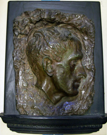
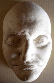
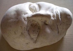
In 1947, Rollins and his wife presented the Princeton Library with a valuable collection of Western Americana, consisting of books and manuscripts on all aspect of Western life and culture. In addition, Rollins presented the library with his bronze relief portrait (above) created by Gutzon Borglum (1867-1941).

The American sculptor of Scandinavian descent is best known for his colossal sculptures, particularly the presidential portraits on Mount Rushmore in South Dakota. Borglum’s works held in Princeton University collections are somewhat smaller but no less beautiful.

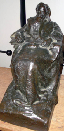
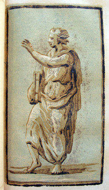
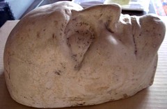
Borglum trained in Paris at the Académie Julian, where he formed a close relationship with the sculptor Auguste Rodin. After a stay in London, Borglum settled in New York City around 1901 and completed a series of small bronze figures including John Ruskin (left).

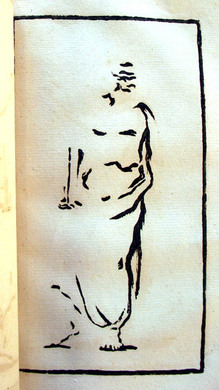
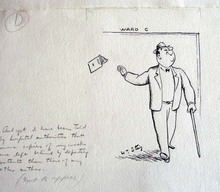
Our graphic arts collection also holds an untitled ink drawing by Borglum of a cowboy riding a horse on a desolate plane dated 1890. Borglum sailed to Europe on the Bourgogne in 1890 and the drawing includes the note, ‘On ‘La Bourgogne’ Sept. 1890. (Graphic Arts collection GA 2006.02368)

Four articles on Rollins and his collection are published in the Princeton University Library Chronicle IX, 4 (June 1948), pp 177-210.

See also the Philip Ashton Rollins manuscript collection WC001.

Henry J. Finn, educated at Princeton College

finn's5.jpg

“By Peabody & Co. New-York ; Finn’s Comic Sketch Book, for 1832: to be published in the style of Johnston’s celebrated Scraps, consisting of four large sheets, exclusive of a humorous cover, all designed and drawn by Henry J. Finn. Price not to exceed $1.” from New England Magazine 1831

finn's2.jpg
finn's.jpg

“Henry J. Finn was born in the city of New York, in the year 1782. When a boy he sailed for England, on the invitation of a rich uncle resident there. The vessel sunk at sea, and the passengers and crew were for many days exposed in small boats until they were picked up by a ship which landed them at Falmouth. Finn resided in London until the death of his uncle, who made no mention of him in his will. He then returned to New York in 1799, studied law for two years, —became tired of the profession, returned to London, and made his first appearance at the Haymarket Theatre “in the little part of Thomas in the Sleep Walker.” He continued on the stage with success … and accumulating a handsome fortune….”

“Finn [was] celebrated as a comic writer as well as a comic actor. He published a Comic Annual, and a number of articles in various periodicals. …He wrote occasional pathetic pieces, which possess much feeling and beauty, and left behind him a MS. tragedy, portions of which were published in the New York Mirror, to which he was a contributor in 1839.” From Cyclopaedia of American literature, v.2.

finn's4.jpg
finn's3.jpg

Revolving Doors

revolving doors2.jpg
revolving doors3.jpg

In 1919, Man Ray (born Emmanuel Radnitzky, 1890-1976) had his third solo exhibition at the Daniel Gallery, run by a former saloon owner Charles Daniel (1878-1971) and the poet Alanson Hartpence (1883-1946). By this time, Man Ray was losing interest in oil painting and the show featured airbrush drawings (called aerographs) and several installations.

revolving doors4.jpg
revolving doors5.jpg

One of these, called Revolving Doors, featured ten collages made from colorful construction paper cut-up and pasted onto white cardboard. Each collage was framed and hinged onto a rotating support, so that the entire ensemble could be spun like a revolving door. When Daniel asked the artist to give the audience an explanation, Man Ray wrote long labels for each panel. For instance, the Dragonfly label read in part: “The lozenges of different colored wills to ascension are a fairly accurate record of the creature’s struggles.”

revolving doors.jpg
revolving doors6.jpg


Man Ray moved to Paris in the 1920s but continued to explore this series in a variety of mediums, including a pochoir edition published by Editions Surréalistes in 1926. The following year, Man Ray gave a copy to Henri Pierre Roché (1879-1959, who would later write Jules et Jim.) This made its way into the Charles Rahn Fry Pochoir Collection, and ultimately to Princeton University.

Man Ray (1890-1976), Revolving Doors, 1916-1917 (Paris: Editions Surréalistes, 1926). Copy 71 of 105. Graphic Arts Collection (GAX) Oversize 2004-0007E

DiY woodcut in 1766

| 1 Comment
papillon5.jpg

Jean-Michel Papillon (1698-1776), Traité historique et pratique de la gravure en bois [Historical and Practical Treatise on the Printing from Wood] (Paris: Pierre Guillaume Simon …, 1766). Gift of Elmer Adler (1884-1962). Graphic Arts Collection (GAX) 2005-0081N

Papillon’s manual offers instruction in the making of a woodcut. Chapters include information on the cutting of the block, inking and printing, artists’ monograms, xylography and block books, cutter’s tools, and chiaroscuro prints. Below is one of his examples of an image printed from three blocks.

If you are interested in seeing Papillon’s original wood blocks, they can be found at the Cabinet des Estampes at the Louvre.

papillon4.jpg
1
papillon3.jpg

2

papillon1.jpg
3
papillon2.jpg

4

Exposition of 1844

burat3

Jules Burat (1807-1885), Exposition de l’industrie française année 1844. Description méthodique accompagnée d’un grand nombre de planches et de vignettes (Paris: Challamel, [1844]). One of 50 copies. Graphic Arts (GAX) in process

“One of the most remarkable and valuable exposition publications I have ever seen,” writes antiquarian Charles Wood III, “primarily due to the ninety full-page plates.”

burat8
burat2
burat7
burat1
burat4

Jules Burat (1807-1885), professor of the School of Arts and Sciences, journalist, and fine art collector, wrote the texts for this catalogue of the 1844 exposition of French industries. Originally published in two volumes (ours rebound in one), the texts are divided into five parts: 1. métaux (metals); 2. machines (machines); 3. tissus (fabrics); 4. application des beaux-arts (applied arts); 5. industries diverses (various industries). Exhibits include porcelains, crystal, bronzes, and much more.

One section outlines the printing techniques available in 1844. Plates include a lithographic view of the Tuileries after a daguerreotype; early color lithography by Godefroy Engelmann (1788-1839); early phototypies or collotypes by Rose-Joseph Lemercier (1807-1887); and early chromolithography by the Strasbourg printer G. Silbermann. Also one of the few discussions of tissierographie (lithographic engraving) and pianographie (printed music) anywhere.

burat6
burat5

A Caricature Assemblage of Oddities, Whimsicalities & Extravaganzas!!

| 1 Comment
gillray bor
George Moutard Woodward (1760-1809), Grotesque Borders for Screens, Billiard Rooms, Dressing Rooms, &c., &c., Forming a Caricature Assemblage of Oddities, Whimsicalities & Extravaganzas!! (London: R. Ackermann [1799]). Graphic Arts Collection (GAX) Oversize 2007-0006E

These grotesques (figures with large heads) were invented by George Woodward (1760-1809) and etched by Thomas Rowlandson (1756-1827) for the publisher Rudolph Ackermann. Several times Woodward refers to the caricatures as Lilliputians, referencing the small people of Lilliput in Swift’s Gulliver’s Travels. The forty-six horizontal strips mounted on twelve plates were meant to be cut apart and used, literally, as border designs in your home. According to Greco, the partnership created twenty-four sheets in total. The Princeton copy includes an additional sheet of smaller sketches in 6 vertical strips, dated May 20, 1805, not a part of Grotesque Borders as originally published.

gillray bor1
gillray bor2


gillray bor5
gillray bor3

Not long after Woodward and Rowlandson finished publishing their caricatures, Charles Baudelaire (1821-1867) wrote an insightful essay entitled, De l’essence du rire et généralement du comique dans les arts plastiques, in which he differentiates between the uses of grotesque comic figures. For an English language translation, see Charles Baudelaire, The Painter of Modern Life and Other Essays (New York: Garland Pub., 1978). Firestone Library (F) NX65 .B38213 1978

The Colophon. An adventure in enthusiasm.

colophon5
colophon14
colophon8
colophon7

“An adventure in enthusiasm.” This is how Elmer Adler (1884-1962) described his magazine The Colophon: A Book Collectors’ Quarterly (later A Quarterly for Book Lovers). Each signature within an issue was produced by a different printer using their own choice of papers, typography, and illustration. The signatures were bound together in boards by Adler’s Pynson Printers and marketed to 2,000 subscribers.

Similarly, each cover was designed by a different artist in a different style beginning with the first issue, which was designed by the Scottish American artist Edward Arthur Wilson (1886-1970), a student of Howard Pyle. Adler kept the original art, including separations and multiple drafts for each issue. When he moved to Princeton to establish the graphic arts collection for the university, the cover art came with him.

Here is a list of the cover artists through 1935:

Edward A. Wilson Part 1 1930 February
Joseph Sinel Part 2 1930 May
Gustave Jensen Part 3 1930 September
Donald McKay Part 4 1930 December
W. A. Dwiggins Part 5 1931 March
T.M Cleland Part 6 1931 June
Leroy Appleton Part 7 1931 September
Frank McIntosh Part 8 1931 December
Edward A. Wilson Part 9 1932 February
Boris Artzybasheff Part 10 1932 May
T.M. Cleland Part 11 1932 September
Ervine A. Metzl Part 12 1932 December
John Atherton Part 13 1933 February
Marie Lawson Part 14 1933 June
Jack Tinker part 15 1933 October
Louis Bouché Part 16 1934 March
Carl Noell part 17 1934 June
Farle A. Drewry Part 18 1934 September
Kirk C. Wilkinson Part 19 1934 December
Frederic W. Goudy Part 20 1935 March

Artists can be searched through the online index at http://www.artistarchive.com/List/PeriodicalList.aspx


The Colophon. New York: Pynson Printers, 1930-1940. Graphic Arts Reference Collection (GARF) Z1007 .C71; Vol. 1, pt. 1 (Feb. 1930)-v. 5, pt. 20 (March 1935); new ser., v. 1, no. 1 (July 1935)-v. 3, no. 4 (autumn 1938); new graphic ser., v. 1., no. 1 (1939)-no. 4 (Feb. 1940)

Why Does Nobody Collect Me?

In 1934, the American humorist Robert Benchley (1889-1945) was cornered by Elmer Adler (1884-1962) to write a piece for Adler’s magazine The Colophon. This was one of twenty essays Adler commissioned by successful authors telling how they first got published. Benchley titled his “Why Does Nobody Collect Me?” and had his friend from the New Yorker, William Steig (1907-2003), illustrate it.

colophon3
colophon2
colophon


In 1937, Adler brought all the essays together in Breaking into print: being a compilation of papers wherein each of a select group of authors tells of the difficulties of authorship & how such trials are met (GA 2009-0083N). For the book, he added the answers to a series of questions about how each author wrote, how many drafts they made, and so on.

Benchley replied “Dear Adler: I hope that I am not too late to contribute the following priceless items to your Natural History of Belles Lettres: I can not write more than three or four lines of longhand without fainting. Even if I could, I wouldn’t be able to compose on anything but a typewriter, probably a bad habit from newspaper days.”

…”For Harper’s I get a set of galleys, which I am unable to read through, being so sick of the stuff already. I answer the queries, and that’s all. As a result, in my last book, there was a whole line misplaced, giving the paragraph no sense at all. I hadn’t caught it in the proof, because I hadn’t read it, and evidently the proof-reader at Harper’s didn’t notice the different.”

colophon12
colophon11
colophon10
colophon9

Happily, Adler saved the original art, which now resides in the graphic arts collection. William Steig (1907-2003), Untitled pen drawings for Robert Benchley’s “Why Does Nobody Collect Me?” in The Colophon, Part 18, 1934. Graphic Arts GC051 The Colophon Collection.

L'Album, not for the meek

lalbum2

At the turn of the last century, the development of color lithography led to the emergence of many French periodicals. Gil Blas illustré, Le Rire, L’Assiette au Beurre and Le Figaro are some of the best. My favorite, L’Assiette was loosely based on the German magazine Simplicissimus and devoted each issue to a single topic.

The French publishing house of Jules Taillandier decided to get into the game and issued the short-lived periodical titled simply: L’Album. Each issue was devoted to the work of an individual artist, with a centerfold section offering several double-page spreads and commentary by Lucien Puech. The imagery was uncommonly graphic and sexual in nature, possibly the reason it did not last very long. The work of painters Adolphe-Léon Willette (1857- 1926) and Jean-Louis Forain (1852-1931) was featured, along with Emmanuel Barcet, Marcel Capy, Jacques Villon, and many other.

lalbum7
lalbum6
lalbum3
lalbum4

lalbum1
lalbum5

L’Album. Paris: Montgredien et Cie., no. 1-[18]; [1 juin 1901]-[1 nov. 1902]. Graphic Arts Collection (GAX) Oversize 2005-0585

Brand Name Damages' magazine Zinemag

| 1 Comment
brand name
brand name
brand name

“… at 301 Bedford Avenue (at South First Street) is Brand-Name Damages, opened in December by an artists’ collective called the Justice League of America, whose members are mostly recent and current students at the nearby Pratt Institute. The 25 members, who pay $40 a month to support the gallery, meet on Sunday afternoons to determine their activities, which include a homemade magazine called Zinemag.”

Thank goodness New York Times art critic Roberta Smith included this comment in her survey of small, new Brooklyn galleries, published March 23 1990. Without it, we would never know what we had found when this uncatalogued issue of the periodical/artists’ book Zinemag turned up. No other copies are listed on OCLC or in Arcade, the catalog for members of the New York Art Resources Consortium (NYARC). We would certainly be interested in completing the run, if anyone kept their issues.

Zinemag, no. 5, October 1990. Edition: 150. Graphic Arts (GAX) 2010- in process

Roman diptych and stylus

| 2 Comments
diptych
diptych

“A diptych is a sort of notebook, formed by the union of two tablets, placed one upon the other and united by rings or by a hinge. These tablets were made of wood, ivory, bone, or metal. Their inner surfaces had ordinarily a raised frame and were covered with wax, upon which characters were scratched by means of a stylus. Diptychs were known among the Greeks from the sixth century before Christ. They served as copy-books for the exercise of penmanship, for correspondence, and various other uses”. (See the Catholic Encyclopedia entry: [http://www.newadvent.org/cathen/05022a.htm])

Wax coated tablets (either singularly or in bound diptyches) provided an inexpensive, portable, and reusable writing surface. Today, we say “start with a clean slate,” after the clerics who would clear the wax surface of their tablets using the flat top of the writing stylus.

The wood diptych and bronze stylus in graphic arts measures 9.5 x 17 x 9.5 x 2 cm with four holes in each tablet bound together with a leather strap. It is assumed that our first curator, Elmer Adler, had this made for teaching.

For more on the history of writing, see Bernhard Bischoff (died 1991), Latin Palaeography: Antiquity and the Middle Ages (Cambridge; New York: Cambridge University Press, 1990). Firestone Z114 .B5713 1990

Aaron Burr's death mask

burr3
burr
burr1

Aaron Burr Death Mask, 1836. (CO770) Gift of Laurence Hutton.

Author, essayist, and critic, Laurence Hutton (1843-1904) was a collector of death masks, which he donated to Princeton University. Although he had many stories about the collection, he was only completely sure of the provenance and authenticity of a handful. One of these was the mask of Aaron Burr, Class of 1772 (1756-1836).

A 1901 article in the New York Times entitled “Laurence Hutton’s Mask of Aaron Burr” provides the details. An unidentified author writes, “An elderly gentleman called to inspect what was familiarly called “The Skullery” in Mr. Hutton’s New York house, and particularly to make a study of the mask of Henry Clay … [whose authenticity] was doubtful.” After some time, the sculptor “was inclined to accept the authenticity of Clay. And he knew that Burr was Burr—for he had made it himself! He had not seen it for fifty years … but recognized it at a glance. As a young man employed in the construction of “specimens” for a firm of phrenologists, he had been sent to Staten Island the day after Burr died. And then and there he had performed the gruesome operation.”

In his book Portrait in Plaster, Hutton wrote that the mask was “made by an agent of Messrs. Fowler & Wells, who still posses the original cast. The features are shortened in a marked degree by the absence of the teeth. Mr. Fowler said that in Burr destructiveness, combativeness, firmness, and self-esteem were large and amativeness excessive.”

Aaron Burr was born in Newark, New Jersey, on February 6, 1756, son of Aaron Burr, a theologian and second president of the College of New Jersey (now Princeton University). He entered the College of New Jersey at age thirteen and graduated in 1772. Burr began his political career in 1784 and continued in politics … ultimately as Vice President of the United States under Jefferson. He lost his second candidacy for Vice President when he alienated Republican leadership with sympathies for the Federalists. Burr blamed much of his political downfall on Alexander Hamilton and his compatriots. After failing to force Hamilton to apologize for statements made against Burr in the gubernatorial race, Burr challenged Hamilton to a duel. When Burr killed the prominent politician, popular opinion cast him as a cold-blooded murderer, and warrants were put out for his arrest in New York and New Jersey. Burr fled to Philadelphia and then the South to escape capture. (taken from Princeton University Burr collection finding aid)

The Adventures of Peregrine Pickle

| 1 Comment

pickle8.jpg

Scottish author Tobias Smollett (1721-1771) first published The Adventures of Peregrine Pickle in 1751. The popular story of Hawser Trunnion, a retired naval officer, went through three editions until one was published with illustrations.

Peregrine Pickle

Peregrine Pickle


Swiss artist Henry Fuseli (1741-1825) created a frontispiece for the fourth edition in 1768 and many other illustrated editions followed designed by Thomas Stothard (1755-1834), Robert Dodd, (1748-1815), and Richard Corbould (1757-1831) among others. In 1805, Thomas Rowlandson (1756-1827) took on the project and add two color plates to Smollett’s story. Graphic Arts (GA) Rowlandson 1805

Peregrine Pickle

peregrine pickle

peregrine pickle

Peregrine Pickle

The Graphic Arts collection also holds the rare volume Rowlandson’s Humorous Illustrations of the Works of Fielding and Smollett, consisting of forty etchings by Rowlandson, [George Moutard] Woodward, &c. (GA) Rowlandson 1808.8. Among these forty prints are six designed by various artists for editions of the Peregrine Pickle. Rowlandson’s are seen above on the right.

The Song of the Barbecue for the 4th of July, not by Walt Whitman

H.L. Stephens is said to have had the idea for an American humor magazine while drinking at Pfaffs, a saloon where Walt Whitman and other writers spent their evenings in 1859. Once Vanity Fair was launched, frequent references to Whitman appeared in their pages, along with parodies of his writing. The Song of the Barbecue was printed in the September 29, 1860 issue, referring to a gathering for Stephen A. Douglas held at Jones Wood on September 12.

I sing not of the cue of Phelan,
I sing not of the actor’s cue,
I sing not of the Roman Q,
I sing not of the cu-rious,
I sing of the Barbe-cue.

I sing to thee of fools,
I sing to thee of apes,
I sing to thee of idiots,
I sing to thee of knaves—
Managers of the barbecue.

Meat was stale, order not kept;
Roughs were bosses, chiefs and all,
And the only calves and pigs,
Also sheep who were to be there,
Were low-legged, in shoes and shirts.

For more on Whitman, see Princeton Professor C.K.Williams’ new book On Whitman reviewed in today’s NYTs:

http://www.nytimes.com/2010/07/04/books
/review/Vendler-t.html?ref=books

For issues of Vanity Fair, see Graphic Arts GAX Oversize Hamilton 1219q

Fiddler D.D. and Scraps Magazine

D.C. Johnston (1799-1865), Scraps (Boston: D.C. Johnston, [1830?]-1849). Some issues include separate titles such as no. 4 for the year 1833: Trollopania; no. 5 for 1834: Fiddle,-D.D.; no. 7: Phrenology exemplified and illustrated. Designed, etched and published by Johnston. Sinclair Hamilton Collection of American Illustrated Books, GAX Oversize Hamilton 938Q

Look closely, see the title in the hair.

David Claypoole Johnston gave up acting after only a few years to pursue a career in engraving, both on copper and wood. He started one of the earliest comic magazines in the United States, called Scraps, which was printed from engraved copper plates and included four pages of cartoons in each issue. Some frames are sequential and some frames stand alone. Here are a few examples.

Audubon's Tufted Duck

John James Audubon (1785-1851). Pattern Print for Tufted Duck. Fuligula Rufitorques. 1834. Engraved, printed, and colored by Robert Havell Jr. (1793-1878). Graphic Arts collection GAX Audubon case.

Thanks to the “Adopt-a-book” benefit sponsored by the Friends of the Princeton University Library this spring, and specifically to the donations given by Ruta Smithson in honor of Andrew Smithson and by Ursus Books, one of our Audubon prints has been conserved and rehoused by Special Collections Paper Conservator Theodore Stanley.

Plate 234 Tufted Duck (common name Ring-Necked Duck). Fuligula Rufitorques was drawn in watercolors by John James Audubon (1785-1851) and then, engraved, printed, and colored by Robert Havell, Jr. (1793-1878), completed in 1834. For a view of the editioned print in the copy of Birds of America at the University of Pittsburgh see: http://digital.library.pitt.edu/a/audubon/plates.html.

In 1827, Audubon approached Robert Havell, Sr. (1769-1832) to take-over the engraving of his watercolors for The Birds of America. His original printer, Edinburgh engraver W.H. Lizars dropped out of the project after his staff went on strike. Havell Sr. was joined by his son, Robert Havell, Jr. (1793-1878), who engraved the plates while his father supervised the printing and coloring. Health problems led to Havell Sr.’s retirement in 1828 and his death four years later, leaving the majority of the work to his son. Havell Jr. finished the final print in 1838 and the first edition of the book is often called the Havell Edition.

One of Audubon’s biggest complaints with Lizars’ first plates was the variation in the hand coloring between impressions. Havell solved this by creating a working proof or pattern print for each plate. Audubon marked up the trial proofs until one satisfied him and this was used by the colorists as a guide. In a modern edition, the artist’s approved print is known as the bon à tirer (BAT), which in French means good to print. Note Havell’s initials, added in ink on the center title, presumably to indicate his approval.

Howard C. Rice wrote in the catalog for a 1959 Audubon exhibit at Princeton University:

This is one of the so-called ‘Pattern Prints’ used by the workers in Havell’s studio to guide them in the coloring. Since two hundred or more impressions of each plate had to be hand-colored, it was necessary to establish a standard pattern for the workers to follow in order to maintain uniformity in the coloring … It is said that the margins of such pattern prints were often trimmed irregularly or otherwise mutilated, as a security measure, to prevent them from being stolen from the studio or surreptitiously sold.

A Country Inn Yard at Election Time

William Hogarth (1697-1764), The Stage-Coach, or The Country Inn Yard, June 1747. Engraving. Graphic Arts Collection Hogarth GC113.

Hogarth’s print, The Stage-Coach, was first advertised on June 26, 1747 as a print representing “a country inn yard at election time.” Since the election had only been announced eight days earlier, Hogarth must have completed the scene with some haste. The only direct reference to the campaign is the crowd in the back, perhaps a comment on the lack of attention the election received from the English people.

The central focus of Hogarth’s print is the woman with her back to us, entering the coach. Ronald Paulson wrote, “whether we think of her as “broadbottom” or as backside, she embodies self-absorption and unawareness of what is going on around her as she prepares to disappear inside the coach. The composition focuses on her back, and creates another verbal pun: she is literally “turning her back” on the urgency of the election… .”

Over seventy years later, George Cruikshank took this image and re-imagined it for contemporary London society. At first only indirectly as The Piccadilly Nuisance, Dedicated to the Worthy Acting Magistrates of the District with the stage coach seen from the side. The followed year, he tried again with Travelling in England, which more directly echoes Hogarth’s print.

George Cruikshank (1792-1878), The Piccadilly Nuisance. Dedicated to the Worthy Acting Magistrates of the District, December 29, 1818. Etching with hand coloring. GC022 Cruikshank Collection. Gift of Richard W. Meirs, Class of 1888.

George Cruikshank (1792-1878), Travelling in England, or A Peep from the White Horse Cellar, August 12, 1819. Etching with hand coloring. GC022 Cruikshank Collection. Gift of Richard W. Meirs, Class of 1888.

In 1887, Imre Kiralfy built an outdoor theater on Staten Island, N.Y. His first production was “Nero, or the Destruction of Rome,” which combined dance, music, visual spectacle, and mime. Reviews called it a gigantic, historical, biblical, dramatic, and musical spectacle. P.T. Barnum was in the audience one night and liked the event so much that he arranged with Kiralfy to add the show to Barnum’s upcoming tour around London. “Nero” was shortened slightly and integrated into Barnum and Bailey’s Greatest Show on Earth.

This program from the Olympia Theatre in Kensington assures the viewers that the circus will be “positively exhibiting in London only”. The Greatest Show on Earth (including “Nero”) played until 1890 and then, opened an even more lavish production in New York City. Other acts included a double drove of acting elephants (the greatest in both numbers and intelligence) and Bo Peep and her flock of trained sheep (Signora Stella’s flock of oddly trained American merinos).

For more information, see Margaret Malamud, “Roman Entertainments for the Masses in Turn-of-the-Century New York,” The Classical World 95, no. 1 (Autumn, 2001): 49-57.

Steichen's Navy Photography

Edward Steichen (1879-1973), Surrounded by Hellcat fighters, ordnancemen work on bombs on the hangar deck of the USS Yorktown. Officers and men in background are watching a movie, ca. 1944. Gelatin silver print. Graphic Arts GC131.

Photographer Edward Steichen was thirty-eight when he joined the U.S. Army’s photography division during World War I. Specializing in aerial reconnaissance, Steichen finished his commission with the rank of Colonel. When the United States entered World War II, Steichen tried to reenlist but, at age sixty-one, he was turned down.

Finally, in 1943, he was asked if he would like to help with the Navy’s effort to recruit young pilots. Steichen was given the title of director of the U.S. Naval Photographic Institute, working as a lieutenant commander in the Naval reserve. He and his hand-picked unit created images of good will and patriotism, with very little evidence of the actual war.

This is one example of his work, depicting soldiers at work making bombs while others watch a movie. For more, see: http://www.archives.gov/research/ww2/photos/

Octave Uzanne's "Dictionnaire bibliophilosophique"

Double wrappers from Octave Uzanne (1852-1931), Dictionnaire bibliophilosophique, typologique, iconophilesque, bibliopégique et bibliotechnique à l’usage des bibliognostes, des bibliomanes et des bibliophilistins par Octave Uzanne, polybibliographe et philologue (Paris: Imprimé pour les sociétaires de l’Académie des beaux livres, Bibliophiles contemporains, en l’an de grace bibliomaniaque, 1896). Copy 89 of 176. Graphic Arts Collection (GAX) Z992 .U93 1896.

Octave Uzanne (1851-1931) loved books. Long before Forest Gump, Uzanne compared a good book to a superb box of chocolates. He read them; he wrote, edited, and designed them; and he collected them. Uzanne founded several small literary magazines including L’Art et l’idée and Le Livre moderne as well as founding the Société des Bibliophiles Contemporaines (followed later by the Société des Bibliophiles Indépendants).

When he was forty-five, he prepared this dictionary to all aspects of the book world, including authors, illustrations, bindings, paper, and much more. Note below right “Un Auteur qui désire garder l’anonyme” (the author who wishes to remain anonymous), which is a portrait of Uzanne.

1 2 3 4 5 6 7 8 9 10 11 12 13 14

Recent Comments

  • Howard Coblentz: I have a round seal shaped like a pear a read more
  • John Overholt: Wikipedia's entry for Sir Francis says: "Throughout Baring's lifetime his read more
  • Serge Rodrigue: It is a precious thing you have a book from read more
  • Colin Wicks: I have a copy of “A Round Game.” And it read more
  • Laurence Hilonowitz: I was a Customer, Friend of Bob Wilson. I Live read more
  • allen scheuch: Absolutely STUNNING! Those colors, those designs made my day! Thanks, read more
  • Olivier: Hello Diane, If you are still looking for an examplare read more
  • Stella Jackson-Smith: I have a framed picture by A.Brouet, signed with the read more
  • John Podeschi: I remember Dale fondly from my days at Yale (1971-1980). read more
  • Joyce Barth: I have some or all of this same poem. I read more