Recently in Illustrated books Category

How Hot Is It Where You Are?

Francis Frith (1822-1898), Cairo, Sinai, Jerusalem, and the Pyramids of Egypt: a Series of Sixty Photographic Views; with Descriptions by Mrs. Poole and Reginald Stuart Poole (London: J.S. Virtue; New York: Virtue & Co., [1860]). Gift of Hertha Cordis Conway.Graphic Arts Collection (GAX) Oversize 2006-0146F

A successful grocer, Francis Firth took a chance in 1850 when he formed a partnership and opened The Frith and Hayward Photography Studio in Liverpool. In 1856, Frith made an extended trip to Egypt, traveling up the Nile from Cairo to Abu Simbel. He carried with him four cameras and all the equipment necessary to take and develop wet collodion glass-plate negatives. He often complained about the chemicals boiling-over inside the tent he used as a darkroom.

Frith made other trips to the Middle East in 1857 and 1859, then printed and published 1,000s of albumen photographs in a series of deluxe books and albums. The public went crazy for these images and Frith made a small fortune. Although he retired soon after this, his publishing company in Reigate, Surrey, continued to operate until 1970.

Family Bible. Superfine Edition.

| 10 Comments

New Devotional and Practical Pictorial Family Bible, Containing the Old and New Testaments, Apocrypha, Concordance, and Psalms in Metre… . Superfine Edition. (Philadelphia, PA; Chicago, IL; St. Louis, MO; and Atlanta GA: National Publishing Co., 1879). Gift of Rev. Dr. Stephen White, Princeton’s Episcopal chaplain. Graphic Arts GAX 2008- in process

The King James Bible was the Harry Potter of the nineteenth-century. The family bible might have been the only book purchased for an American home and so, publishers crammed them with additions to make their volume more desirable.

This 1879 edition includes pages with pre-printed photograph holders, space for genealogy, maps, charts, chromolitho-graphed prayers, and 2,500 illustrations.

Also: Illustrations of scenes and incidents in the life of Christ; the cities and towns of the bible; scenes in the life of St. Paul; topographical sketch of Jerusalem and the holy land; the wanderings in the wilderness; illustrations of the tabernacle and Solomon’s temple; scenes in the lives of the patriarchs, prophets and kings of the old testament; illustrations of bible scenes and incidents; animals, birds, insects, etc, of the bible; illustrations of the trees, plants, and flowers of the bible; biographies of the reformers and martyrs, etc.

Together with: Dr. William Smith’s Dictionary of the Bible in which every important scriptural word is full explained, and a complete history of each book of the bible, beautifully illustrated, a history of all the religious denominations of the world, illustrations of the parables of Jesus and proverbs of Solomon, history of the translation of the bible, chronological and other useful tables, treatises, maps, etc., designed to promote and facilitate the study of the sacred scriptures.

French Advertising Design

| 1 Comment
Paul Poiret (1879-1944), editor, Pan: annuaire du luxe à Paris, an 1928 (Paris: Devambez …pour Paul Poiret, [1928?]). Graphic Arts Collection (GAX) Oversize NC139.D94 P36 1928q


At the time Poiret was working on Pan, his reputation as a women’s fashion designer was on the decline and by 1929, he was forced to declare bankruptcy. For this 1928 volume, he compiled more than 100 examples of advertisements for luxury goods designed by his friends, including Yan B. Dyl, Edy Legrand (1892-1970), Charles Martin (1848-1934), Tsugouharu Foujita (1886-1968), and others. Products are from a wide range of firms such as Van Cleef & Arpels, Judith Barbier, Mitsubishi, Maigret, Hermes, Lanvin, Callot Soeurs, Maxims, and the Moulin Rouge.

Vagabondiana


John Thomas Smith (1766-1833), Vagabondiana; or, Anecdotes of Mendicant Wanderers through the Streets of London; with Portraits of the Most Remarkable, Drawn from the Life (London: Published for the proprietor; and sold by J. and A. Arch [etc.] 1817) Graphic Arts Collection (GA) Oversize Rowlandson 929.3q

In the early years of the nineteenth-century, John Thomas Smith was the Keeper of Prints and Drawings at the British Museum as well as a professional illustrator. He lived on Chandos Street near Covent Garden, a rather seedy part of London, where he liked to sketch portraits of his neighbors.

Smith’s 1833 obituary printed in The Gentleman’s Magazine noted “Mr. Smith had much pleasure in tracing out and examining the peculiar manners and costumes of the inhabitants and visitors of this district of the metropolis. The procuring of information from various sources occupied many years of his life; and he meditated the publication of this interesting mass in two volumes, which we regret he never completed… but in 1817 he published a work on which he had been some time employed, entitled Vagabondiana”. For more information, read Smith’s autobiography: A Book for a Rainy Day (London: Richard Bentley, 1845). Firestone Library (F) 1459.863.1845

First Things First

First American Woodcut, ca. 1670

John Foster (1648-1681), Portrait of Richard Mather. Woodcut, first issued ca. 1670. Given in memory of Frank Jewett Mather Jr. by his wife, his son, Frank Jewett Mather III, and his daughter, Mrs. Louis A. Turner. Graphic Arts division, GA 2006.00728

At the age of twenty-two, John Foster had completed his education at Harvard and was teaching English grammar in Dorchester, Massachusetts. When his friend and minister, the influential Richard Mather, passed away, members of the congregation planned a publication in his honor. Foster offered to design and print a woodcut portrait of Mather for a frontispiece to The Life and Death of That Reverend Man of God, Mr. Richard Mather. Only six copies of the print are known. It is considered the first woodcut printed in the United States.


First American metamorphosis book, ca.1775

[Metamorphosis] ([Philadelphia, ca.1775])

Graphic Arts holds three different editions of this ealy American juvenile. This one contains eight woodcuts by James Poupard. The prints are arranged into sections with four of the plates cut through the center so that the top and bottom can be raised. The lion turns into a griffin, the girl into a mermaid, etc. According to Sinclair Hamilton’s Early American Book Illustrators and Wood Engravers, some later 19th-century editions carry the title Metamorphosis; or, a Transformation of Pictures with Poetical Explanations for the Amusement of Young Persons.


First American picture of a baseball game, 1838

The Boy’s Book of Sports: or, Exercises and Pastimes of Youth. New Haven: S. Babcock, 1838. Wood engraving by Alexander Anderson (1775-1870). Graphic Arts Collection. Gift of Sinclair Hamilton, Class of 1906.

In the 1820s, a group of men from Philadelphia, prevented by an obscure ordinance from enjoying their favorite pastime in their own city, began playing an early version of baseball in Camden, New Jersey. By the 1830s, other teams had formed along the East Coast, and rules to the game were published in Robin Carver’s Book of Sports (1834). Carver’s book included this wood engraving depicting a baseball game played on Boston Common. The same block was used to illustrate several publications over the next few years, including the first and second editions of The Boy’s Book of Sports (1835 and 1838).

Aesop's Fables

1546

1761

1831

1884

1930

1954

Aisōpou tou Phrygos ho bios kai hoi mythoi: auxēthentes te kai pro sapēkribōmenoi pros antigraphon palaiota ton to ek tēs basilikēs bibliothēkēs = Æsopi Phrygis vita & fabulæ : plures & emendatiores, ex vetustissimo codice bibliothecæ Regiæ (Lutetiæ [Paris]: Ex officina Rob. Stephani typographi Regii, M. D. XLVI. [1546]). Greek title and Greek subtitle in Greek characters; text in Greek. Graphic Arts Collection (GAX) 2004-3189N


Robert Dodsley (1703-1764), Select Fables of Esop and Other Fabulists …(Birmingham [Eng.]: printed by John Baskerville, for R. and J. Dodsley, 1761). Graphic Arts Collection (GAX) Baskerville 1761b


Fables of Aesop and Others, translated into English with instructive applications, and a print before each fable by Samuel Croxall (Philadelphia: S. Probasco, 1831). engravings by James Poupard. Graphic Arts Collection (GAX) 2003-0490N


Selections from Aesop’s Fables, versified by Clara Doty Bates; accompanied by the standard translations from the original Greek; illustrated by E.H. Garrett … [et al.] (Boston: D. Lothrop, c1884). Graphic Arts Collection (GAX) 2003-0369N


The Subtyl Historyes and Fables of Esope, Translated out of Frensshe in to Englysshe by William Caxton at Westmynstre in the yere of oure Lorde. mcccc.lxxxiij ([San Francisco]: The Grabhorn Press at San Francisco, 1930) “Two hundred copies… Initialed and decorations by Valenti Angelo …” Graphic Arts Collection (GAX) 2004-3609N


12 Fables of Aesop (New York: Museum of Modern Art, c1954) “Linoleum blocks by Antonio Frasconi to illustrate Twelve fables of Aesop newly narrated by Glenway Wescott, Adapted from a limited edition designed by Joseph Blumenthal.” Graphic Arts Collection (GAX) Z232.B654 A37 1954

Literary Squiggles

| 1 Comment

The first book of literary criticism I’ve ever read with an index to squiggles just arrived: Adam Thirwell (born 1978), The Delighted States: a Book of Novels, Romances, & their Unknown Translators, Containing Ten Languages, Set on Four Continents, & Accompanied by Maps, Portraits, Squiggles, Illustrations, & a Variety of Helpful Indexes (New York: Farrar, Straus and Giroux, c2007). Firestone Library (F) PN3491 .T55 2007

It’s about time.

Professor Michael Wood’s review: http://www.bookforum.com/
inprint/015_02/2467

Picturing the Moon

The Inconstant Moon: Poems to the Moon by Mark Jarman … [et al.]; with a Homeric hymn translated by Apostolos N. Athanassakis; lithographs by Enid Mark. (Philadelphia: ELM Press, 2007) Limited edition of 45 signed copies, 8 poets’ copies numbered I-VIII, and 10 artist’s proofs. (GAX) Oversize 2007-0662Q


James Nasmyth (1808-1890) and James Carpenter (1840-1899), The Moon, Considered as a Planet, a World, and a Satellite. 2d edition. (London: J. Murray, 1874). Illustrated with woodburytypes and wood engravings. Graphic Arts Collection (GAX) Oversize 2003-0202Q

Nasmyth photographed his own hand to demonstrate the similarity between the shrinking of the molten surface of the moon and the wrinkling of his own skin.

Twenty Volumes of "Phiz"

David Croal Thomson (1855-1930), Life and Labours of Hablôt Knight Browne “Phiz” (London: Chapman and Hall, 1884). 1 vol. in 20, extra-illustrated with 1250 plates. Graphic Arts (GAX) 2008- in process

Newly acquired by the graphic arts division is this unique twenty-volume extra-illustrated copy of Life and Labours of Hablôt Knight Browne. Browne was the 19th-century illustrator best known for his steel-plate etchings and wood engravings for ten books by Charles Dickens.

Dickens was already a popular author when his illustrator Robert Seymour committed suicide. The practically unknown Browne was selected to complete The Pickwick Papers and went on to collaborate with Dickens until 1859. Browne took the nickname “Phiz” to complement Dickens’ penname “Boz.”

As it was originally published in 1884, Thomson’s single volume biography contained an engraved portrait and 130 illustrations (GA Rowlandson 946). Princeton’s unique copy has been vastly expanded to 20 volumes, extra-illustrated with the insertion of more than 1250 plates, including 11 watercolours, 81 pencil and ink drawings (a few with a touch of colour or double-sided), and 11 autograph manuscript items signed by Browne.

Among the manuscripts are a group of charming illustrated letters to Frederick William Cosens, an avid collector of Dickens. Cosens commissioned Browne to furnish him with watercolor drawings of every image he had created for a Dickens novels (more than 400 in all). It has been speculated that this 20 volume set is the work or commission of Cosens, although the provenance is not certain.

These volumes present to researchers not only a wonderful collection of art by one of the great illustrators of the 19th century, but also a number of variant states of the final plates. The sketches and letters provide documentary information about Browne that cannot be obtained elsewhere.

The Kelmscott Chaucer

| 2 Comments

Geoffrey Chaucer (d. 1400), The Works of Geoffrey Chaucer now newly imprinted (Upper Mall, Hammersmith, in the county of Middlesex, Printed by me William Morris at the Kelmscott Press. Finished on the 8th day of May, 1896). Graphic Arts Collection (GAX) Oversize PR1850 1896f

William Morris (1834-1896) wrote, “Have nothing in your houses which you do not know to be useful or believe to be beautiful.” [Hopes and Fears for Art, Rare Books (EX) 3867.4.345] One of the objects Morris would not have objected to was his own Works of Geoffrey Chaucer, also known as the Kelmscott Chaucer after the press where it was printed.

In 1891, Morris set up three presses in his home, where he could design and print fine press editions. Over 50 books were completed. The Kelmscott Chaucer was one of the last and certainly one of the most successful.

The book was the product of many talented men besides Morris. The text was edited by Frederick Startridge Ellis (1830-1901), ornamented with 87 pictures designed by Edward Burne-Jones (1833-1898), and engraved on wood by William Harcourt Hooper (1834-1912). It is interesting to noted that Burne-Jones’s drawings were photographed and the photographic images printed onto the woodblocks to ensure the fidelity of the engraving. The full-page woodcut title, fourteen large borders, eighteen borders or frames for the pictures, and twenty-six large initial words, along with the ornamental initial letters large and small were designed by Morris. For more on this, see The Life of William Morris by J. W. Mackail, v. 2, p. 326, Graphic Arts collection (GAX) PR5083.M25.

425 copies of the book were completed by a total of 11 master printers. Thanks to Morris’s expert salesmanship and personal magnetism, the entire edition was sold out before the books were finished on May 8 and issued on June 26, 1896.

Princeton University library owns four copies of the Kelmscott Chaucer. One is bound in full white pigskin and signed by T. J. Cobden-Sanderson (1840-1922) at Doves Bindery in 1903. For more about Morris and his circle, the William Morris Society has a new blog at http://morrissociety.blogspot.com/

Photographic Pleasures

Cuthbert Bede (pseudonym of Edward Bradley, 1827-1889), Photographic Pleasures: Popularly Portrayed with Pen and Pencil (London: J. C. Hotten, 1859). 24 lithographed cartoons and humorous stories about the new art of photography. Graphic Arts Collection (GAX) 2006-3219N


Tree and Serpent Worship

James Fergusson (1808-1886), Tree and Serpent Worship, or, Illustrations of Mythology and Art in India in the First and Fourth Centuries after Christ (London: India Museum … , 1868). Graphic Arts Collection (GAX) Oversize 2004-0934Q

Tree and Serpent Worship was compiled by the self-taught historian James Fergusson (1808-1886), who made his fortune at a young age in Calcutta and then devoted the rest of his life to his passion for Indian architecture. Fergusson befriended a number of the British officers who spent their time in India practicing the new art of wet-plate photography, such as Major Robert Gill (1804-1879) whose albumen prints were used to illustrate Fergusson’s 1864 edition of The Rock-Cut Temples of India (Graphic Arts Collection (GAX), 2007-2590N).

Another of Fergusson’s associates was James S. Waterhouse (1842-1922), who never used a camera before arriving in Calcutta. He became so accomplished that he was ultimately named surveyor-general to the monumental Survey of India. Under the sponsorship of the Indian government, Waterhouse spent eleven years—from 1864 to 1875—documenting the ethnic diversity of the people of India; work later replicated by Edward Curtis and others who joined the international mania for mammoth ethnographic studies.

During that same period, Waterhouse provided Fergusson with a group of images depicting the ancient Buddhist monuments in Sanchi, a small village in the state of Madhya Pradesh. The frontispiece of Tree and Serpent Worship shows Waterhouse’s image of the Northern gateway to the Great Stupa at Sanchi. This is the oldest of the religious stupas, or mounds, constructed in the third century BCE to hold the remains of the Buddha.

Along with 20 photographs by Waterhouse are 36 by W. H. Griggs (1832-1911), depicting Amravati sculptural fragments from the collection we now know as the Victoria & Albert Museum.

After the Manner of Rembrandt

Thomas Worlidge (1700-1766), A Select Collection of Drawings from Curious Antique Gems: Most of Them in the Possession of the Nobility and Gentry of this Kingdom: Etched after the Manner of Rembrandt (London: Printed by Dryden Leach, for M. Worlidge … , [between 1768 and 1780]. Graphic Arts Collection (GAX) 2005-2376N

Around 1740, painter and printermaker Thomas Worlidge settled in the Covent Garden section of London. He found success painting portrait miniatures and later, as an etcher working “after the manner of Rembrandt”. This refers to his drypoint technique of drawing with a sharp needle directly into the surface of the copper plate. It also alludes to Worlidge’s admiration for Rembrandt the man, such as in this frontispiece self-portrait, which is a clear imitation of a Rembrandt self-portrait.

When Worlidge died in 1766, he was in the middle of a massive project etching a series of 182 drypoint portraits. Princeton owns several variant editions of the collection. The following is a description of the project taken from the Dictionary of National Biography, vol. 21:

The series was published in parts, some of which seem to have been issued as early as 1754 but Worlidge died before the work was completed. It was finished by his pupils William Grimaldi and George Powle, and was published by his widow in 1768 at the price of eighteen guineas a copy. In its original shape the volume bore the title, A select Collection of Drawings from curious antique Gems … printed by Dryden Leach for M. Worlidge … and M. Wicksteed, Seal-engraver at Bath.
The frontispiece, dated in 1764, shows Worlidge drawing the Pomfret bust of Cicero; behind on an easel is a portrait of his second wife, Mary. No letterpress was included originally in the volume, but between 1768 and 1780 a few copies were issued with letterpress. After 1780 a new edition in quarto, deceptively bearing the original date of 1768, appeared with letterpress in two volumes at five guineas each. The title-page omits mention of M. Wicksteed’s name, but is otherwise a replica of the first.

Anopisthographic Biblia Pauperum

leaf 39 “t” Beatitude and leaf 40 “v” Coronation

blank verso of leaf 40 and leaf 38 “s” Hell


Three leaves from a Biblia pauperum, Schreiber edition X (38-40, .s, t, v.), late 1460s. Hand-colored woodblock prints. Sheet size 27 x 41 cm. GC110 Book Leaves Collection.

Princeton’s historical leaf collection holds three leaves from an edition of the Biblia pauperum, one of the best-known of the fifteenth-century blockbooks. According to Nigel Palmer’s article in the current Journal of the Printing Historical Society (no. 11, 2008, Firestone Z119 .P95613), the Biblia pauperum was “an ensemble of texts and images which narrated the history of man’s redemption from the Annunciation through to the Last Judgement and the coronation of the blessed soul in heaven” represented in 40 plates. During the 1460s, the 40 woodblocks for this volume were recut three times, along with seven intermediate issues in which just some of the blocks were replaced.

Mr. Palmer examined the sheets in Princeton’s collection and wrote that he believed they belong to the edition X, “almost certainly printed in Germany”. Of the known copies of this edition, Palmer identified one in Blackburn, England, originally from Gotha, which lacks these numbers and might be a match for our leaves.

The three leaves shown here are anopisthographic (printed on one side). Two of the sheets have been pasted together to form recto and verso of one sheet. Because there are so few Biblia pauperum surviving in their original structures, it is difficult to be certain about their construction but several editions were sewn into single-quire volumes in chancery folio (approximately 310-20 x 440-50 mm., only slightly larger than Princeton’s sheets).

Blockbooks were made from about 1450 to the 1470s, and Palmer cautions us to regard them as intertwined with all experimentation in printing technology of the period, included single-leaf woodcuts, single-leaf metalcuts, single-leaf engravings, books and single leaves with text printed with moveable type, and books with typographic text and woodcut illustrations.

For a complete reading of the iconography in each plate (in English), see Avril Henry’s Biblia Pauperum Marquand Library Oversize Z241.B6B52 1986Q

Divine Proportion Illustrated by Leonardo

| 1 Comment

Luca Pacioli (ca. 1445-1517), De divina proportione. Opera a tutti gli ingegni perspicaci e curiosi necessaria que ciascun studioso di Philosophia, prospectiua, pictura … ([Venice]: A. Paganius Paganinus … imprimebat, [1 June 1509]). Graphic Arts Collection (GAX) Oversize 2004-1250Q

Luca Pacioli, known as Brother Luca, was a Franciscan monk and a mathematician. In 1497, he was invited to the court of Lodovico Sforza in Milan, where Leonardo de Vinci (1452-1519) was also in residence. The two became friends and spoke at length about mathematical theory as it applied to the application of proportion in artistic composition. It was at this time that Luca began his book De divina proportione. Leonardo provided some of the illustrations and the book was dedicated to Lodovico. In 1499, Luca and Leonardo were forced out of Milan and it was not until 1509 that their three volume work was published in Venice (volume three is an Italian translation of Piero della Francesca’s Latin writings On [the] Five Regular Solids). For more information, read Ruth Mortimer’s Harvard College Library Department of Printing and Graphic Arts, catalogue of books and manuscripts, (1964, v.2, part 2, p. 499-502. GA Z881 .H346)

Divine Proportion, or the golden ratio, is the ratio a : b = b : (a + b).

Euclid in Color

Oliver Byrne. The First Six Books of the Elements of Euclid, in which Coloured Diagrams and Symbols are Used instead of Letters for the Greater Ease of Learners (London: Printed by Charles Whittingham for William Pickering, 1847). Graphic Arts Collection (GAX) Oversize 2007-0026Q

One of the many remarkable things about this edition of Euclid is the expert printing. Each of the colors were printed from separate plates that had to be expertly registered; that is, positioned so that the geometric angles of the didactics matched exactly.

The printing was done by Charles Whittingham (1795-1876), nephew to Charles Whittingham, founder of the Chiswick Press where elaborately illustrated editions were published. Whittingham the younger joined his uncle’s business and quickly perfected the specialty of overlaying the printed image from several blocks.

The book was exhibited in London at the Great Exhibition of 1851 and both Euclid and Oliver Byrne, an otherwise unknown mathematician, took a backseat. Praise was researved for the beauty of the composition and the artistry of the printing. The book was sold by William Pickering for the extravagant price of 25 shillings, placing it out of reach of the simple educators who were suppose to have benefited from this new system for learning geometry.

The History of the Life of the Late T. M. Cleland

| 16 Comments

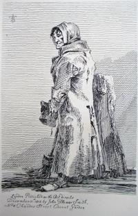
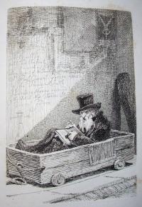
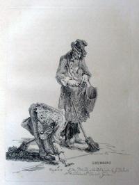
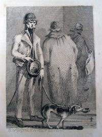
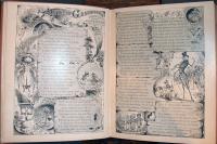
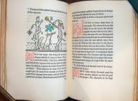
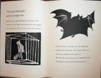
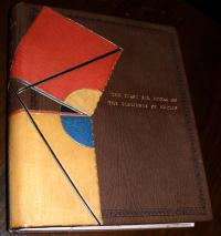
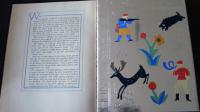
Henry Fielding (1707-1754), The History of the Life of the Late Mr. Jonathan Wild the Great. Illustrations by T.M. Cleland (1880-1964) and an introduction by Louis Kronenberger (New York: Limited Editions Club, 1943). Gift of Elmer Adler. Graphic Arts collection (GAX) PR3454.J663 1943


Soon after Thomas Maitland Cleland left school, at the age of 16, he taught himself to set type, bought a small Gally Universal, and began making books in his basement. In 1900, he moved to Boston and published under the imprint Cornhill Press, named after the street where he lived. D. B. Updike of Merrymount Press was an early mentor, who provided commissions and endless criticism, leaving Cleland chronically unsatisfied with anything less than perfection.

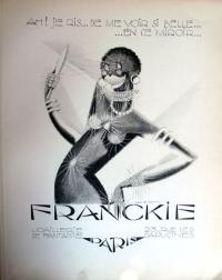
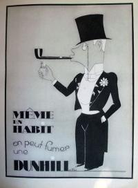
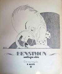
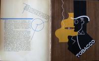
Cleland went on to work as art designer for McClure’s Magazine, the Locomobile Company of America, the Westvaco Corporation, the Cadillac Motor Car Company, and Fortune Magazine, although he wrote “I am not, and never have been, particularly interested in advertising and have done much of my work for it only because it was, or seemed to be, necessary in order to make a living.”

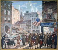
In the 1930s, he made a series of calendar illustrations for the Harris, Seybold, Potter Company of Cleveland Ohio, which manufactured high-quality sheet-fed offset lithographic printing presses. The company tried to convince the printing world that sheet fed-offset presses could produce quality 4-color process work and Cleland’s prints were meant to provide the proof. “God Bless America,” seen below, is one of these prints.

In between commercial work, Cleland illustrated fine press editions, often using a series of stencils. Writing to Merle Armitage about his process, Cleland explained “It is made entirely with stencils which I cut myself by hand in thin metal (thirteen of them in all) and which I then printed successively by brushing through them with pure water colours. … so far as I know, no one has attempted before to make a complete picture with them as a medium, and I hope no one will try it again. It was an insane amount of work for such a trifling result, and took about four months work to make a hundred of them—fifty for the special edition of Adler’s book of my work, and fifty for sale.” (GAX Oversize NE539.C57 A3 1929q)

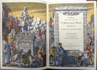
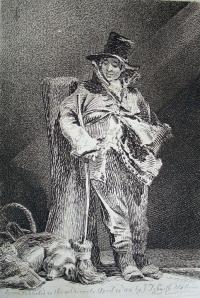
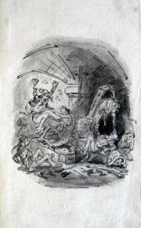
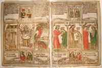
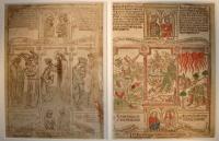
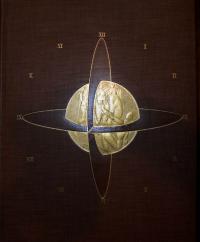
One of his most complex projects was Jonathan Wild, seen above, printed under Cleland’s supervision by the Marchbanks Press and published by the Limited Editions Club. In a letter to editor George Macy in 1942, Cleland wrote, “I am anxious to have this large line drawing photographed for the plate so … I should have proofs of the plate on which I can paint in the color for each stencil … so that they will have only the actual coloring of the edition to do after the book is off the press.” The coloring was accomplished by Charlize Brakely, who charged $10 per thousand pages. The book has 30 pages with color in an edition of 1,500, so that means a total of 45,000 pages to color.

Milton's Quatercentenary

2008 is John Milton’s quatercentenary. As one of many events celebrating the author this year, Professor Nigel Smith spoke Thursday at Labyrinth Books on his new book, Is Milton Better than Shakespeare? Professor Smith pointed, in particular, to Milton’s ability to merge poetry with conversation and urged audience members who were not convinced to simply read Paradise Lost.

Firestone Library holds 610 editions of works by Milton including four copies of the first edition of Paradise Lost from 1667. Rare Books and Special Collections boasts 62 illustrated editions of Milton, beginning with the first illustrated Paradise Lost, published in 1688 with engravings by M. Burghers and Peter Paul Bouche after designs John Baptist Medina and Bernard Lens. Rare Books (Ex) Oversize 3859.369.142q

Pictured here is the first edition illustrated in color: Le Paradis perdu (Paris: Chez Defer de Maisonneuve, 1792). Graphic Arts division (GAX) Oversize PR3561.F5 D8 1792q. For this edition, Frédéric-Jean Schall (1752-1825) created a series of paintings specifically to be used as designs for engraved illustrations to this bilingual edition. Twelve stipple engravings were printed à la poupée, that is, with hand-painted application of colored inks to sections of the copper plate before printing. Each sheet had to be inked and printed separately, significantly limiting the edition’s print run, but adding enormous beauty and charm to the volume.

Mise En Page

| 5 Comments

Alfred Tolmer (1876-1957), Mise En Page: The Theory and Practice of Lay-Out (London: The Studio, 1931). Princeton copy is part of the Charles Rahn Fry Pochoir Collection. Graphic Arts Collection (GAX), Oversize 2004-0692Q

In the early years of the 20th century, the publishing house known as Tolmer et Cie or Maison Tolmer was located at 15, quai Bourbon in Paris. The editor in chief was Alfred Tolmer, who took over after his father, whose name does not seem to have been recorded. Alfred’s son Claude Tolmer (1922-1991) was also with the firm and Bernard Tolmer is also mentioned. These three generations of Tolmers produced literally hundreds of beautiful volumes with exceptional design, often illustrated with original pochoir or lithographic prints. See Papillons in a previous blog post.

In 1930, Alfred began to write his definitive treatise on graphic design, entitled Mise en Page: the Theory and Practice of Layout, which continues to be consulted, if only for the inspirational layout of this book alone. The volume deals with photography, typography, and illustration, using unusual techniques of collage, pochoir, and coated papers. He published a French language edition himself and an English language edition with The Studio magazine, which was printed in London and includes the French text at the back.

Matisse and Joyce

“Cyclops” by Henri Matisse, 1935. Soft-ground etching.

James Joyce (1882-1941), Ulysses (New York: Limited Editions Club, 1935). 6 etchings and 20 photomechanical reproductions by Henri Matisse (1869-1954) Copy no. 700 of 1500, signed by Henri Matisse and James Joyce. Graphic Arts Collection (GAX) Oversize PR6019.O9 U4 1935q

Ever since George Macy, founder and editor of the Limited Editions Club, published an English language edition of Ulysses in 1935, pairing James Joyce’s text with prints by Henri Matisse, there has been a controversy as to whether Matisse ignored Joyce by submitting images based on Homer’s Odyssey. There is no question that the six original soft-ground etchings— “Calypso,” “Aeolus,” “Cyclops,” “Nausicaa,” “Circe,” and “Ithaca”—have a relationship to Homer. The question is whether this was a conscious choice, sanctioned by Joyce, to relate the story and structure of the one book to the other.

In James A. Knapp’s article “Joyce and Matisse Bound” http://muse.jhu.edu/journals/elh/v067/67.4hnapp.html the question is answered yes, with documentation offered from letters between Macy and the artists, and comments from their colleagues, such as Alfred Barr who wrote “Matisse remarked that he had observed how Joyce’s Ulysses was divided into episodes based on Homer’s Odyssey … Macy accepted the suggestion and Matisse went to work.” (Matisse: His Art and His Public, 1951).

Either way, the work of two masters comes together in a powerful way. Macy designed the sequence, including reproductions of the drawings Matisse also sent, which led up to the final etchings. These are bound on top of the final prints in an overlapping fashion that echoes the overlapping stories of the text. Princeton’s copy is one of the 250 (out of the total edition of 1500) signed by Joyce, which originally sold for $15.

1 2 3 4 5 6 7 8 9 10 11 12 13 14

Recent Comments

  • Howard Coblentz: I have a round seal shaped like a pear a read more
  • John Overholt: Wikipedia's entry for Sir Francis says: "Throughout Baring's lifetime his read more
  • Serge Rodrigue: It is a precious thing you have a book from read more
  • Colin Wicks: I have a copy of “A Round Game.” And it read more
  • Laurence Hilonowitz: I was a Customer, Friend of Bob Wilson. I Live read more
  • allen scheuch: Absolutely STUNNING! Those colors, those designs made my day! Thanks, read more
  • Olivier: Hello Diane, If you are still looking for an examplare read more
  • Stella Jackson-Smith: I have a framed picture by A.Brouet, signed with the read more
  • John Podeschi: I remember Dale fondly from my days at Yale (1971-1980). read more
  • Joyce Barth: I have some or all of this same poem. I read more