Recently in Illustrated books Category

The Father Proposes to Lose the Children! and Charles Dickens objects


hop6.jpg
hop4.jpg
George Cruikshank (1792-1878), Hop o’ My Thumb and the Seven League Boots … [from the Fairy library] ([London : D. Bogue, 1853]). Separate issue of the plates on India proof paper, in green morocco portfolio. With pencil inscription in bottom margin of first plate: “To John Adams Acton with the kind regards of his sincere friend, George Cruikshank, Jan. 1st, 1872.” Graphic Arts Collection (GA) Oversize Cruik 1853.4q; part 1, copy 3

hop5.jpg
hop3.jpg

hop1.jpg
hop2.jpg

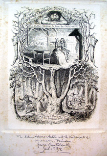
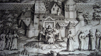
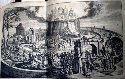
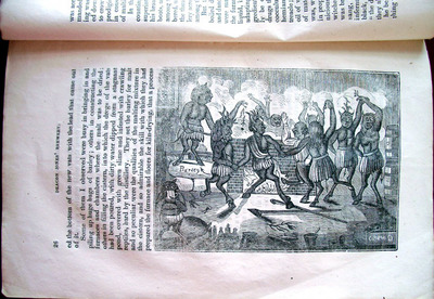
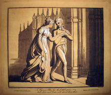
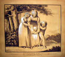
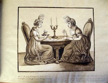
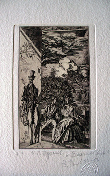
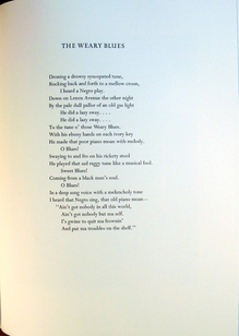
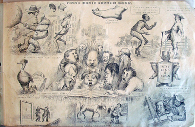
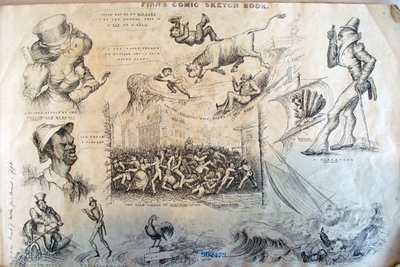
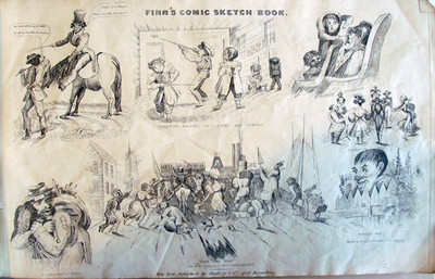
When George Cruikshank (1792-1878) published a group of fairy tales using a form of social realism not previously seen by the Victorian public, his friend and sometimes collaborator Charles Dickens (1812-1870) objected. In his journal Household Words (no. 184, vol. VIII, 1 October 1853, pp. 97-100), Dickens wrote a humorous but heartfelt reply, titled “Frauds on the Fairies.” A complete transcript of Dickens’ essay is available at: http://www.victorianweb.org/authors/dickens/pva/pva239.html
but here is a taste.

“We must assume that we are not singular in entertaining a very great tenderness for the fairy literature of our childhood. What enchanted us then, and is captivating a million of young fancies now, has, at the same blessed time of life, enchanted vast hosts of men and women who have done their long day’s work and laid their grey heads down to rest.”

“…In an utilitarian age, of all other times, it is a matter of grave importance that Fairy tales should be respected. Our English red tape is too magnificently red ever to be employed in the tying up of such trifles, but every one who has considered the subject knows full well that a nation without fancy, without some romance, never did, never can, never will, hold a great place under the sun.”

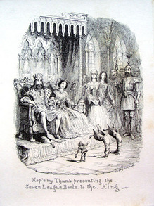
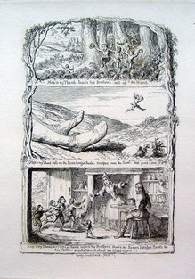
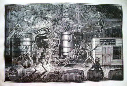
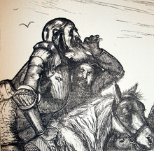
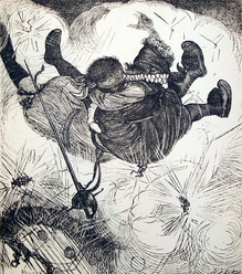
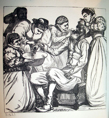
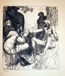
“…We have lately observed, with pain, intrusion of a Whole Hog of unwieldy dimensions into the fairy flower garden. The rooting of the animal among the roses would in itself have awakened in us nothing but indignation; our pain arises from his being violently driven in by a man of genius, our own beloved friend, MR. GEORGE CRUIKSHANK. That incomparable artist is, of all men, the last who should lay his exquisite hand on fairy text. In his own art he understands it so perfectly, and illustrates it so beautifully, so humorously, so wisely, that he should never lay down his etching needle to “edit” the Ogre, to whom with that little instrument he can render such extraordinary justice. But, to “editing” Ogres, and Hop o’-my-thumbs, and their families, our dear moralist has in a rash moment taken, as a means of propagating the doctrines of Total Abstinence, Prohibition of the sale of spirituous liquors, Free Trade, and Popular Education.”

The Tabula of Cebes or The Journey of Human Life

tavola4.jpg
tavola3.jpg
Cornelio Pepoli, Lettere instruttive intorno alla Tavola di Cebete …col Nome Pastorale di Cratejo Erasiniano (Venezia: Appresso Francesco Sansoni, 1771). Frontispiece engraved after Hans Holbein (1497-1543). Includes Latin and Italian versions of the Kebētos Thēbaiou pinax, on facing pages. Graphic Arts (GAX) 2010- in process

Cebes of Thebes (ca. 430-350 B.C.E.) was a member of Socrates’ inner circle. One of the dialogs that has been attributed to him is the Pinax or Tabula, also known as the Tablet of Cebes.


In fact, it was probably Hellenistic, from the second or at the earliest, the first century. The Tabula was well known in antiquity, and after the first modern publication in the late fifteenth century, popular in Europe through the eighteenth century (such as this example).

tavola2.jpg

Pepoli’s bilingual text is a dialogue describing a vast panoramic painting of human life in allegorical terms, and depicting the dangers and temptations that the frail human pilgrims encounter. It is an attempt to show that only the proper development of our mind and the possession of real virtues can make us truly happy. Parallels are often drawn between this work and John Bunyons’ The Pilgrims’ Progress.

Frontispiece is based on a design by Hans Holbein (below), although Pepoli’s includes a key at the foot of the plate identifying the highlights and low points of human progress, such as genius, luck and happiness, but also misery, penitence, folly of love, and much more.

tavola1.jpg

Below: Hans Holbein’s title page with the Tabula Cebetis, metalcut, 1521. Kunstmuseum Basel. First used in De patienta, in Quintus Septimius Tertullian’s Opera …, edited by Beatus Rhenanus, Basel: Johann Froben, July 1521.

Holbein_the_Younger.jpg

tabula1.jpg

Princeton has a large collection of Tabula Cebetis. Here are two more examples.

See also Princeton’s Rare Books blog: http://blogs.princeton.edu/
rarebooks/2009/01/
beyond_is_prisonton_deliriumto.html

For more information: John T. Fitzgerald and Michael White, Kebētos Thēbaiou pinax (The Tabula of Cebes) (Chico, CA: Scholars Press, 1983). Classics Collection (Clas). Firestone PA3948.C2 A24 1983

tabula2.jpg

Above: Cebes, of Thebes, Paráfrasis árabe de la tabla de Cebes. Traducida en castellano é illustrada con notas por Pablo Lozano y Casela. (Madrid: Imprenta Real, 1793). Rare Books (Ex) 2010-1020N

Below: Hendrick Laurenszoon Spieghel (1549-1612), H. L. Spieghels Hertspieghel en andere zede-schriften (Amsterdam: Hendrik Wetstein, 1694). Rare Books (Ex) N7710 .S64 1694

The True History of Deacon Giles' Distillery

dream4.jpg
George Barrell Cheever (1807-1890), The Dream, or, The True History of Deacon Giles’ Distillery and Deacon Jones’ Brewery: Reported for the Benefit of Posterity … (New York: Printed for the publishers, 1848). First published in Salem, February 1835. Graphic Arts Collection (GAX) Hamilton 974 (2)


dream3.jpg

“In 1835 Rev. George B. Cheever, then the youthful pastor of a church in Salem, Mass. published, under the title of Deacon Giles’s Distillery, what purported to be a dream. Daemons were represented as working in the deacon’s distillery, and manufacturing ‘liquid damnation,’ ‘murder,’ ‘suicide,’ etc., for the human employer.”

“The stinging satire took effect. Mr. Cheever was assaulted in the streets of Salem, and was also prosecuted for slander by a certain rum-distilling deacon, who thought he recognized his own portrait in the deacon Giles of the dream. Mr. Cheever was convicted and imprisoned for a few days, but on his release returned at once to the attack in another dream concerning Deacon Jones’s Brewery, in which devils are described as making beer, and, as they dance about the caldron….”

dream2.jpg

“The assault and the prosecution called universal attention to the affair; the dreams were published everywhere and produced great effect. About the same time another local excitement aided the general cause. Mr. Delavan exposed the methods of the Albany brewers, whom he charged with procuring water for their business from a foul pond covered with green scum and defiled with the putrid remains of dead cats and dogs. Eight brewers brought suits against him, claiming damages to the amount of three hundred thousand dollars, but did not succeed in recovering a dime.”


From Cyclopaedia of Biblical, Theological, and Ecclesiastical Literature, Volume 10 By John McClintock (Firestone library, BR95 .M335 1873)

dream1.jpg

Frans Masereel's cuts for Some Corners of the Heart

| 2 Comments
quelques4.jpg
quelques3.jpg

Henri Barbusse and Frans Masereel, Quelques Coins du coeur (Some Corners of the Heart), (Genève: Le Sablier, 1921). Graphic Arts (GAX) 2010- in process

The Flemish artist Frans Masereel (1889-1972) is best remembered for his graphic novels, in the classic sense of the term. Masereel settled originally in France but moved a great deal, returning to Paris in 1921 when he completed the illustrations for Henri Barbusse’s novel Quelques coins du coeur (Some Corners of the Heart). In all, Masereel completed over twenty graphic novels, most of which are available at Princeton.

quelques2.jpg
quelques1.jpg

As a pacifist, soon to be member of the French communist party, Masereel had great sympathy for the work of Henri Barbusse (1873-1935), who was also politically outspoken. Both campaigned in 1921 in favor of Sacco and Vanzetti. 1921 was also the year Barbusse completed Le Couteau entre les dents (The Knife Between My Teeth), which reflected his sympathy with Bolshevism.

Edition Schwarze Seite

editions5.jpg
editions6.jpg
editions2.jpg
editions3.jpg
editions4.jpg

Edition Schwarze Seite (Black Page Edition) is the small press of German artists Anne Buessow and Eckhard Froeschlin. http://www.froeschlin-buessow.de. Froeschlin writes “our books are a combination of original graphic art: etchings, woodcuts or lithographies, with letterpress, mostly handset texts.” For the last twelve years, Froeschlin has spent time each year in Nicaragua, holding printing workshops and collaborating with the TallerContil group in Matagalpa. Four artists’ books emerged from this project, specifically focused on the culture, poetry, and graphic arts of Nicaragua.

The TallerContil started with woodcuts printed in the most basic conditions and evolved to a well-fitted studio boasting an etching press and a Hollander beater, both built in Matagalpa. The two volumes seen here resulted from the Wuppertal-Matagalpa friendships. Note: There will be a workshop about this collaboration at the upcoming CODEX III conference. http://www.codexfoundation.org.

Above, Pablo Antonio Cuadra (1912-2002) [poetry], Eckhard Froeschlin [etchings], El Nicán-Náuat (Wuppertal: Editions Schwarze Seite, 2003). Edition: 25. Graphic Arts GAX 2010- in process

Below: Ernesto Soto [short stories], Eckhard Froeschlin [etchings], Casas Perdidas = Fundstücke [Lost Homes] (Wuppertal: Editions Schwarze Seite, 2010). Edition: 25. Texts in Spanish and German translated by Guenter Schmigalle. Handmade mould paper by Danilo Rivera, Matagalpa, using banana leaf fibers. Handbound by Roger Green using Nicaraguan coffee bags. Graphic Arts 2010- in process

editions1.jpg
editions8.jpg
editions7.jpg

Progress of Female Virtue

progress6.jpg
Maria Hadfield Cosway (1759-1838), Progress of Female Virtue. Engraved by A. Cardon, from original drawings by Mrs. Cosway (London: R. Ackermann’s Repository of Arts, 1800). Graphic Arts Collection (GA) Oversize 2005-0256Q
and
Maria Hadfield Cosway (1759-1838), Progress of Female Dissipation. Engraved by A. Cardon, from original drawings by Mrs. Cosway (London: R. Ackermann’s Repository of Arts, 1803). Graphic Arts Collection (GA) Oversize 2005-0257Q

progress5.jpg
progress4.jpg

progress3.jpg
progress2.jpg

At a time when most women barely left their parents house, the British/Italian artist Maria Hadfield Cosway (1759-1838) traveled the world, dined with royalty, inspired her fellow artists, and seduced at least one American president.

Cosway created several drawing series meant to be translated to engravings for wide distribution. These include her designs for Progress of Female Virtues (1800), and its complement Progress of Female Dissipation (1803), as well as a volume of Old Master paintings she spent two years copying at the Louvre, published as Gallery of the Louvre (1802).

Also a pioneer in women’s education, Cosway established a college for young ladies in Lyon, serving as its director from 1803 to 1809. This was followed by a convent school for young girls in Lodi, for which she was named Baroness of the Austrian Empire.


NOTE: The Cotsen Children’s Library has these two volumes copied exactly in pen, ink and wash by Antoinette de Chaponay, around 1810.

progressctns.jpg
progressctns2.jpg
Antoinette de Chaponay, Progress [of] Female Virtues. Progress [of] Female Dissipation. [Manuscripts] ([France?, 1810 - 1811]). Note: Two lines of verse in English serve as caption to each with French translation pencilled in to right, Drawings en grisaille on buff paper watermarked “F. Iohannot”, interleaved with laid paper. Cotsen Children’s Library (CTSN), Manuscripts Q 32026 and 32027

See also: Stephen Lloyd, Richard & Maria Cosway: Regency Artists of Taste and Fashion (Edinburgh: Scottish National Portrait Gallery, 1995) Marquand Library (SA) Oversize ND497.C75 L55 1995q
Thomas Jefferson (1743-1826), Jefferson in Love: the Love Letters between Thomas Jefferson & Maria Cosway (Madison: Madison House, 1999). Firestone Library E332.88 .C67 1999

Sheets of Evidence

kentridge1.jpg

The most beautiful book published in 2009 was Sheets of Evidence by South African artist William Kentridge in collaboration with Dieu Donné Press. When you come to see a copy in our reading room and begin leafing through its pages of pristine hand-made paper, all you will see is just that: blank paper.

The eighteen pages are, in fact, filled with drawings and text by Kentridge translated into watermarks with the assistance of Susan Gosin and Paul Wong. The concept was “to create a book whose surface revealed nothing, and instead encouraged the viewer to, not simply read between the lines, but to look beneath the surface.”

To create the watermarks, the drawings and text were scanned, digitized, and cut into adhesive-backed rubber watermarks, which were then adhered to wove moulds. Sheets were formed with short cotton linter pulp, pressed to 2300 psi, and stack dried on pellons at Dieu Donné Papermill. This non-profit artist workspace is dedicated to the creation, promotion, and preservation of contemporary art in the hand papermaking process. To see some of the completed pages, click here http://dieudonne.org/

William Kentridge, Sheets of Evidence (New York: DD Publishing Program in collaboration with Dieu Donné Press, 2009). Edition: 20. Graphic Arts GAX 2010- in process

Valentin Popov

popov4.jpg
Valentin Popov, 21 Original Etchings based on Ivan Turgenev’s The Torrents of Spring (San Rafael: Gordian Press, 2009). Gift of Dr. Gunther Haller and Lyhn Haller.
popov1.jpg

The Russian novelist Ivan Turgenev (1818-1883) wrote The Torrents of Spring in 1872. Over one hundred years later, the Ukrainian artist Valentin Popov created twenty-one etchings to bring this novel back to life. The story is a romantic tale of Dimitri Sanin, a young Russian who falls in love with a seductive woman named Gemma while traveling in Europe.

Popov’s website tells us that the project was “originally begun in 1983 with a grant from the Academy of Fine Art of the USSR. The etchings took approximately three years to complete and in 1988 received the Academy’s Silver medal.”

popov7.jpg
popov5.jpg

Each hard-ground etching includes additions of dry point, aquatint, and/or burnishing. They are overprinted with a combination of transparent yellow and white inks. Each edition, designed by Stephen Black of San Rafael, is presented in a clamshell box covered in Japanese silk with a copper plate affixed in a debossed area on the cover.

popov6.jpg

Forty-two numbered sets were produced, with five additional Artist Proofs and three Museum Proofs. Graphic Arts has one of the Artist Proof editions. Firestone also holds a copy of Popov’s illustrated trade edition: Ivan Sergeevich Turgenev (1818-1883), The Torrents of Spring; illustrated by Valentin Popov; translated by Ivy and Tatiana Litvonov (New York: Grove Press, 1996). PG3421 .V5 1996.

For more images, see http://popov.com/TurgenievPrints.html.

I Would Prefer Not To

scanlan7.jpg
Herman Melville (1819-1891) and Joseph Scanlan, Two Views (Brussels: Bartleby & Co., 2003). Copy 26 of 50. Graphic Arts GAX 2010- in process

This artists’ book includes the stories “Bartleby, the Scrivener” by Herman Melville and “Window Stunt” by Joe Scanlan, Professor of Visual Arts in the Lewis Center for the Arts and Director of the Program in Visual Arts at Princeton University. Scanlan first wrote this variation on Melville’s short story in the course of nine straight days, transposing the New York City narrative to Chicago where he was living. The 2003 volume marks his third refinement on Bartleby, this time moving the story to Brooklyn, as Scanlan rewrites the same story over and over again in an effort to make it perfect.

Mr. Scanlan writes, “I was delighted when Thorsten Baensch proposed to me the idea of Two Views. His books are so beautifully realized that I was able to overcome the absurdity of publishing a short story of mine alongside Herman Melville. Thorsten pays great attention to detail and insists on reading being a hands-on experience, from the handmade storage box to the tipped-in plates to the color of thread for the binding.”

“Of course the coup de gras is the stereoscopic viewer that is “hidden” under the cushion for the book. It was my idea to include it—I liked the obvious play on the idea of “two views”—but it was Thorsten who knew there was an extensive stereoscopic image archive at Williams Collge, so he went there and would not leave until he found an image of Wall Street from the same era as Bartleby the Scrivener.”

scanlan5.jpg

Walt Whitman and Vojtěch Preissig

whitmanlimited4.jpg
whitmanlimited3.jpg
Walt Whitman (1819-1892), Salut au monde! Illustrated by Vojtěch Preissig (New York: Random House, 1930). Copy 129 of 360. Graphic Arts GAX 2010- in process.
whitmanlimited2.jpg
whitmanlimited.jpg

The Czech artist Vojtěch Preissig (1873-1944) went to Paris in 1897 to work under Alphonse Mucha. When he returned to Prague in 1903, he opened his own printing studio and published the review Česká Grafika. From 1910 to 1930, he lived in the United States teaching graphic arts as well as acting as the director of the School of Printing and Graphic Arts, Wentworth Institute, Boston. Preissig worked with the resistance movement during World War II and died in a Nazi concentration camp.

One of his last project in the United States was an edition of Salut au Monde! (Hello to the World!) by Walt Whitman (1819-1892). He not only illustrated the poem, but designed a new type cut and cast by the State Printing Office in Prague.

O take my hand Walt Whitman!
Such gliding wonders! such sights and sounds!
Such join’d unended links, each hook’d to the next,
Each answering all, each sharing the earth with all.

What widens within you Walt Whitman?
What waves and soils exuding?
What climes? what persons and cities are here?
Who are the infants, some playing, some slumbering?
Who are the girls? who are the married women?
Who are the groups of old men going slowly with their arms about each other’s necks?
What rivers are these? What forests and fruits are these?
What are the mountains call’d that rise so high in the mists?
What myriads of dwellings are they fill’d with dwellers?

Frederick Evans' platinotypes for the Immortal Don

evans4.jpg
Miguel de Cervantes Saavedra (1547-1616), The History of Don Quixote of the Mancha. Translated from the Spanish … by Thomas Shelton, annis 1612, 1620. Introductions by James Fitzmaurice-Kelly, 1896 ([London: privately printed, 1913]). 4 volumes extra-illustrated with 99 platinotypes. Vol. 1 contains an addition title-page: “Illustrations to Cervantes’ Don Quixote by Arthur Boyd Houghton, 1866. Facsimile reproductions in platinotype of Dalziel Brothers’ woodcuts by Frederick H. Evans. Privately printed, MCMXIII.” Graphic Arts GAX 2010- in process.

evans2.jpg
evans9.jpg
This four volume set of Don Quixote belonged to the photographer and bookseller Frederick Henry Evans (1853-1943). The set is extra-illustrated with 99 photographic facimiles of illustrations drawn by Arthur Boyd Houghton (1836-1875) and printed by the Brothers Dalziel (Edward, George, John, Margaret Jane!, and Thomas), the most influential British wood engraving firm in the 1860s and 1870s. Evans made these plates by photographing the ink prints and then, using the negative to make platium (photographic) positives.

evans10.jpg
evans7.jpg
evans3.jpg
evans1.jpg
According to a note from Evans, only three platium prints were made from each negative and then, the negative was destroyed. Evans printed and privately published this edition of three, as he did with a number of classic illustrated books in his personal library. Each volume has two Frederick Evans’ bookplates: one designed by F.C. Tilney and the other an adaptation of the Morte Darthur borders by Aubrey Beardsley (possibly authorized by the artist).

Evans also wrote: “The smaller drawings have been enlarged to make the set uniform in size. These drawings - the most imaginative, respectful and comedically heroic ever made for the immortal Don - have been reproduced in this beautiful photographic process expressly to illustrate the best English translation….”


evans5.jpg
evans8.jpg


And if that is not enough, laid-in is an autographed letter dated 1916, from Charles Ricketts. “Dear Mr. Evans, I remember you quite well and congratulate you on your reproductions of Houghton’s Don Quixote illustrations. …It may interest you to know that Whistler, who admired Houghton greatly, has a special liking for the Don Quixote series which he was the first to bring to my notice. Ever sincerely yours, C. Ricketts”.

http://www.kimeia.com/pdf/history.pdf

Reproducing Versailles' Hall of Mirrors

versailles.jpg
“Protection accordée aux Beaux-Arts, 1663” in La grande galerie de Versailles, et les deux Salons qui l’accompagnent, peints par Charles Le Brun, dessinés par Jean-Baptiste Massé…. (Paris: Imprimerie royale, 1752). Graphic Arts GA French prints

In 1662, the print makers of the Cabinet du Roi were organized to create an engraved record of the celebrations held by Louis XIV. Five years later, the charge was expanded to include an engraved record of every painting and sculpture owned by the King, along with his gardens, buildings, and the interior decoration of the residences.

The most spectacular work of the time was that of Charles Le Brun (1619-1690) who was Louis XIV’s principal painter and leader of the Académie royale de peinture et de sculpture. Among his many projects was the decoration of the Galerie des Glaces (Hall of Mirrors), Le Grand Escalier (Grand Stairway), and other rooms, vaults, and niches at Versailles.

Beginning in 1723, the artist Jean-Baptiste Massé (1687-1767) undertook the project of copying the ceiling decoration of the Hall of Mirrors and accompanying rooms at Versailles, for the purpose of making a series of reproductive engravings. Massé was given special permission to build scaffolding in the apartments and spent over eight years at the ceiling carefully copying Le Brun’s designs. A number of engravers worked over twenty years to prepare and then, print the series of plates.

Completed in 1752, La grande galerie de Versailles et les deux salons qui l’accompagnent was published with 56 massive engravings on 52 plates. Two prints from this set are reproduced here. In the central oval on the print above, we see Louis XIV on his throne, Minerva on the left, and an allegorical figure of Eloquence (according to François Charpentier) kneeling on the right. The caption might be translated Protection Accorded the Fine Arts.

In The Reformation of Justice, 1667 (below), the central scene includes Louis XIV holding a book and scepter with Justice on the left, judges on the right, and La Chicane below his feet. For an extended reading of these and the other scenes in the Hall of Mirrors, see http://www.galeriedesglaces-versailles.fr/html/11/collection/galerie.html

versailles2.jpg
“Reformation de la Justice, 1667” in La grande galerie de Versailles, et les deux Salons qui l’accompagnent, peints par Charles Le Brun, dessinés par Jean-Baptiste Massé…. (Paris: Imprimerie royale, 1752). Graphic Arts GA French prints

See also:
Charles Le Brun (1619-1690), Recueil de divers desseins de fontaines et de frises maritimes, inventez …([Paris, 1693?]) Marquand Library (SAX): Rare Books Oversize NA9400 .L49f

Tapisseries du roy: ou sont representez les quatre elemens et les quatre saisons : avec les devises qui les accompagnent et leur explication (Paris: Chez Sebastien Mabre-Cramoisy … , 1679) Marquand Library (SAX): Rare Books Oversize NK3000 .L46f

Charles Le Brun (1619-1690), Grand escalier du chateau de Versailles, dit Escalier des ambassadeurs (Paris: L. Surugue, [1725]) Marquand Library (SAX): Rare Books Oversize NA1046 .L49e

Lawrence Hutton as a boy meeting Thackeray

hutton thackeray.jpg
Charles M. Relyea (1863-1932), A Boy I Knew, 1896. Pen and ink drawing with gouache highlights. Graphic Arts GA 2006.01984

The American journalist Laurence Hutton (1843-1904) published his autobiography in four monthly issues of St. Nicholas magazine from December 1896 to March 1897, under the title “A Boy I Knew.” The memoir ends in Savannah around 1853, “when his father told him to observe particularly the old gentleman with the spectacles, who occupied a seat at their table in the public dining-room; for, he said, the time would come when The Boy would be very proud to say that he had breakfasted, and dined, and supped with Mr. Thackeray. …He did pay particular attention to Mr. Thackeray, with his eyes and his ears; and one morning Mr. Thackeray paid a little attention to him, of which he is proud, indeed. Mr. Thackeray took The Boy between his knees, and asked his name, and what he intended to be when he grew up. He replied, ‘A farmer, sir.’ Why, he cannot imagine, for he never had the slightest inclination toward a farmer’s life. And then Mr. Thackeray put his gentle hand upon The Boy’s little red head, and said: ‘Whatever you are, try to be a good one.’ And whatever The Boy is, he has tried, for Thackeray’s sake, ‘to be a good one!’”

In 1897, Hutton received the honorary degree of A.M. from Princeton University and published a hard cover edition of the memoir as: Laurence Hutton (1843-1904), A Boy I Knew and Four Dogs (New York: Harper, 1898). Laurence Hutton Collection (HTN) 3794.8.32

More Jack Sheppard

jack sheppard20

The Daily Journal. Tuesday 17 November 1724
“Yesterday morning, about nine of the clock, the famous John Sheppard was carried up from the Condemn’d Hold to the Chapel in Newgate, where having heard prayers and received the Holy Sacrament, he was brought down again to the Press-Yard between ten and eleven, when Mr Watson came in the name of the sheriffs to demand his body;

Mr Perry and Mr Reuse … deliver’d the same: Mr Watson told the prisoner, that he must put him on a pair of handcuffs for his security; he vehemently resisted the same, flying into the greatest passion, and endeavour’d to beat the Officers; upon searching him, they found a penknife conceal’d about his cloaths, with which ‘tis apprehended, he design’d to have cut the ropes, and attempted to escape out of the car … .

When he arrived at the Tree, he sent for Mr Applebee, a printer, into the cart, and in the view of several thousands of people, deliver’d to him a printed pamphlet, Entitled, A Narrative of all the Robberies and Escapes of John Sheppard, … which he desired might be forthwith printed and publish’d.”

Portions of this text, written by Sheppard, are reprinted in: The Life and Exploits of Jack Sheppard: a Notorious Housebreaker and Footpad; giving a full acount of his numerous robberies: his escape from the New Prison; his commitment to Newgate; he is tried, and receives sentence of death; his wonderful escape from thence although loaded with irons; he is retaken, confined in the condemned cell, and chained to the floor; then removed to a stronger place in Newgate, called the Castle, from which place he escapes in the night; he is again taken, and secured in Newgate; after which he is hung at Tyburn (Derby: Thomas Richardson; London: Simpkin, Marshall and Co.; Portsea: S. Horsey, [1830?]). Graphic Arts Collection (GAX) 2010-1247N

Newpaper text from: Rictor Norton, “Jack Sheppard, Jail-Breaker,” Early Eighteenth-Century Newspaper Reports: A Sourcebook, 9 October 2003. http://grubstreet.rictornorton.co.uk/sheppard.htm

Sunrise is coming after while

hughes4tp.jpg
Langston Hughes (1902-1967), Sunrise is Coming After While. Poems selected by Maya Angelou; prints by Phoebe Beasley (New York: Limited Editions Club, 1998). Copy 170 of 300. Numbered and signed by Phoebe Beasley and Maya Angelou. Graphic Arts GAX 2010- in process

The Limited Editions Club created and published modern fine press editions for a small group of subscribers. This was a high volume business, with as many as twelve projects completed each year in editions of 1500. The Club was founded and managed by George Macy (1900-1956) from 1929 to 1956; by Helen Macy from 1956 to 1968; and their son Jonathan Macy from 1968 to 1970. During the 1970s, the imprint was bought and sold several times, with little artistic success until 1978, when Sidney Shiff (1924-2010) took over.

hughes.jpg
hughes2.jpg

Under Shiff’s direction, a number of beautiful livres d’artistes were produced highlighting the work of African American writers and artists. For the 1998 season, Shiff contacted the poet Maya Angelou (born Marguerite Annie Johnson, 1928) and LA artist Phoebe Beasley (born 1944) to develop a book of poetry by Langston Hughes (1902-1967). Angelou selected the poems and Beasley responded to them with six brightly colored screen prints. Angelou then completed the volume by writing both an introduction and an afterword. Drexel Press printed Beasley’s plates and the text was designed and hand-set in Monotype perpetua by Michael and Winifred Bixler.

hughes5.jpg
hughes3.jpg

For more information on Angelou, see http://www.nytimes.com/2010/10/27/arts/design/27archive.html?partner=rss&emc=rss
For more information on Beasley, see www.PhoebeBeasley.com
For more information on Hughes, see http://www.langstonhughessociety.org/
For more information on the Limited Editions Club, see http://www.majure.net/lechistory.htm
and
William Burton, “The Decline and Fall of The Limited Editions Club,” American Book Collector (July/August 1980).

hughes6.jpg

First Cuban illustrated book

| 1 Comment
parra7.jpg
parra1.jpg
parra5.jpg
parra6.jpg
parra4.jpg

Born in Portugal, Antonio Parra y Callado traveled to Cuba around 1771 on a commission from Madrid’s newly established Royal Cabinet of Natural History (later called the National Museum of Natural Sciences). The thirty-two-year-old enthusiast, with no academic training, collected plants and seeds to be sent back to the museum’s Botanical Garden.

Parra quickly became fascinated with the Cuban culture, the topography, and the diverse natural history of the Caribbean. His studies expanded, eventually focusing on marine life, collecting and documenting specimens of salt and fresh water fish, crustaceans, corals, eels, turtles, and other marine plant life over the next thirty years.

Parra married and his son, Manuel Antonio Parra y Muñoz, was born in Havana. A talented artist, Manuel joined his father’s research team while still a teen-ager, sketching, etching, and printing images of the specimens they collected. Together they published an exhaustive study of the fish of Cuba, which is believed to be the first scientific treatise published in Cuba, as well as the first Cuban illustrated book.

The volume describes and illustrates sixty different species of fish and twenty-three crustaceans. Among the most interesting is a folding plate following the title page that presents a group of lobsters on an elaborate silver platter. The book’s plates account for nearly one half of the island’s production of printed images in the eighteenth century. Parra established his own Cabinet of Natural History in Havana; I wonder if anyone reading this has been there?

The final chapter, added without explanation, documents a black slave with an enlarged hernia. Identified by researchers at the John Carter Brown Library as Domingo Fernández, this man was one of the first Caribbean slaves to be depicted in a published source.

parra3.jpg

Antonio Parra y Callado (1739-18??), Descripcion de diferentes piezas de historia natural las mas del ramo maritimo: representadas en setenta y cinco laminas (Havana: En la imprenta de la Capitanía General, 1787). 75 copper plate etchings, one hand colored. Graphic Arts (GAX) in process. Purchased with the fund given by Kenneth H. Rockey, Class of 1916, in memory of his wife, Isabel A. Rockey.

Henry J. Finn, educated at Princeton College

finn's5.jpg

“By Peabody & Co. New-York ; Finn’s Comic Sketch Book, for 1832: to be published in the style of Johnston’s celebrated Scraps, consisting of four large sheets, exclusive of a humorous cover, all designed and drawn by Henry J. Finn. Price not to exceed $1.” from New England Magazine 1831

finn's2.jpg
finn's.jpg

“Henry J. Finn was born in the city of New York, in the year 1782. When a boy he sailed for England, on the invitation of a rich uncle resident there. The vessel sunk at sea, and the passengers and crew were for many days exposed in small boats until they were picked up by a ship which landed them at Falmouth. Finn resided in London until the death of his uncle, who made no mention of him in his will. He then returned to New York in 1799, studied law for two years, —became tired of the profession, returned to London, and made his first appearance at the Haymarket Theatre “in the little part of Thomas in the Sleep Walker.” He continued on the stage with success … and accumulating a handsome fortune….”

“Finn [was] celebrated as a comic writer as well as a comic actor. He published a Comic Annual, and a number of articles in various periodicals. …He wrote occasional pathetic pieces, which possess much feeling and beauty, and left behind him a MS. tragedy, portions of which were published in the New York Mirror, to which he was a contributor in 1839.” From Cyclopaedia of American literature, v.2.

finn's4.jpg
finn's3.jpg

Before Blake there was L'Héritier

heritier10.jpg
Alexandre Joseph L’Héritier, La messe pascale, poëme du Sr. Alexandre Joseph L’Heritier…. (Paris, 1772). Graphic Arts Collection (GAX) 2007-1139N
heritier9.jpg
heritier4.jpg
heritier7.jpg
heritier5.jpg
heritier8.jpg
Nearly twenty years before William Blake’s first illuminated book, Alexandre Joseph L’Héritier produced a volume in a similar style and format. There is no listing for L’Héritier in standard French biographical dictionaries or in art historical sources. This appears to be his only work or the only one so far attributed to him. Unlike Blake, who printed from metal relief plates, L’Héritier used intaglio plates, etching the text in reverse and leaving clear plate marks on each page. Hand-printed in a small edition, the plates are of irregular sizes and shapes, sometimes printed directly on top of the other.

heritier3.jpg
heritier2.jpg
heritier1.jpg

L’Héritier used the Latin liturgical text (Ordinary of the Mass with Easter proper) as basis for his imagery, paraphrasing the text in French on opposite pages. Parts of the liturgical text (introit Christus surrexit, et al.) are at variance with the Roman missal. Approbation by ecclesiastical censor (p. 124) is included dated 3 Apr. 1770.

The botanist, magistrate, and bibliophile Charles Louis L’Héritier de Brutelle (1746-1800) came from a large aristocratic French family and it is possible that Alexandre was a relation. Charles had a large library and published several beautifully illustrated books, working closely with the prolific engraver Pierre Joseph Redouté (1759-1840). Is it possible that Alexandre collected the discarded plate fragments and used them to publish a book of his own? Pure speculation.

See also Charles Louis L’Héritier de Brutelle (1746-1800), Cornus. Specimen botanicum sistens descriptiones et icones specierum corni minus cogitarum (Paris: Didot, 1788). Rare Books Oversize QK495.C785 L53e

An Art Deco Song of Solomon

cantique7.jpg
cantique4.jpg

Le Cantique des cantiques [The Song of Songs] (Paris: La Belle Edition, 1914). Pochoir plates by George Barbier (1882-1932). Copy no. 201 of 175 copies, numbered 66-240. Graphic Arts Collection (GAX) NK8667.B37 B524

cantique3.jpg
cantique6.jpg
cantique5.jpg

Barbier's Falbalas & fanfreluches [Ruffles & Frills]

barbier5.jpg
barbier12.jpg
barbier11.jpg

George Barbier (1882-1932), Falbalas & fanfreluches: almanach des modes, présentes, passées et futures [Ruffles & Frills: Almanach of Style, Present, Past, and Future] (Paris: Meynial, 1922-1926). Charles Rahn Fry Pochoir Collection. Graphic Arts (GAX) Oversize 2004-0920Q

The French artist George Barbier (1882-1932) designed costumes for the Folies Bergeres, for the Ballets Russes, and for Rodolfo Valentino in the film Monsieur Beaucaire (1924). He also designed textiles, wallpaper, and jewelry, illustrated books and fashion periodicals, and is responsible for Cartier’s black panther logo. Albert Flament referred to him as “one of the most precious and significant artists of our era.”

barbier6.jpg
barbier4.jpg
barbier3.jpg
barbier7.jpg

Barbier designed plates for various fashion albums and almanacs, including Modes et manières d’aujourd’hui (1912-1923), La Guirlande des mois (1917-1920), Le Bonheur du jour (1920-1924), and finally, his own publication Falbalas et fanfreluches (1922-1926). The final title was published in a limited edition of 600 copies with twelve plates in each annual hand-colored by pochoir, using up to thirty stencils per images. The text of 1922 is by comtesse Mathieu de Noailles; 1923 by Colette; 1924 by Cécil Soral; 1925 by Gérard d’Houville; and 1926 by the baronne de Brimont.

Interestingly, Barbier first exhibited at the Salon des Humoristes in 1910 under the name Edward William Larry and often published articles under other pen names.

barbier9.jpg
barbier8.jpg
barbier1.jpg
barbier13.jpg
1 2 3 4 5 6 7 8 9 10 11 12 13 14

Recent Comments

  • Howard Coblentz: I have a round seal shaped like a pear a read more
  • John Overholt: Wikipedia's entry for Sir Francis says: "Throughout Baring's lifetime his read more
  • Serge Rodrigue: It is a precious thing you have a book from read more
  • Colin Wicks: I have a copy of “A Round Game.” And it read more
  • Laurence Hilonowitz: I was a Customer, Friend of Bob Wilson. I Live read more
  • allen scheuch: Absolutely STUNNING! Those colors, those designs made my day! Thanks, read more
  • Olivier: Hello Diane, If you are still looking for an examplare read more
  • Stella Jackson-Smith: I have a framed picture by A.Brouet, signed with the read more
  • John Podeschi: I remember Dale fondly from my days at Yale (1971-1980). read more
  • Joyce Barth: I have some or all of this same poem. I read more